There is a Fairchild reference that states that even when the chromaticity is identically measured from an emission from a display and A / B tested against a reflected print, it will always be perceptively different. Mind boggling, but psychophysical things are what they are.
There is an interesting side note here for house paint matching. Typically the CIE reference is the 10° observer instead of the typical 2° that is used for displays and prints. The reason is that our macula has dyes that differ as the field of view increases, essentially creating six dimensions of receptivity from the three cones. So the “match” beyond our centre core of vision is different for room sized dimension. This also leads down the rabbit hole of our perceptual system being able to be somewhat spectrally sensitive. Interesting stuff!
It literally changes colour because of the limitations of either the capture device sensor or the camera rendering transform. That’s a technical problem.
Not really sure what you are asking.
I’ve cited a technical problem, and offered no solutions. There is a partial, half-baked and crap solution in Filmic. There isn’t in ACES.
Again though, we aren’t talking about human vision limits, but rather the well-within-human-range output contexts. You sort of hint at what a solution might be, but you used the word “invisible” which doesn’t adequately describe what might / should happen, as we can’t make something invisible.
Again, it’s a rather interesting question which loops back to our learned aesthetic models derived from photographic film.
Anyway, let’s talk about yellow then.
Assume that portrait was taken in high dynamic range, so it captured a lot more color information. Alternatively, that it was a render and we have provided the color information to infinity. We’re left with the problem of representing “some” color, what that color really is being irrelevant here. So given some curves with different time/space (aperture speed/fstop/etc) what kind of image would you have made?
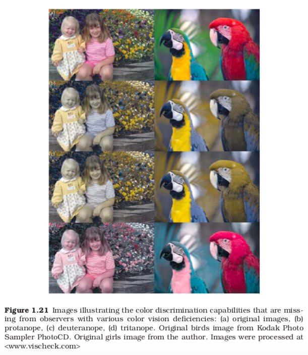
Are any of these color profiles any less ‘real’ than the next? At least, for the yellow blind observer the red photo could adequately represent reality.
The issue is that the actual hardware in this case has a limit, so the skin representation intensity exceeds the limit of the hardware and it skews wildly to the broken yellow. The same happens with camera rendering transforms.
Applying a transfer function from scene to display (aka crap term “tone mapping”) merely postpones the problem. That is, if we apply a nonlinear transfer function up to X, the exact same issue will appear for all intensities above X. This is all that ACES is in essence; a protocol and a set of wide gamut primaries and some pre-formed curves, hence it doesn’t “solve” the problem any more than the sRGB OETF does. It’s the same broken result.
The question remains “What is a the most aesthetically sane thing to do for an intensity that exceeds the device in question?”
I won’t answer it, but most folks can likely deduce what my preferred approach is from the rudimentary work present in Filmic.
Yes they are all garbage. The standard observer is based on just that; average visioned individuals. Deviate from the standard observer and the entire 1931 CIE model falls apart. Can it be used to try and estimate and simulate the effects of non-standard observers? To some lesser extent possibly, but the entire thing becomes an exercise in folly, and an entirely tangential discussion irrelevant to what is being discussed here.
Is your ideal solution something like mapping that yellow photo to the colors it would have if the light were average temperature white? I’m asking because I’m not sure I understand the problem. Is the problem that the light is yellow? Maybe you’re calling for more artistic color representation and specifically selecting the right color-scheme for each frame, or maybe the opposite totalitarian extreme of everything by the books. I don’t know. That’s why I’m asking what that 1 particular photo should look like, or how you would make it. Maybe for fun I’d make it technicolor, who really cares as long as it expresses the art you intended?
So with white shifting, it’s the same reason I brought up HDRI. To any observer, standard or no, there is a point where all the light will -appear- white (or even transparent, like X-Rays). That’s just human truth. However, in blender if you map colors through RGB curves, information is lost. You can’t take that light and then bring the intensity back down into red or yellow or whatever, it’s now a black and white value spectrum due to the destructive maxima clamping, which could allow the value to shift past 1.0 to save the value but it doesn’t (it would still display white, but it could save the relative energy). Yet, the output being represented as white, are you saying that part is false?
Oooh, rabbit hole, I’ll bite. It is recently postulated that birds can perceive the Earth’s magnetic field through the interaction of entangled quantum particles using a protein called cryptochrome in their eyes. The Khoi San of the Kalahari desert have an unerring ability to navigate back to their family shelter after a hunt which involves shooting a large antelope with a tiny poisoned arrow and chasing madly after/tracking said animal for sometimes days until it drops. Interestingly, they have an adage, which I heard from Dominee Swanepoel (a NG priest who translated the Afrikaans bible into Khoi) almost 40 years ago, roughly translates as ‘you should never trust a one eyed man to get you home…’