I was inspired by japanese workflow to create graphics: Color, shading, line,Gradient for depth and Tone.
You know those comics where they use crosshatch to bring some shades in, that is the tone.
Did you ever see that in an animation as well, and would it then look like this:
How I created it;
Make lowpoly scene in Blender/cycles 2.97b
Use only emission shaders, AO, and freestyle on another layer
Do a trick with the normals in compositor to give some extra shades
Two kind of crosshatches. You can define where they have to appear (illuminance)
Z-depth.
Good idea or bad idea to use Tone or crosshatch in animation?
Hmm I think it’s a bad idea. It should be baked in the texture’s I think. No idea yet what the worklow will be. (I am not going to paint it manually).
For a still it could be ok.
The reason not to use cross hatching, is because the cross hatching must remain consistant looking. If you got the artistic skill to keep it consistant then maybe. There are not very many colors chosen for animation when doing color, or black and white in animation. But you will see high graduals, high detail is concept art.
This is because shading on that level requires super talent, and much much time.
What I have seen is detail shading level of, 2 - 4 tones.
Sure you can. I did just this as a test several years ago in XSI, but the concept would be the same.
You first need a crosshatch pattern that covers an entire object as a texture. You could use a tileable texture for background props, and something hand crafted for important objects.
From here, there are a lot of directions you could go, but a good place to start would be using a light path - is shadow ray node and maybe a layer weight node to control where the crosshatching shows on an object.
With something like this, the crosshatching remains static relative to the objects. You’re just revealing the pattern as the camera/objects move.
As the gif shows you can encounter the screen door effect in animations which isn’t always desirable. On the other hand like @thedaemon said, the pattern can have an inconsistent look if mapped to the objects directly because of inconsistent distances and angles to the camera. Searching coherence and screen door effect should point you towards various ways to tackle such styles.
I see now that the way I did it was indeed a bad idea and I have the following in mind:
Bake AO textures for each object and use that as mask for texturing crosshatch (experiment). Or as cgCody says: “using a light path - is shadow ray node and maybe a layer weight node to control where the crosshatching shows on an object”
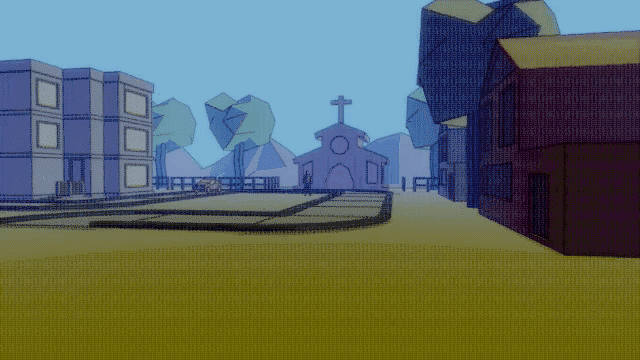
Instead of crosshatch I used AO (scene, not baked) with low samples and blurred that out in the compositor. Next to that, objects has 3 shades (see mountain), and then a gradient to desauturate objects further away.
What could I improve more? (Besides character modeling )
on a note about inconsistency, sometimes it can be a desirable look, it depends on your design. With an animation it might look cool or amusing to see the inconsistent cross hatching, moving around with the animation.
 )
)