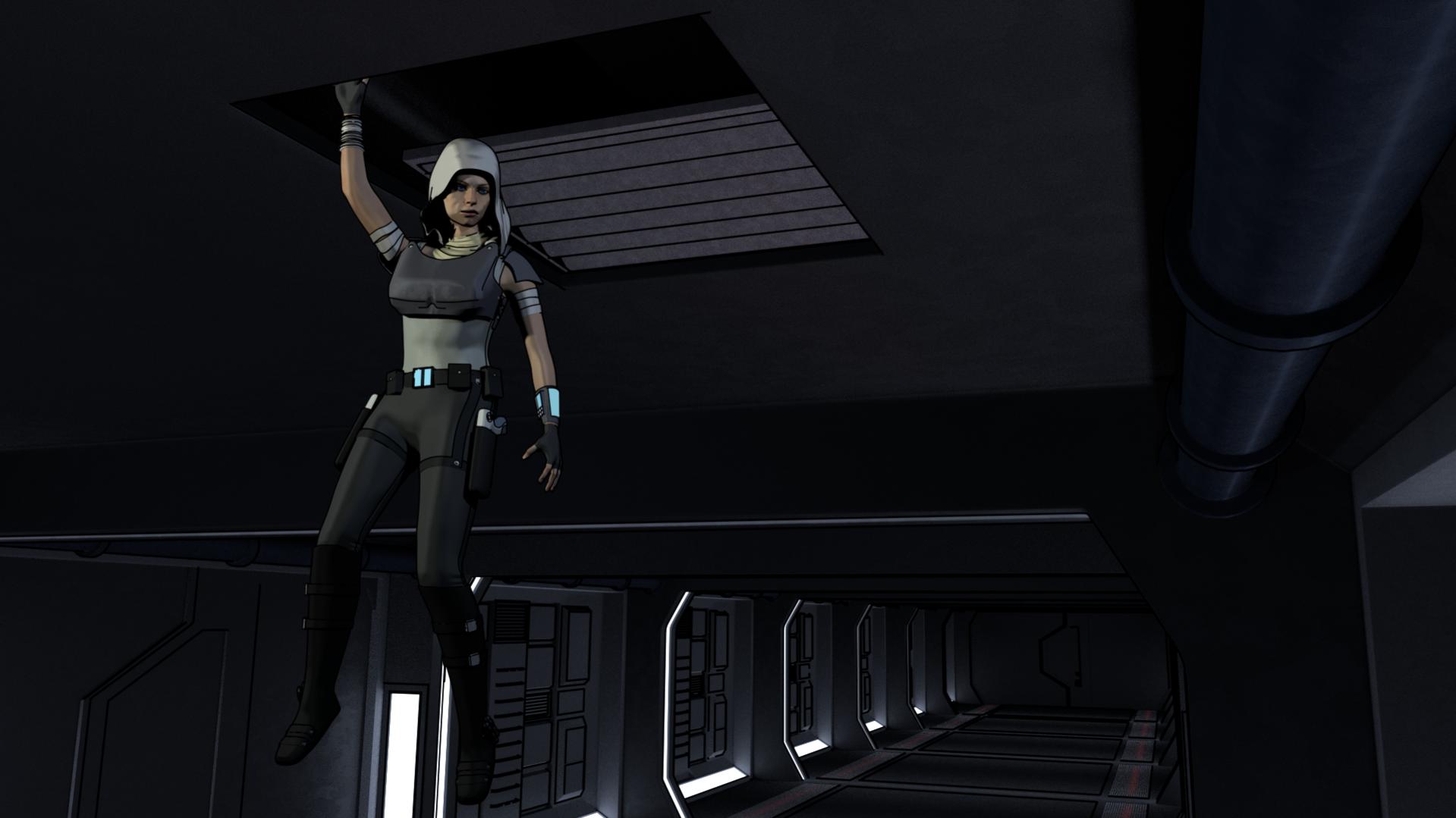
Does this look right? She drops down the vent and lands on the floor. Bottom pose was a pain in the butt but I think it ended up looking pretty good. Added some motion blur to middle image to re-enforce the idea that she’s falling.
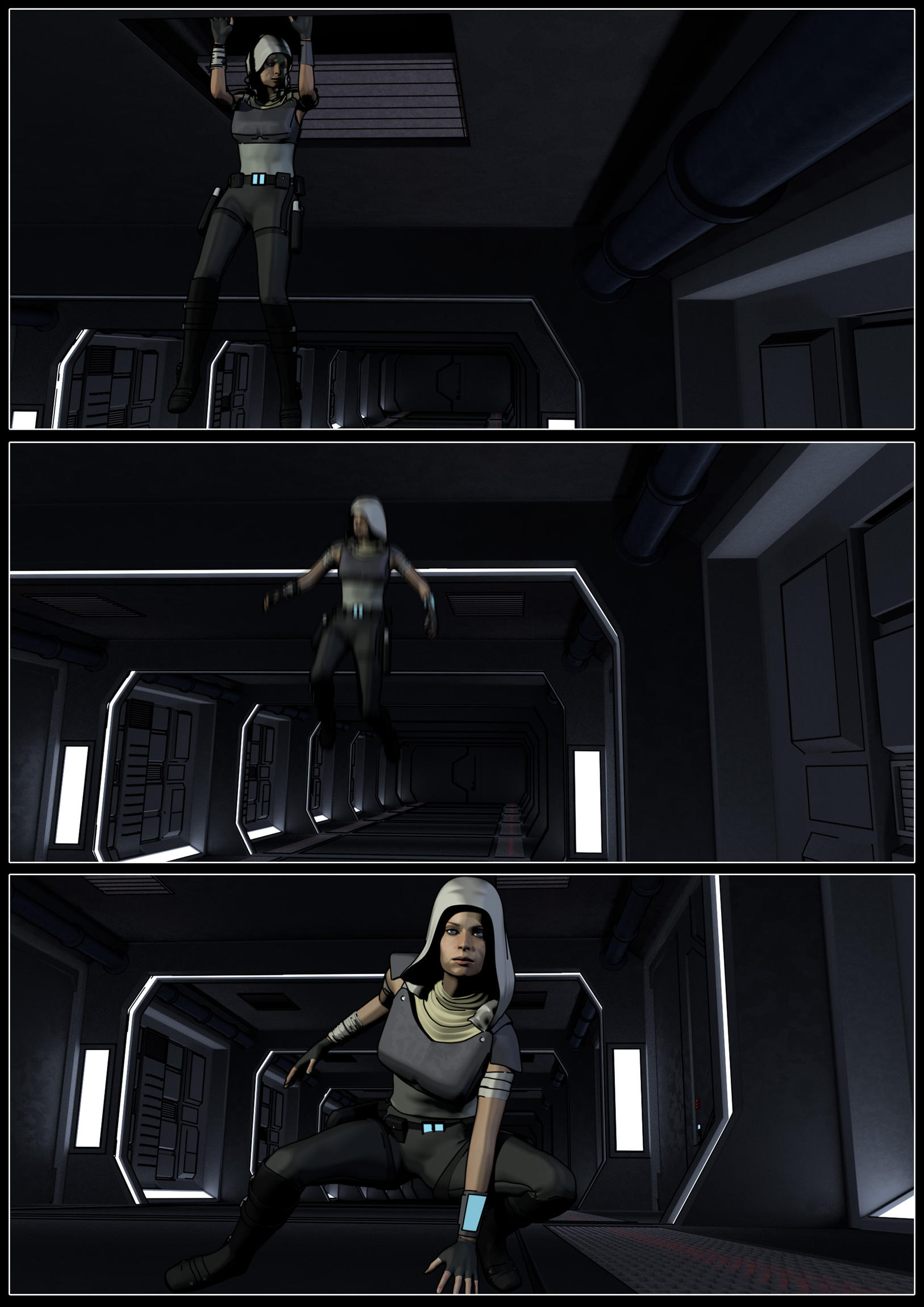
It gets the point across easily enough as you can tell what’s happening from the 1st and 3rd panels. On the middle panel, if you wanted to spend more time on it, I would suggest her hood flying up and also her arms up. She obviously has skills, so the position of her arms is fine for an action hero in animation/video (controlled landing), but for graphic novel sometimes you have to exaggerate things to illustrate what is happening. Again, here, not necessary, but if you were to change it…
Side note, what was your end goal for this, is it going to be on the web or printed? If printed, you may need to lighten your panels as they are quite dark, which looks great for the mood you are setting in these renders.
Yeah I may end up coming back to this page and tweaking that 2nd panel a bit. Note entirely happy with it, but as you say, gets across the message. And I don’t have any plans for print, just digital really.
Looks good, but you could make a few more adjustments.
First Panel:
Her elbows look like they are bent at a 90 degree angle. Either make the angle less than 90 or more as keeping it near 90 makes it look posed and stiff. The hips and legs look more natural, but the waist looks too straight and aligned with the upper torso. Bend it so that it curves and shares more of the rotation of the hips instead of forming a sharp angle. As a general point, avoid sharp 90 degree angles and perfectly straight lines wherever possible when posing people, try to have some sort of flow or motion to your character to bring them more to life (if that makes sense). Another thing is that she’s shifted to the far left of the panel staring at the bottom right corner. Is there something you want me to pay attention to on the right there?
Second Panel:
Bring the arms and knees closer together, maybe bend the knees a little more. It feels really stiff here. If a person is falling, the limbs should be held close together to maintain balance or flailing pointing upwards because the limbs are individually lighter than the torso. Think about it like pieces of string tied to a falling rock.
Third Panel:
The left arm is too straight here. It looks like her hand is barely touching the ground by her fingertips. You need to bring her upper body closer to the ground enough so that her arm can bend. The only reason why she would need to stick her arm out like that is to absorb some of the shock of the landing, which needs to be further emphasized here. Also, avoid looking directly at the camera as it breaks some of the fourth wall illusion. Try to vary more between camera shots instead of just shooting at the same angle, but slightly shifted downwards for three frames. Maybe take a shot from her side or one from above/below.
Thanks for feedback! Very helpful. Worked on 1 and 3 a little (will do 2 soon). Think first frame looks more natural now, the single arm up and one hanging by the side I think helps with that. Also the 3rd one, I found a great pic of Black Widow in Iron Man 2 doing the exact pose I wanted (called a 3 point landing apparently…) Think it looks better now, and chnaged her eye direction so that shes not looking right at the camera, as suggested.
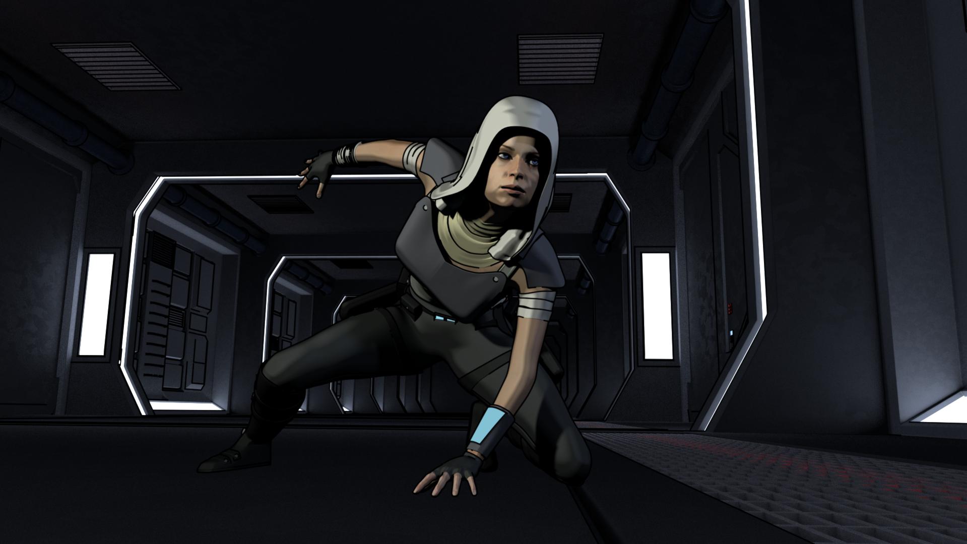
Still need to tweek this, pose is more difficult than you first imagine. Think neck is leaning forward too much. Think arm is ok though for the pose. Think her head is twisted too far round aswell.
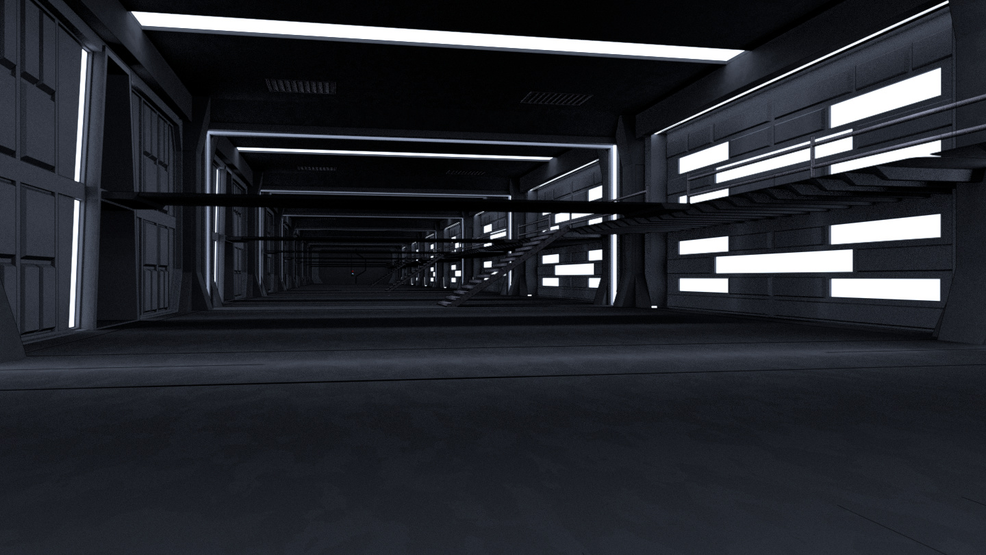
Definitely a much improved pose the second time around. Also, I don’t know what the situation is, but the hallway seems a little too empty. Feels like it could use some more props like a few crates, some signs, emergency lighting fixtures… Stuff like that.
Someone new to comment, welcome ![]()
Yeah, its clear on purpose. It’s a huge prison corridor, and easy access is important for guards, but also vehicles which can access the corridor for security purposes (which is why the corridor is so wide and tall)
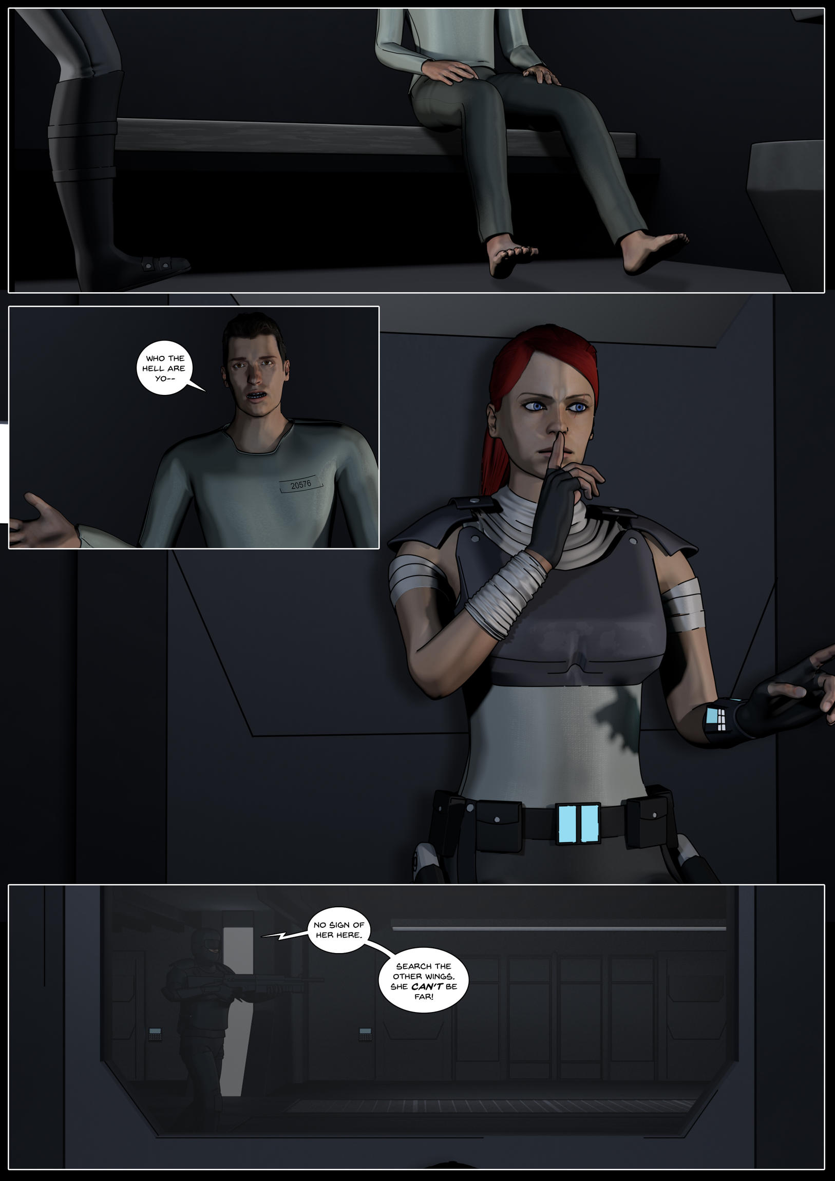
Having a lot of fun making these panels, I must say! It’s hard to work out what facial expressions to use for some panels though, but I think I’m doing ok atm. Here are pages 9 and 10 back to back. I tried out some lettering on page 10, which I think looks good.
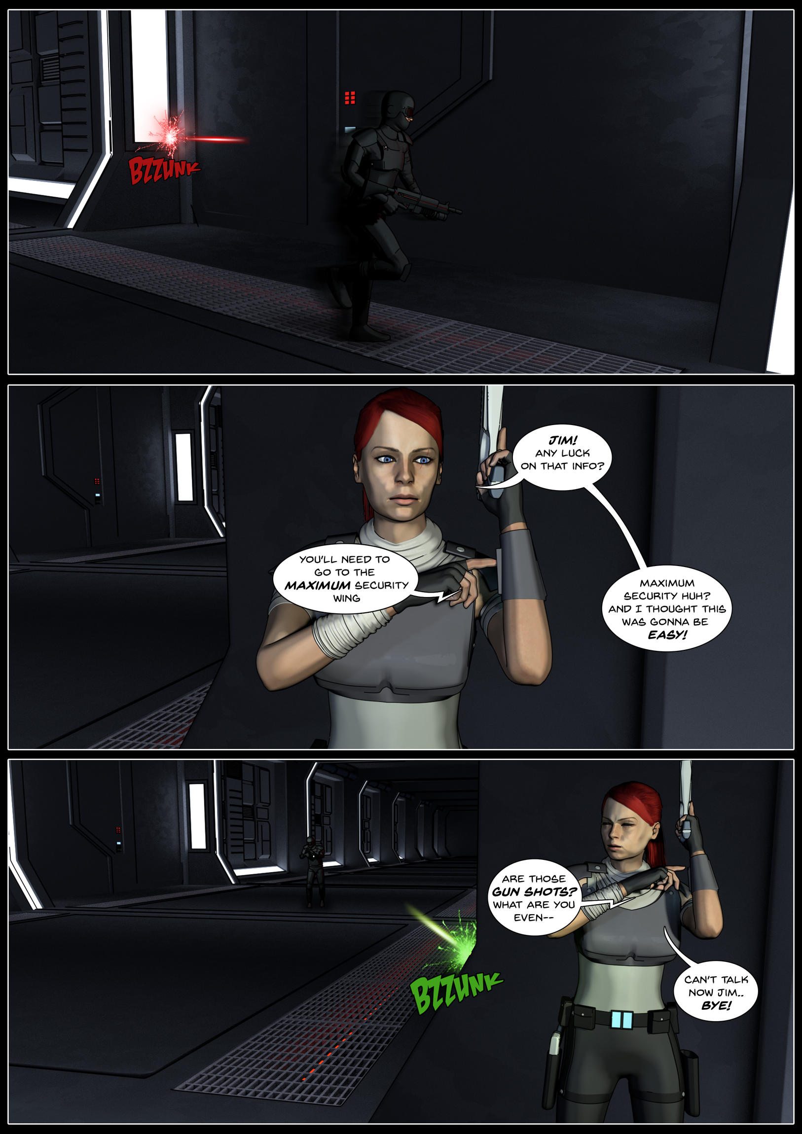
I know I said I wasn’t gonna share many pages, but I’m really happy with this page so far!
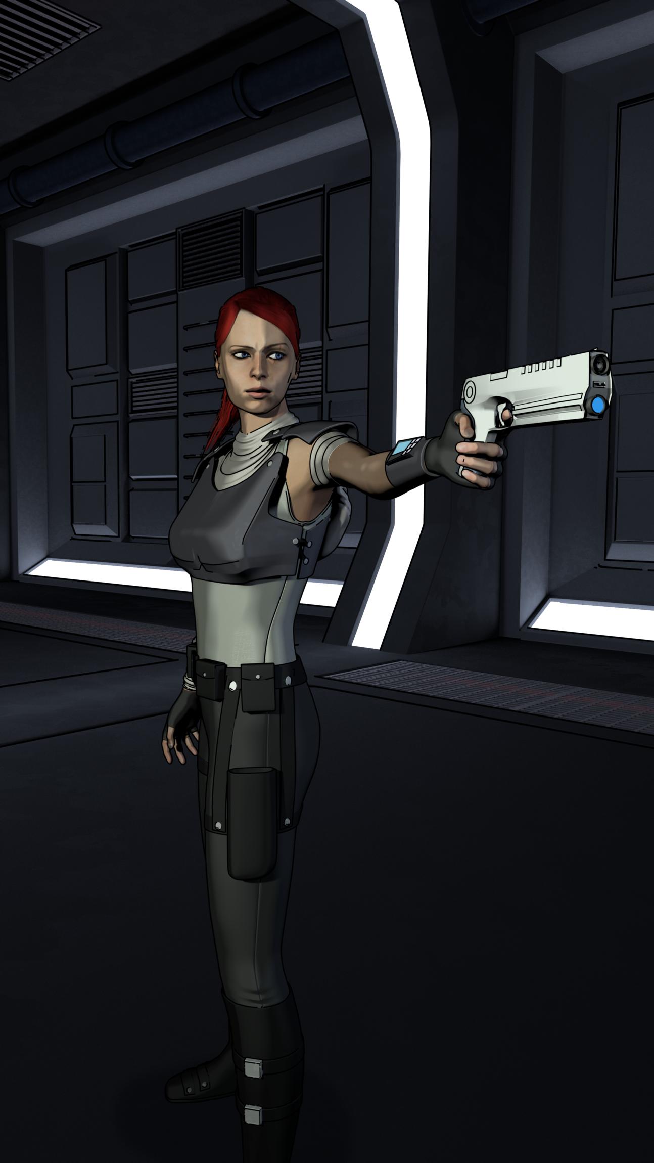
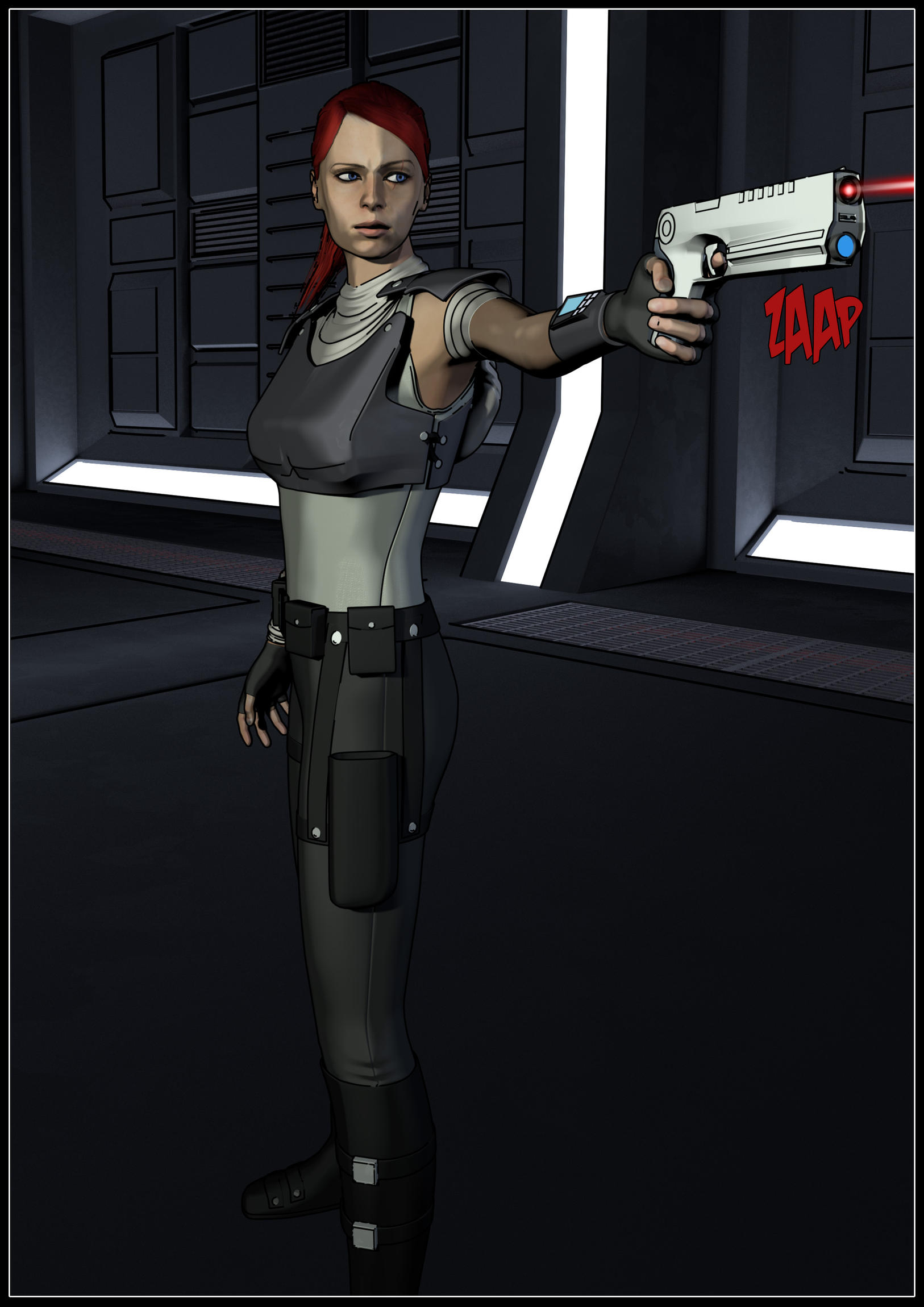
Also, previous post, I’m gonna re render second panel, and just have Kara looking the other way. I realised there is no real need for her to be looking at wrist comms to contact Jim, she does it so often, that she can just press the button and talk. Also will make 3rd panel flow better if she is looking in the general direction.


Before rendering any more panels, I had to go back to the prison cells corridor, as there were a couple of final things to add, plus, it was too dark in comparison to the other corridor. So I have made it brighter, changes the right hand side wall to feature lighting (totally ripped off Star Wars there…) and also added doors at each end. Just need to add some railings on the walkways, and It’ll be ready to go.
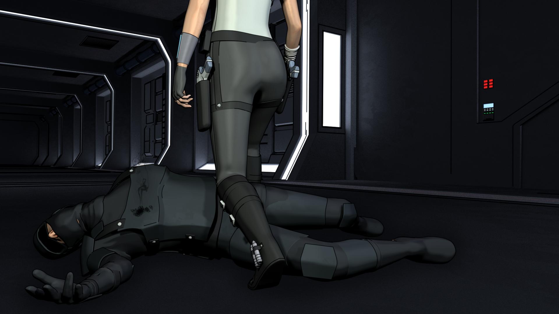
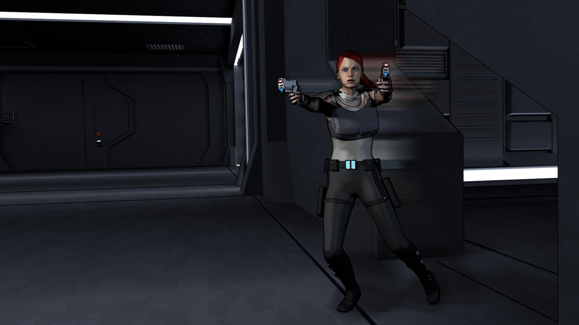
Still going! About half way through first chapter now, getting it all rendered. Going quicker now I know what I’m doing more. Gonna try and get a couple of pages a day done this week and see where I end up. Here are a few stills from recent pages.

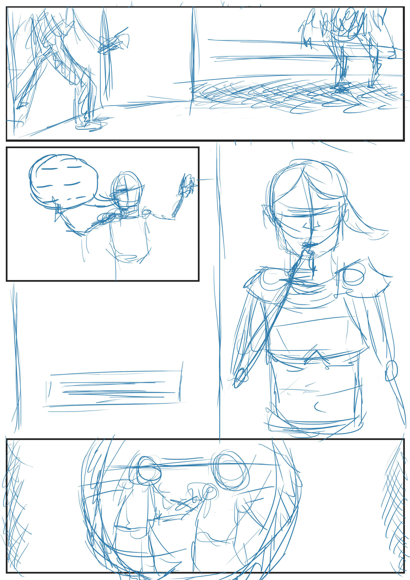
Finally worked out how the darn mouth controls work! Here is another page I thought I’d share with you. Kara finally has a physical form to scowl at! Also, A side by side of just how rough my storyboarding is, but it’s enough for me to know what I roughly want.
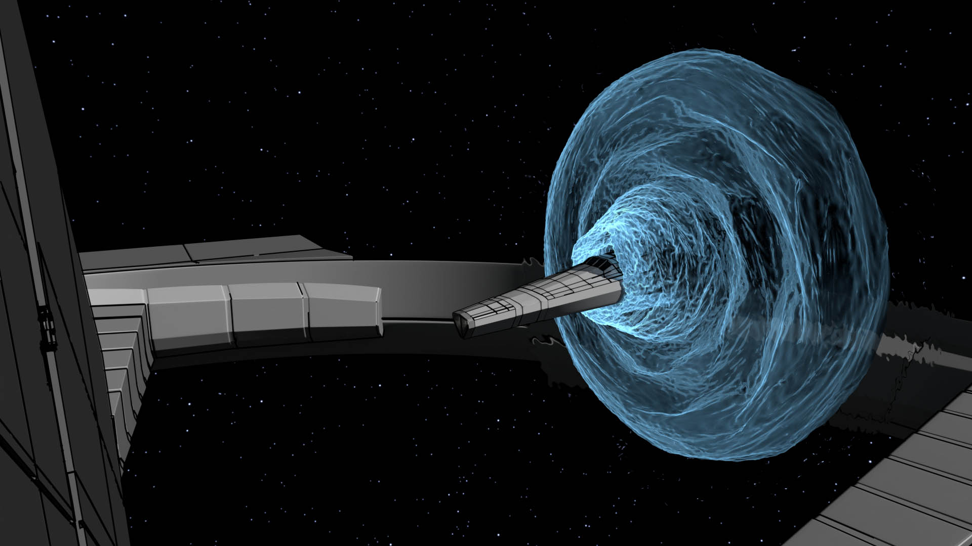
Testing an effect for the ship jumping into a system. Not completely sold on it, but looks ok for now. Should have tried this earlier really. About 10 more pages to go, and a few early pages need some re-renders.
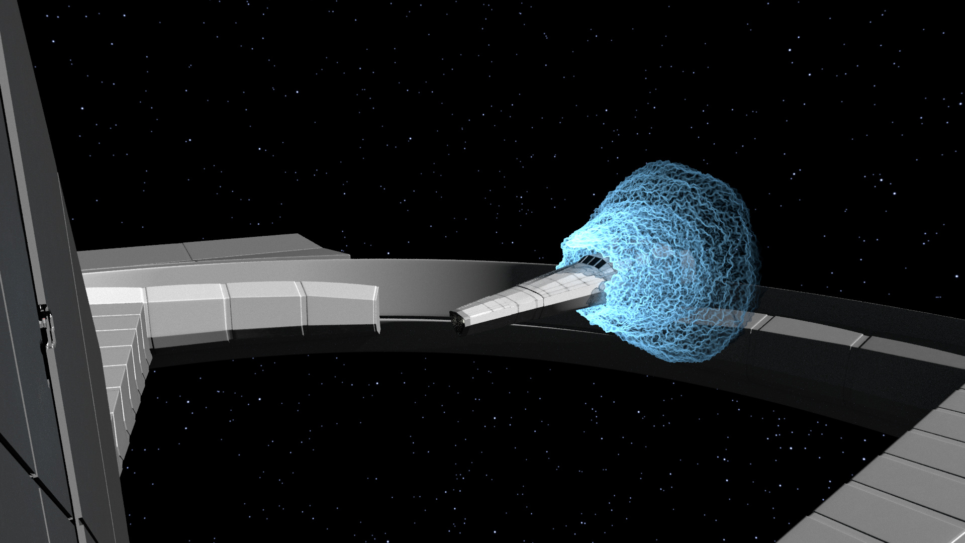
Done some tweaks to the shape, and have done a test render. 3 different render layers, and some post effects. A lot better now.
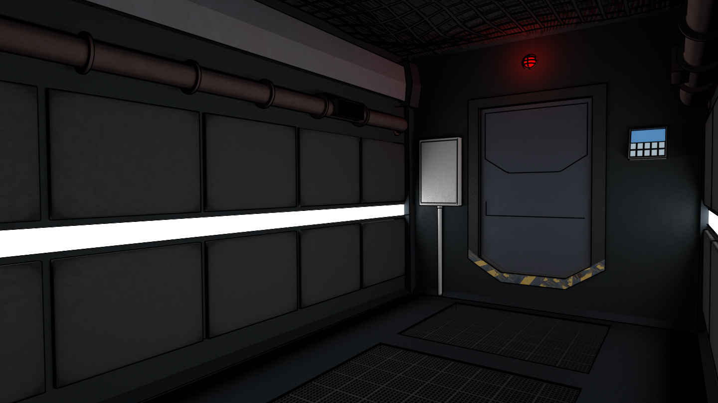
Re-visited the airlock room on Kara’s ship. Added a couple of things, and changed the shape. Also tweaked some materials and things to better match the new ship, as this was modelled with the old ship in mind. I think 8 pages left, and a few re-renders before the first chapter is ‘complete’. Will then do lettering, which will probably only take a day or so.
Looking great! I like how everything is looking crisp and clean. Keep up the great work!
dvnobles lives! (see what I did there…?) How’s progress on yours?