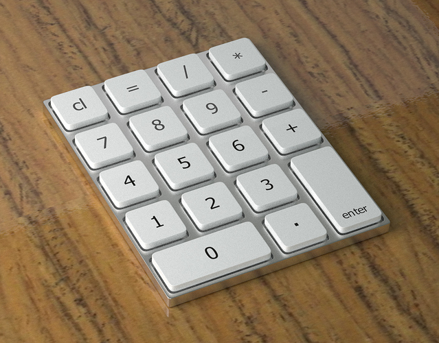
A part of a desk setup.
I don´t know what to make it. Any ideas?

Attachments
A part of a desk setup.
I don´t know what to make it. Any ideas?
If you’re looking for ideas on what to do with it, you can always try adding a screen and making it a calculator. Or you can create a whole bunch more keys and make it a part of a keyboard for a computer. Also, the gray metal material looks a little grainy, so that could be something to improve upon.
I see mostly two problems. First, the beveling is wrong. The top two corners on the base of your calculator look too sharp from this angle. That may just be the camera angle or it could mean you forgot to do those when beveling. The top face on each key looks too sharp on the corners. Beveling that would help. Of course, this may all be completely wrong as I’m having a hard time looking in on bigger details as a result of the lower resolution in your scene and the fireflies and grain from your poor rendering settings. Your biggest thing should be to figure out how to get rid of fireflies. I’m getting the feeling you don’t have the world’s most powerful computer so increasing your samples is unlikely to be an option for you. Ensuring you mess around with your material settings more to get rid of more of those fireflies might be a better bet. You’ll have to link me to what you are using in terms of materials.
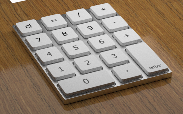
You may also enjoy some benefits by changing your lighting situation. Use a 3 point light setup for your scene as a standard rule of thumb. Here is something that may help get you started on figuring that out if you don't know already: http://www.mediacollege.com/lighting/three-point/ . Beyond that, I think I can see that you are using a flat texture on a plane for your background which, while better than letting it stay void, should have some more texture work put into it to allow for a more realistic look. Try messing around with normal maps for that. Use gimp and the crazy bump plugin if you are looking for a nice open source alternative to the commercial solutions. Here is a resource with that: https://developer.valvesoftware.com/wiki/Normal_Map_Creation_in_The_GIMP . And here is also a resource for the normal map thing: https://www.youtube.com/watch?v=Cb4U_WFln-w . With that, you should be good and ready to go on your way. Enjoy. Oh and do post back when you are ready.
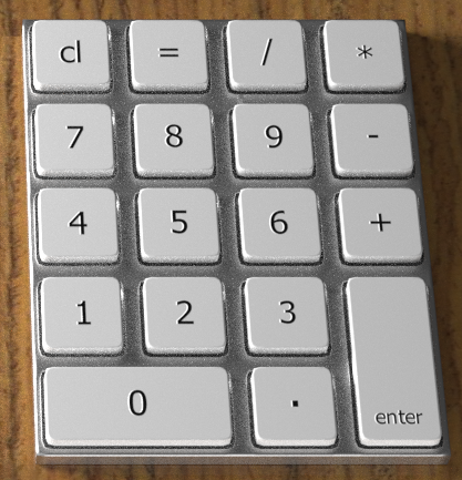
Your new look is a definite improvement, although I prefer the first wood surface to the second.
Since you’ve got it on a desk-like surface, you could recess it into the desk and make it a cipher lock mechanism of some type. Perhaps put a glowing display in the same recess showing a suggestive prompt? Anyway, just a thought.
I would say the material for that wood table looks better than before. On top of this, I see improvement in the rendering quality although I could still see that go further with more samples or tweaking of settings such as the lighting situation or the number of times materials have light bounce off of them. I would recommend going to a few sites and looking over. You’ve gotten most of the way there you just need more nuanced changes from here for the most part. You could send your file over and I can take a look at it if I have a little time on my hands to do so. Otherwise, I wish you good luck.