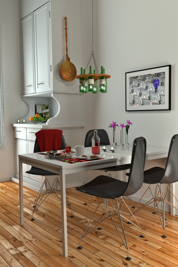
I saw the reference image somewhere and downloaded it in great excitement and then promptly forgot where it came from. Stupid, stupid, stupid.
It’s supposed to be a redone apartment somewhere in Scandinavia; Gothenberg methinks.
My ardent follower(s? Too much to hope for?) will recognise my inimitable style in wall-hangings, what with the framed bulb photo to the right.
The scene is rendered in Cycles. Other than the fruit in the cupboard alcove, everything was modelled for the scene. The chairs have been uploaded to Blendswap, and when time permits they will be corrected (the seat shape is slightly off) and uploaded again. The floor texture comes off Blendswap.
There is a subtle amount of DOF that seems to round things out nicely here.
Are the flowers too bright? Can anyone tell me how to make them look that little bit better? The material is a translucent bitmap, but perhaps this sort of thing desperately needs SSS.
For me the glossy look doesn’t work well with the floor texture. I think it would look better without gloss but with a normal map accentuating the creases between the panels.
A shot like this that is entirely monochromatic is difficult – whether it’s a photograph or not. How about a nice fabric wall-hanging on the side of that cabinet? What if the cabinet itself were painted a warm, pleasing color? A portion of a partially off-frame painting on the wall is a nice trick for suggesting additional space to the left side of the scene. You appear to have a slightly different color on the far wall (thus giving the scene an “escape hatch”), but it’s not quite distinctive enough.
The interior lighting must be quite sterile, giving the whole scene a sense of sterility, whereas those lights could be given a complementary color cast. Likewise, if you actually step outside and use a color-sensitive reflective light meter on a white exterior surface, you will see for yourself that the light is a mixture of blue sky-light (more than you think!) and yellowish sun.
If I were lighting this scene for a photo shoot, I would have taped a smooth piece of aluminum foil on the underside of the table in order to provide a very slight fill-light on the top surface of those chairs. I would also have a white reflector off-camera to my right to fill in the back of those chairs. And, I would send away for chairs that were not nearly so reflective!
Upper right space looks little sparse comparing to other parts of image. May be fill it in with hanging lamp? But the main thing is the table leg structure; do you have any texture on it?
@LiMuBei, I have reduced the gloss slightly, but without it the floor seems way too dull.
@sundialsvc4, agree, it’s a tricky image. I decided to leave the cupboard as is, but to accentuate the window by amping the area light there, and placing a window frame almost entirely off-frame left.
Rather than a wall-hanging I added the bed warmer to the cupboard, which adds a slightly quirky touch.
I have fiddled extensively with the lighting, and in this shot managed to over-expose the upper right-hand corner without realising it. Since the scene is an interior and contains glossy and glass surfaces, noise is a horrendous problem. In order to mitigate that as far as possible, I render two images, each with a different seed value, and combine them in GIMP using “Darken only” on the upper layer. This means a total of 10,000 passes for a relatively smooth image, which takes a couple of hours.
I tried placing an area lamp under the table - really nice trick, thanks - but the noise is generated was simply too much to deal with. Instead I placed an area lamp off-frame right.
I really like those deep black glossy chairs. So as a compromise I lightened the black and reduced the gloss a notch or five.
@ridix, I hope you like the wine-bottle lamp. The bulbs are driving me mad, though, since I simply cannot get them to look convincing.
All the comments are hugely appreciated; they really have made a profound difference to the image.
The lighting has been adjusted. Ridix’s comment regarding the table legs proved to be correct; they had the incorrect texture applied, so that will have to wait for the next render.
A small amount of post-processing was performed in GIMP as well.
Looks Great, all the small details really make an interesting design. The lighting is perfect and I think the changes you made have polished to perfection.
mmortal, thanks for those very encouraging words! The only thing I am struggling with, though, are the light bulbs in the wine bottle lamp. They scream “rendered”. How can I fix that?
Can anyone please suggest a better way of making the bulbs in the wine bottle lamp look better?
I noticed that the skirting board in front of the cupboard was offset by a few centimetres, so this render corrects that.
Kemmler, I will fiddle around with the floor at some stage, and the cabinets have the same material as the table, i.e. slight gloss and gentle noise displacement. Thanks for your comments!
The flowers seem a little bit bright, but I think if there’s any problem with this scene it’s that the floor’s too high contrast. Other than that it’s a lot better than what I could do (especially since I know almost nothing about Cycles) so keep it up.
I am not sure what you can do. I fooled around a little bit to try and see and I kept wanting to blur it in the compositing nodes. I don’t know how to do that with cycles. Anybody on here know how he could blur just those lights inside cycles, or are we going to have to wait for that ability for a while?
Blurring just those lights is no problem - I just use render layers for that (yup, Cycles has them already), and blur it in the compositor. Despite that, it still looks awful.
The gloss on the chairs has practically disappeared now. I think the floor is just right as well.
This time I have done the Darken only trick in the compositor (i.e. rendered two images each with a different seed value and then combined them in the compositor using a Darken node) but for some reason some pixels still get through, which was not the case in GIMP.
Just a little detail, the lightbulb framed picture looks like its a window to a room full of lightbulbs
maybe add a glossy glass rectangle to make it look like theres a plastic cover like most picture frames