‘Invalid Attachment specified’
Sweet mother of god you’re fast! :eek:
I took a new scene up and down again, as i - upon revision - realised
that i would do some more work myself before getting criticisms on it :o
Inverse linear attenuation. Meaning that the light intensity attenuated at inverse the distance instead of at inverse the square of the distance.
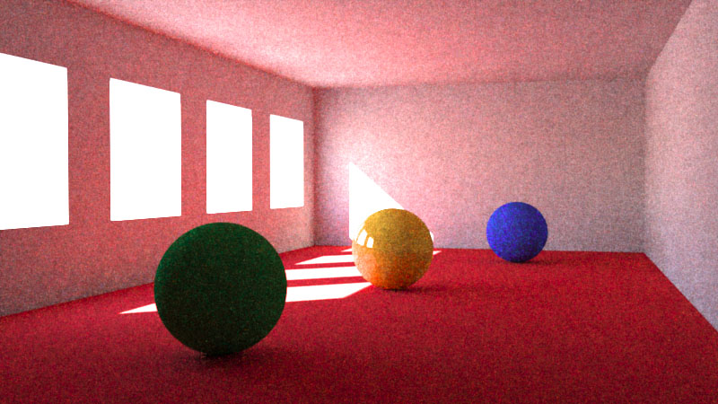
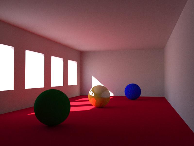
I do, however, think that your new render is quite dull, and at least quite far from what i was trying to achieve. I seems to have a sort of overcast-day feel to it, rather than the sunny day feel of your earlier render. But this may of course simply be because you felt you spent enough time on me (which you certainly did), or because your end goal was different than mine.
Yes. I agree. When I considered what I would need to do to fix this, this is where I decided that I had already put enough time on this. The end render is the result of a delicate balance between the exterior sky light, the floor bounce light and the ambient occlusion. I would like to be able to set the AO color otherwise than by setting the sky color. I would have set the AO color to a tint of orange to regain that warm color inside the room. But that would have meant that the sky would now look redish in the windows. To fix that, I needed to add a geometry for the reflecting sky. I already mentioned that in my prevoius post. Right now, rendering at 50% resolution requires 5 minutes on my laptop. This makes for long wait times. SO I decided that this was time for me to stop.
BTW, this is so typical of where I tend to draw the line between using a “legacy CG renderer” such as BI or a more photorealistic renderer. When I start feeling that I’m just tweaking this and that, and fixing this and that, and adding yet more geometry or light, and rendering and fixing yet some more, this is where I decided that my time is worth more than that. For realistic lighting, I will go for realistic renderers anytime even if they spend more time rendering. At least, it is the renderer that spends all this time. Not me. If I decide to use BI, I know right away that the result will not be photorealistic because I’m not willing to tweak that much. I will go for expressive lighting instead.
I think this is most clear when you talk about getting rid of the yellow tint, a tint i thought added a great feeling to the scene
No. This was the atmosphere effect that was added. This cast a general yellow tint normally due to mist. In that case, it just made it difficult to control the color scheme of the lighting.
This said, that yellow tint that is so attractive in the previous render may be artistically attractive but barely realistic. There are no surfaces in this room to justify that strong yellow tint. One might just as well paint the walls yellow. This would still be cheaper than adding yet more yellow lights.
I just removed all lights except the sun light and rendered in LuxRender. Let it run for 45 minutes, which is just a little less time than it took the original blend file to render on my computer.
Attachments
ypoissant: thanks for your time !
This is my version.
BI, AO, Nodes…12 minutes

Hi folks!
I’ve started moving on to scenes that - somewhat - resemble what i am going to do later on. This is also very simple scene, but it is still at step in the right direction.
If you want to correct/play with this one too, say the word and ill put it up.
I’m definitively going to need some help (I’m not very satisfied with how it looks right now, but i cant seem to make it any better). I’ve tried using fewer lights, but I think i still am using too many :o. Anyways, there is the original version, a version without texture work (which is not great, i know, it was simply to have a scene that could resemble what i am going to do later on). Lastly there is a version with a bit more node work, and a luxrender render of 03, which is a little dimmer than ypoissants.
I am not aiming for realism. Believability and emotion, of course, but “it would look good if” this and that, is also a valid argument 
Attachments
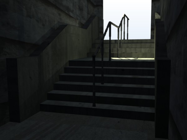
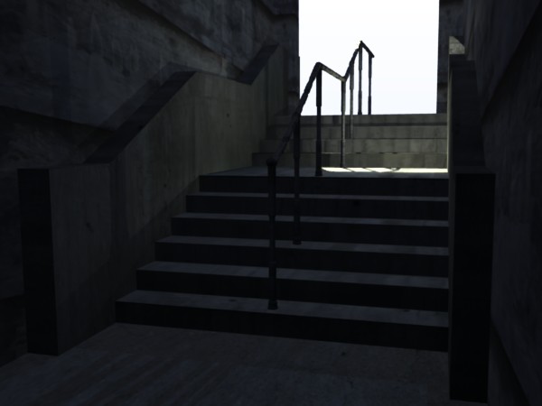
I don’t know if it is just my monitor but the stair ones are really dark. You might want to try bumping up the lights a little. Are they gamma corrected?
They are pretty dark. Are they too dark? I seek to get that “dark tunnel” kind of look.
I didn’t use gamma correction on these ones, though perhaps i should on a second thought.
I couldn’t get it to work quite the way i wanted, so i chose to try without it.
EDIT:
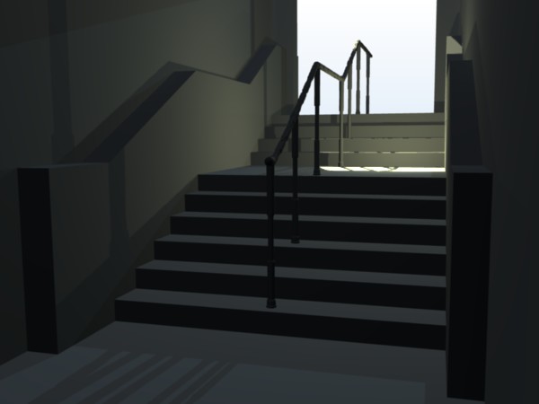
i quickly relit the whole thing, using way fewer lights, and much less time.
It came out much better, in my opinion anyways :o. A little lighter too.
Oh, and gamma corrected! ![]()
I feel this lacks some darkness (not necessarily meaning the whole image should get darker,
i just think it needs a more shadow in the lower parts for it to look natural). Ill work on it ![]()
Attachments
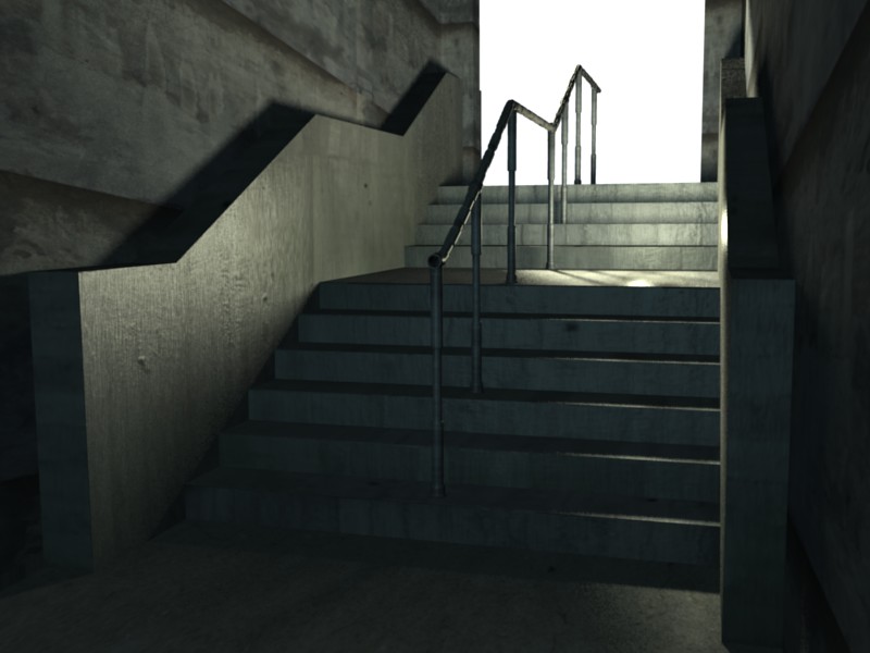
That one is much better. I found out the hard way that low light situations are harder to light. For my animation for my class I had it set at night thinking it would be easier to light. I sure was wrong.
Even in really dark spots I think you want to have it so there is still readable information. And also I think shadows should not be just black.
It may be easier to “overlight” the scene and use negative lights to control the shadows easier or to tone everything down in the compositor.
The trick for getting “dark alleys” to look dark is to place strategic lights that emphasizes the geometry without lighting the whole scene. The last render is much better than the previous ones. But you need more strategically placed lights. Place some lights that light some of the dark hiding places so they look inhabitated. Not enough light so we can see that they are empty but enough to bring them back to view. Getting the light right for those kind of scene is tricly and you will likely try different approaches.