I agree with DorienVincent, I too like the first render, it’s not too saturated at all 

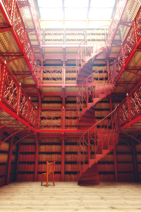
@ForgottenWorld: I also really liked the one white chair sitting lonely by itself down there.
@LordOdin: Yeah, surprisingly my ‘default cube’ sculpture doesn’t sell worth a damn on ShapeWays.

Hey man, this is looking really good. One thing that I notice is that the sense of scale is just slightly off enough to make the scene feel artificial. It’s hard to say what exactly to change, but try making the table and chairs smaller and increase the width of the stairs.
EDIT: Didn’t see that you posted the same time as I did. The chair looks better, but it was better being white IMHO because it balanced the light at the top and created visual interest. I also think the floor is a bit too saturated, because it is demanding a lot of attention.
I hope that helps!
It’s great, but imo too much red 
I’m sure that was your whole point, but just adding a few touches of other colours of book bindings is going to make it a whole lot more interesting Too much of the same thing gets your point across immediately, but after that no one cares. Keep it varied just enough to hold interest and have the viewer searching for more awesome details.


The variation of books is nice! Well done.
I have two observations of things that stand out for me:
-
The books are directly on the floor.
-
The floor material could perhaps be a bit more polished and also a more complex pattern. The untreated wooden floor just seems a bit off considering the elaborate railing and stair.
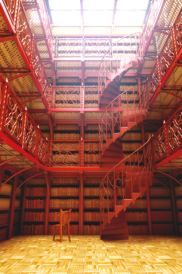
Old floor was much better - this one is way too distracting and breaks the gradient of dark & desat at the bottom to light & saturated at the top
The new books are looking great.
The new floor is great, it gives a pretty good three-dimensional feeling and leads the eye to the books
Will you raise the samplerate for the final render? It looks a little bit “dirty”…
AWESOME. nothing more to say.
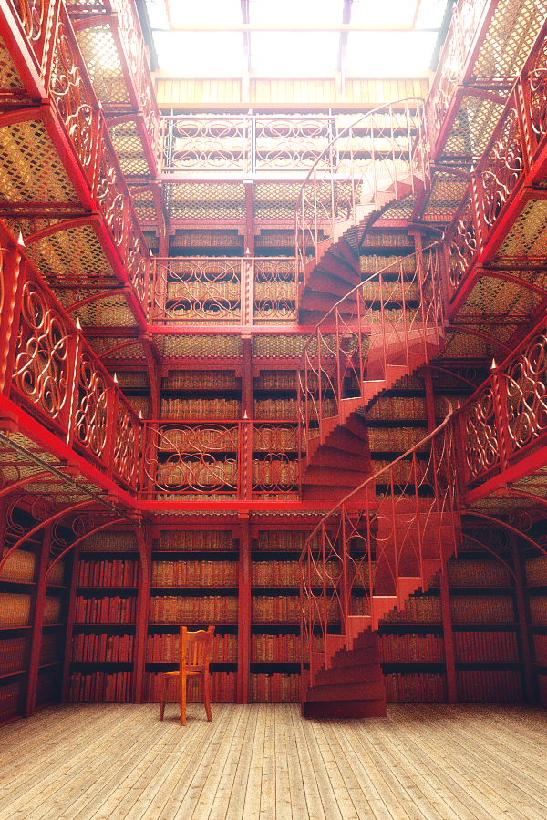
but in this last render I think that this floor looks too white, and the cold ambient that have the scene doesn’t works well with the warmer sensation that have the colour red, it’s dificult to explain…
I think that image can help you

I could try adding some blue to that red.