Just started learning about the cameras and lighting setups. Been Looking at real world photography for this. It’s not an easy thing to get a grip on. Apparently the entire subject is 30% science and 70% art. One of the things I’m having a tough time with is the camera placement and object staging to achieve the best results. Any advice is very welcome!
1 Like
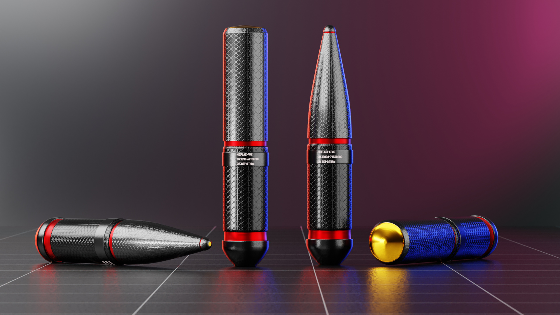
Composition is a helpful tool to add organization, create focal points, or even to alter the mood of the picture. But I think content of the shot matters a bit more because the content is what viewers are usually looking for. Things like color, lighting, and the background can make or break your shot.
COMPOSTITION
The camera settings have options for composition guides. In camera view, they’ll turn on some dashed lines which you can use to organize your shot. Your composition looks pretty good, but try to make the spacing on each side of the shot even. There’s almost twice as much empty space to the right of the blue one. Also, mirrored compositions look more organized when the form/geometry is mirrored on both sides.

LIGHTING
Here’s a Blender tutorial on 3-point lighting. They explain it really well.

COLOR
Do a Google image search on color theory to find common color combinations.
Examples include
- Analogous:
Colors next to each other on the color wheel. - Complimentary:
Colors across from each other on the color wheel. - Triadic:
Three equally spaced colors. - Split complimentary:
A color and and the two colors next to its complimentary color. - Monochromatic
- Grayscale
Currently, your color scheme is: red, yellow, blue, and pink. This is pretty close to a tertiary color scheme. Maybe you could cut out the pink to leave red, yellow, and blue?
In Western culture, designers tend to have chromophobia, but it depends on the context. For example, a playground is likely to have vibrant playful colors, but a building is likely to have very desaturated colors. Color changes can cause seizures, so there is some rationality to designers having chromophobia.
Generally, if you are going to use many bright colors, it’s easier on the eyes to put the colors into a small part of the image as like an accent. For example, the spinning beach ball on Macs might be problematic for epileptics if it was big, but it looks good small.
For your image, I’d recommend keeping the hull black for all colorways, then change the color of the bands to either red, yellow, or blue.
There are lots of interesting things on Google scholar about the scientific effects of different colors on cognition & mood, plus studies on color preferences and what colors make people think of different things. For example, without the viewers awareness, blue light increases cognition, while red light decreases test scores. I wonder if it has anything to do with life evolving underwater in blue light & under a blue sky, so we evolved to use that wavelength more efficiently. Interestingly, the growth of plants is also affected by the color of light. One study found that the color black increased how extravagant and expensive viewers perceived something to be. Don’t take my word for it though, the point is Google Scholar has some interesting studies on color and composition to help you understand art from a more scientific perspective.
Wow! Nice!! Thanks!
1 Like
I’d say that if you were selling high-end and possibly-fictional ammunition, this would be a very compelling advertising shot. I like the way that you have used high-key lighting and color to achieve the #1 objective of advertising photography: “make the product, whatever it is, look sexy!”
This is a nice, balanced composition with a difference in color in the background lighting on the left vs. the right, and I immediately notice that the color of the right-hand light (where color is prominent) is complementary to the color of the object. The use of colored outlines, red on the left side and blue on the right, also contributes a lot to “sexy.”
In short – and as a guy who used to do advertising stuff – I think you did a helluva good job here.
Thank You! Thank you very much! Damn that motivates me to keep going.