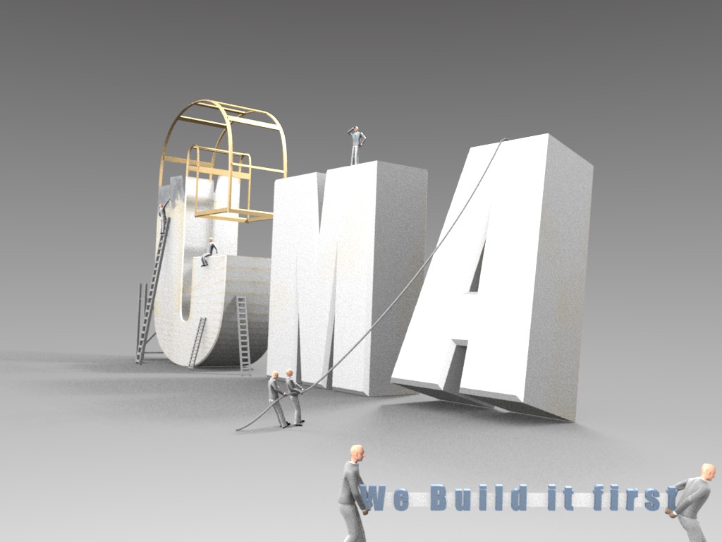
I like the concept, but how is it going to be used? unless it’s really going to be big and visible, you might want to beef up the contrast/color to make it a little less “gray”
That’s extremely cool. The image would look better if it were sharper. Better antiliasing.
Also, for myself at least, I would put some reflection on the letters (not a lot, but enough to give the image some gloss), and maybe some sharper directional light.
I agree with 3distracted on the contrast too. Some simple post-pro would take care of that.
I’ll show you one of the earlier images with higher contrast.
I’ll also try one with a bit of reflection.
This will most likely be the splash for our website.
Thanks for the comments guys.
EDIT -
Heres the latest render, with a darker background to add to the contrast… I tried one with some reflection, but it didnt look very good at all because there isnt much to reflect.