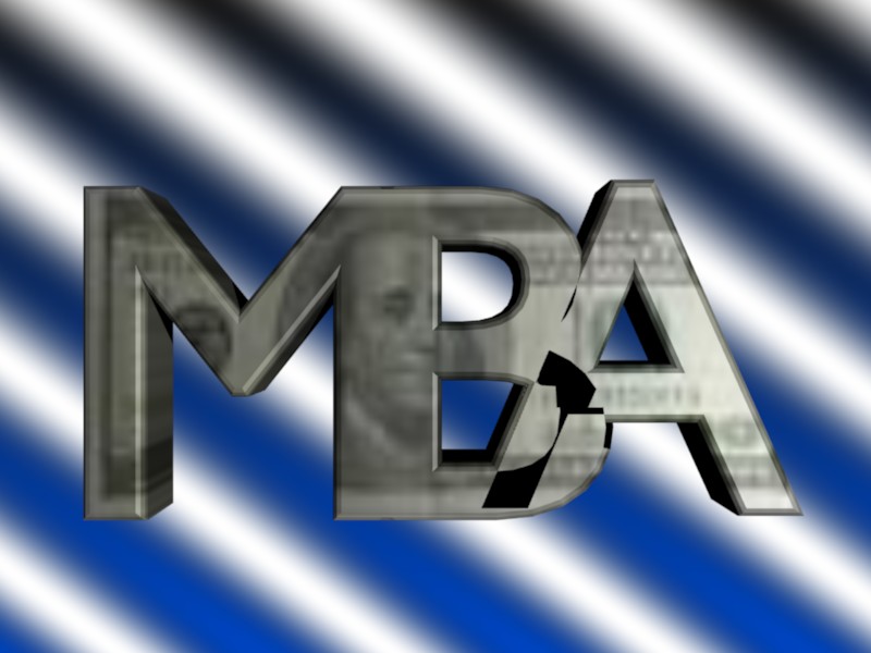
Hey this is my first thread in this forum and I want to know what you think about this render. I made a logo for my school and they absolutly loved it and asked to use it. The name of my school is Mettropolitan Bussiness Highschool (I’ve probably spelled Bus. wrong).
I think that your logos are a bit too busy. A good logo should be identifiable in one glance. When I look at your logo I see a bunch of shapes but it doesn’t leave a firm impression. So my advice would be to simplify things a bit. But the most important thing is that your school is satisfied with it. And if it is this logo the school wants then you should leave it unchanged ofcourse.
Is the logo the 3D “MBA” (which I like), or is it the whole collage (which I don’t).
I thought at first this was a frame from an animation. All those diagonal lines suggest chaotic movement, and the stripes and crossings create visual vibrations. Visually it’s a pretty jarring image. If that’s what you were after and the school likes it, great. Otherwise, I agree with Fritz that you should simplify it.
Sorry my bad it is supposed to be MBA but I had combined so many different pictures to make something that is pretty impressive. So here is the original one the graphics there was just made to impress you.