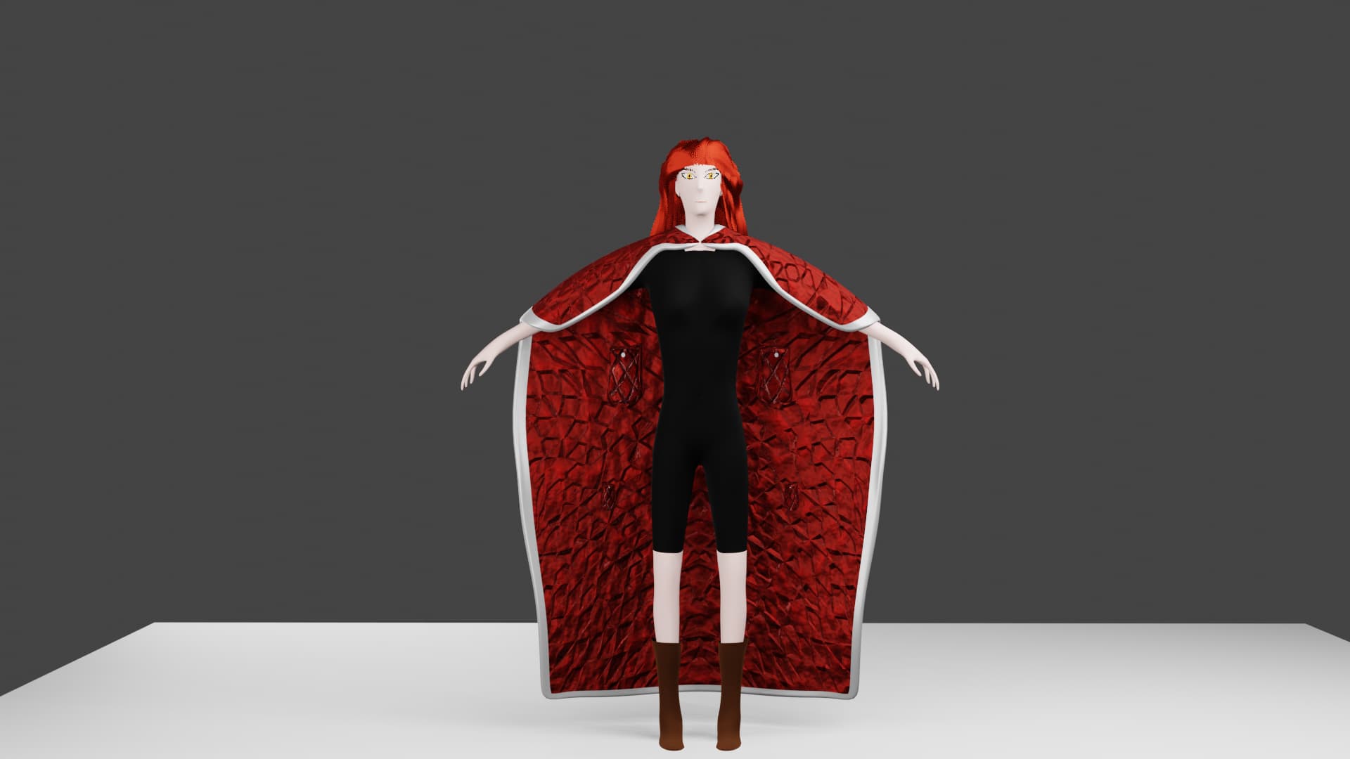
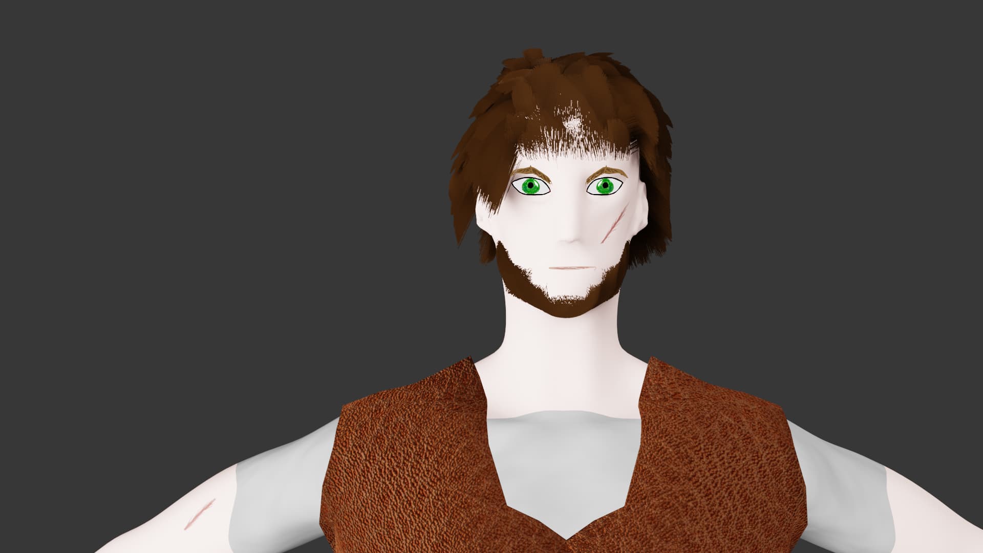
Do you like them, or does something throw them into uncanny valley? I’ve spent too much time working on the project to be able to tell—as what tends to happen. Getting outside opinions helps.
I use grease pencil for the face, does it look weird?

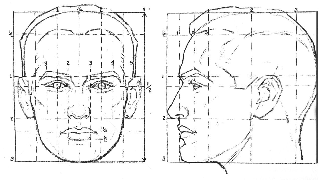
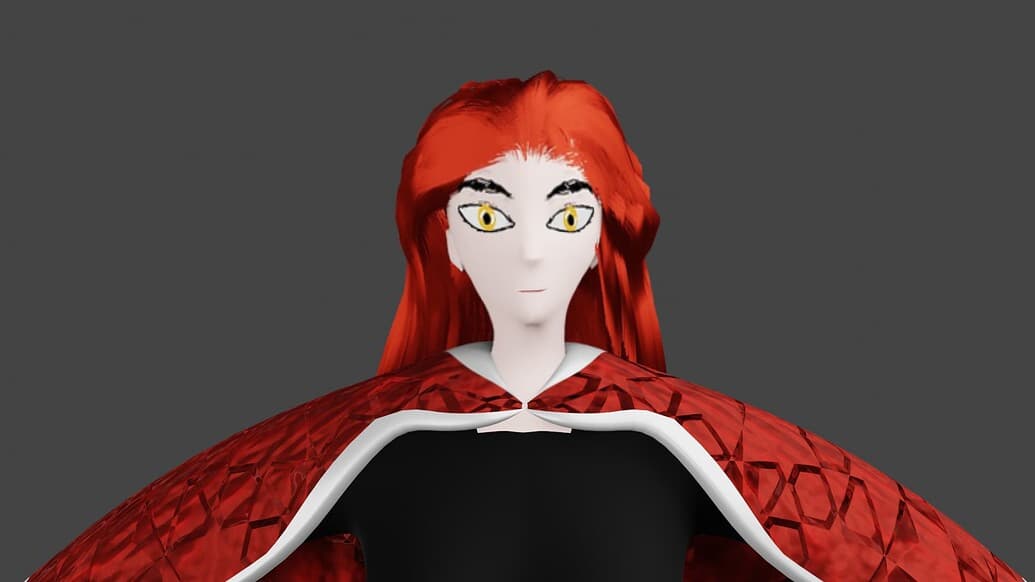
have a look at this picture… your face proportions are not correct. Even if you want to make another style, your eyes are tooooo high.
Same thing for the body.
try to type "human body proportions in your search engine.
have a good day or night
Thank you for the taking the time to give feedback on my work.
My goal isn’t to have perfect proportions (look at all of the styles that are completely inaccurate, Pixar or anime styles are examples), but to have characters that look nice, or at the very least not be jarring. Better proportions could help, but when you first look at them do you think ‘something is wrong here’ or do the artistic designs stand out?

In cases like this I recommend taking your shot into your favorite 2D image software and using a liquify tool to play with the proportions.
Here’s a 30 second alteration I did for one possible set of (female) proportions:
I also tried a pretty boy version;
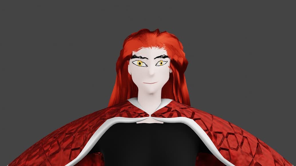
. . .with little success.
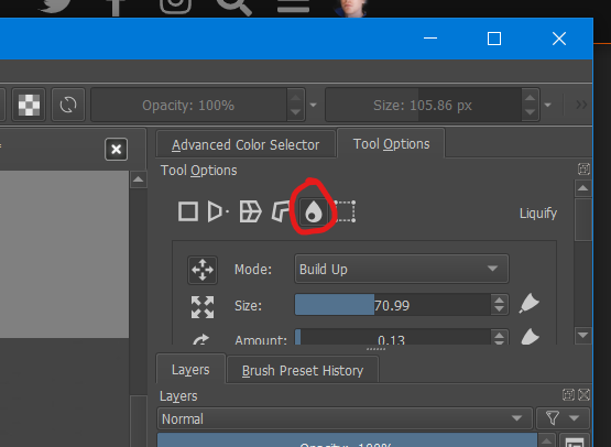
Here’s how to find the liquify tool in Krita (it can be hard to find, took me a while the first time):
Click the transform button:
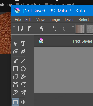
Then in the tool options panel click the water drop icon:
1 Like
Thank you for the tip Joe. I’ve used Krita a bit, but didn’t know about that tool. To me, it seems easier to use the sculpting tools inside blender, but I could see myself using that technique for other things.
Also a newer version:
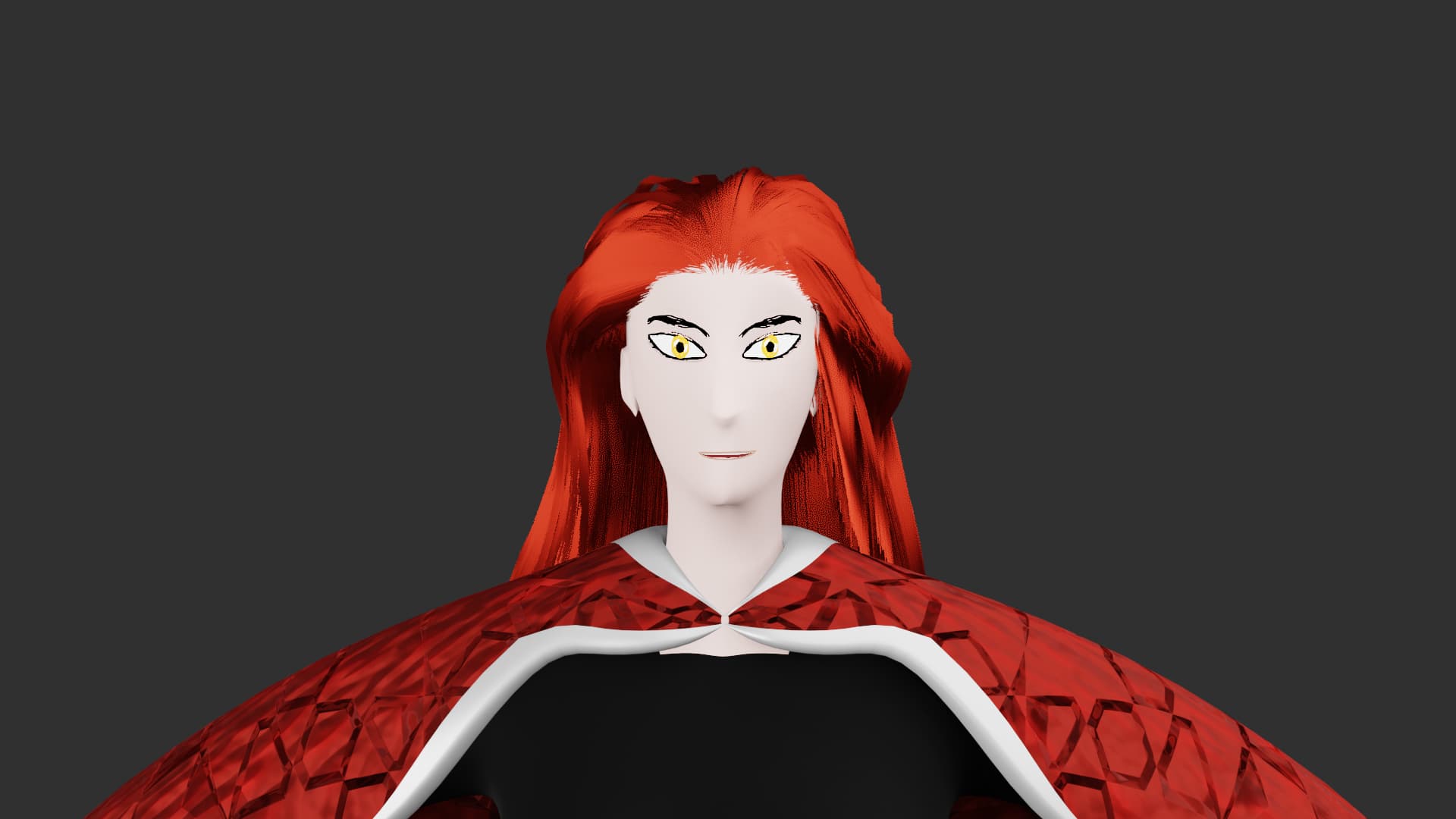
It would be nice to hear if anyone has a gut reaction to think that she looks inhuman, or is at least acceptable for an animation.
 indeed it’s quite strange, but strange can be interesting !
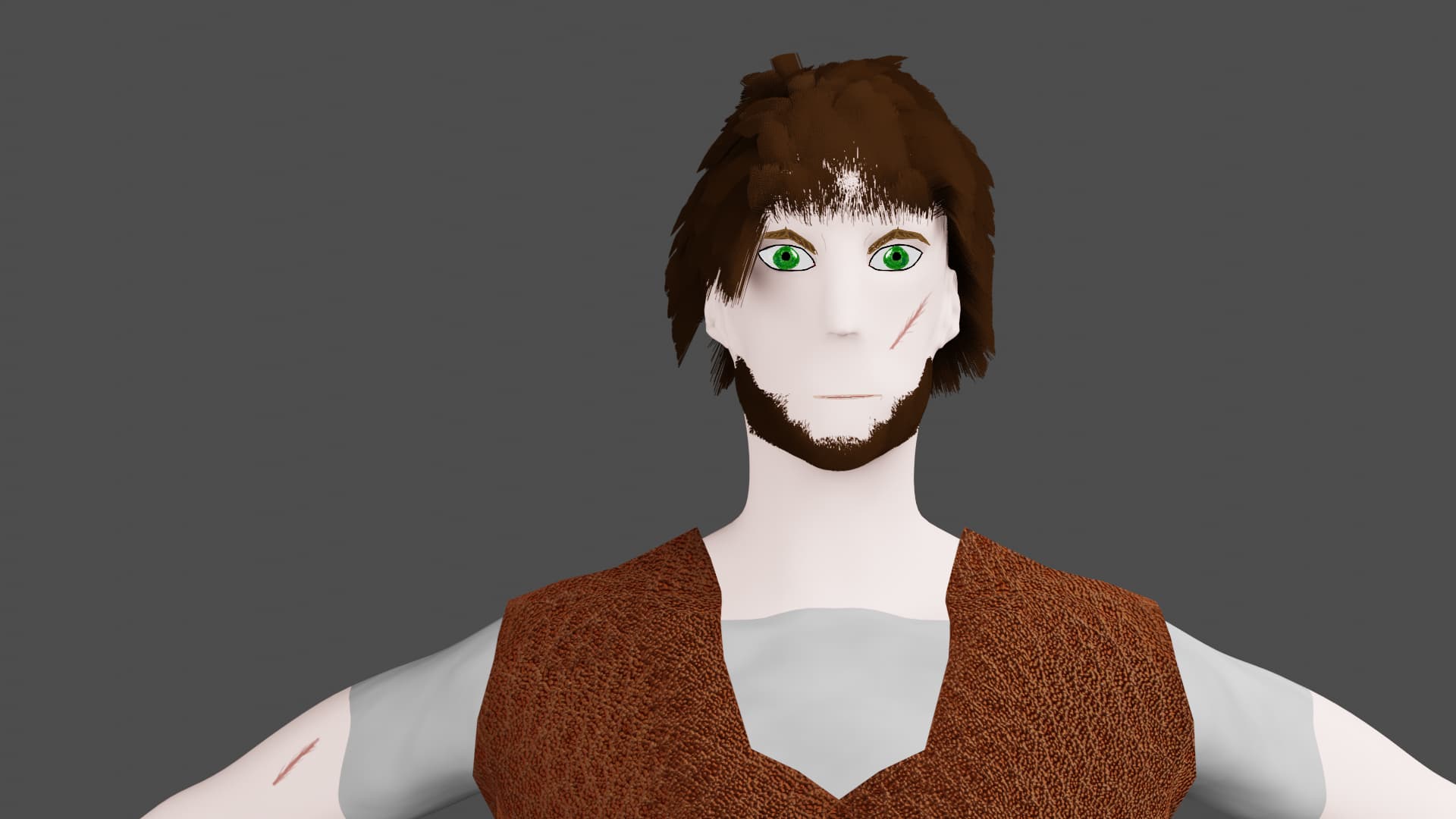
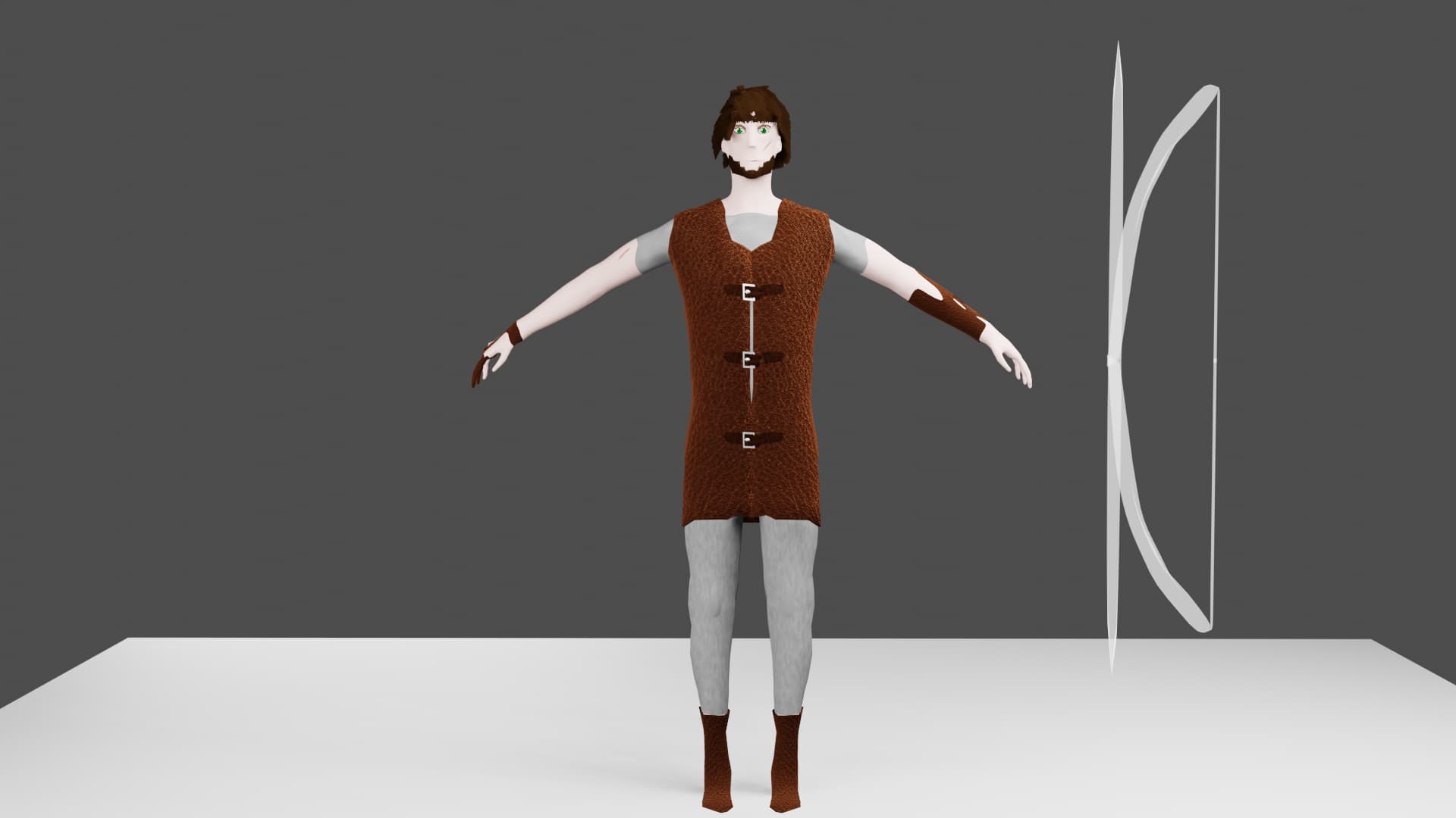
There are different ways of stylizing inside the same character and that could be a bit confusing, eyes are flat and outlined, but nose and mouth seems not. Hair and cloth are a bit more shaded and “realistic”. This lack a bit of unity, but anyway in the wide shots I think it work better.
You need to practice a bit more to get better proportions (even if they are stylized) and a result that looks more “professional”.
However, even if not perfect I like the first one and I find all this interesting.
Some advice :
-Try to make a final image, with a set, character rig, facial expression, lighing ect… Like if the image was a still frame of a movie. That will help you to push the style further and see if everything work when put together.
-Stylizing works like a recipe or a set of rules, try to formulate these and see if everything follow the same rules. That can be : "character are flat shaded without shadows, all props and set are realistic, cloth are textured skin isn’t etc… "
Of course it’s great to follow your artistic instinct sometimes and forget the rules But having them help sometimes.
- Keep working and improving from project to projects.
1 Like
With regards to “jarring”, I find the hair to be a little out of place. I think for your style, stylized polygon hair would work better.
Thank you for the input, I’m still working to improve my character modeling. My issue is that I didn’t have enough intuitive knowledge on facial anatomy and was over-relying on references that didn’t fit my style. Right now I am practicing by making and remaking a test character to be of at least acceptable quality. Once I am satisfied, I’ll get back to making the ones I care about. I’ll try experimenting with different hair production methods to see if I like how it looks.