Wow! That’s looking like a great project! I’ll keep an eye on it.
The atmosphere is really awesome, also the colors. I love his room.
:yes:
I tottaly agree, and can’t wait to see the finished animation.
@holyenigma74 - I like the changes you proposed, but I’m not sure if they’ll work for other shots too, with other camera angles. Apart from that, it’s a style thing too. The original has more of a cranium while your revision is more of an egg-shape - to be honest I think we’re all pretty undecided about what style we’re going for. I’ve subconsciously been heading more towards realism, while Dewald (TheEmptyRoom) has more stylized tendencies, although still quite realistic. It’s something that IMO could make or break the believability of the film.
thats fine… but how it currently is, it isnt “realistic”
the bottom corner edge of the jaw touches the ear lobe
look though these pictures of common celebs, and look at the area of the jaw and the ear.
#4 and #14 show it good. even in #16 you can see the corner of the
jaw is lower than the earlobe.
that the best i can do with the image and “gimp”
I dont have the model so i cant “see” whats going on…
even in these pictures you can see that area is “off”
right click view image for bigger
First of all. The style is not realistic by any means. I would call it stylized with detail. Since he is stylized you can probably get away with it.
@holyenigma74: You do have a point. That area is a little “off”. I don’t agree with the changes you proposed in the images. It’s a bit severe but I do get your point.
I don’t want to change his overall shape of his face. He does have a jaw line that goes up below the ear. It just doesn’t seem right from this angle. I will look into it probably this weekend and post the fix.
I greatly appreciate your input.
you might be able to “fix it” by making the texture a little darker in the area i was talking about…
that might add some depth. kind of a fake way to do it…
could you post a 360 turntable of the head no textures?
no hair just the head.
Former 3D’s Max artists always make the best character models. Luke looks very nearly perfect. The proportions and expression look verrrry professional. Seriously, he could be in a Pixar movie for all I care! I also love the looks of the room (great-looking lighting) and the story sounds cool. I can’t wait to see where this goes!
thank you for the long explanation, i think i understand your workflow. just a quick notea - actually, you can use raytraced AO to get a little occlusion with strand shaded hair, when the emitter is being rendered too. the hair doesn’t occlude itself with raytraced AO (and if you don’t render the emitter, the AO has no effect at all), but it will be kind of faux-occluded somehow if the emitter is rendered too. i don’t really understand why that is, but i’ve used this caveat to good effect when rendering hair and grass.
[ATTACH=CONFIG]200595[/ATTACH]
the image in the compositor is rendered with AO, and the AO pass is also visible. the image in the image editor was rendered without AO, and you can kind of see at the roots and between some hairs clumps where the difference is apparent between the two renders.
i don’t really know if that’s even relevant at all with the Cycles/BI workflow though. buti saw in the Cycles thread that someone’s working on rendering hair in Cycles, so maybe we won’t have to bother with concerns like that anyway in the near future! ![]()
Hair on hair occlusion is very important. Without it is useless to me. I will add the reason to my long explanation.
Yeah somebody is working on hair for Cycles ![]() . It is in a very early stage. I do think it will be a while before it will be ready for production. But still very exciting.
. It is in a very early stage. I do think it will be a while before it will be ready for production. But still very exciting.
Very professionally done! The visuals look very Pixar quality! Will be following this thread closely…
Hey guys 
I wrote a bunch of addons for myself a while back, but hopefully the rest of the team can benefit from some of them too: http://www.lukesescape.com/addons/
That page is kind of the only documentation I’ve written for these tools. Included are:
Shape Key Tools - Three little functions for handling mirrored shapekeys and vertex positions.
Bone Tools - A bunch of tools for handling bone names and other selection functions.
Node Muting - Giving the ability to mute/unmute selected nodes (the M hotkey only toggles).
LoD Tools - A primitive handling of pairs of low and high density versions of a model.
Outliner Tools - Bringing some batch functionality to the viewport from some abilities available in the outliner.
Reload File - A simple button to save and reload the current file, nice for working with linked libraries.
Custom Tools - A messy collection of miscellaneous things not worth another “Tools” addon.
nice addons! i’ll have to check them out.
Got the addons, thanks, also looked at your project, very good work so far, cant wait to see it done!
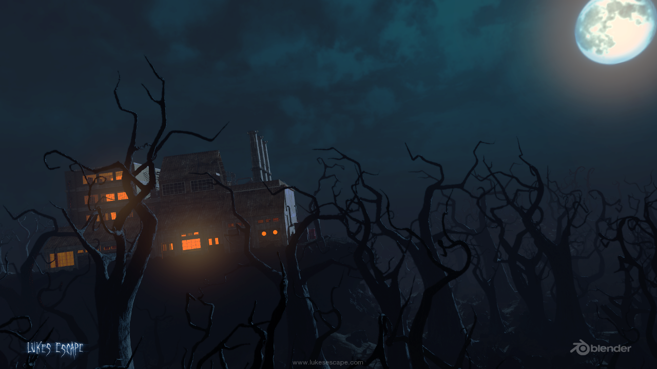
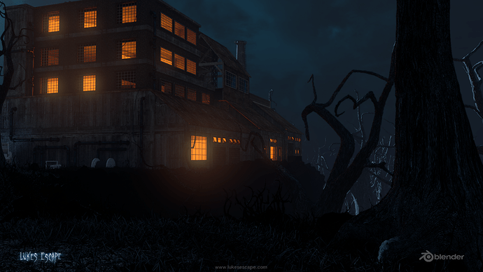
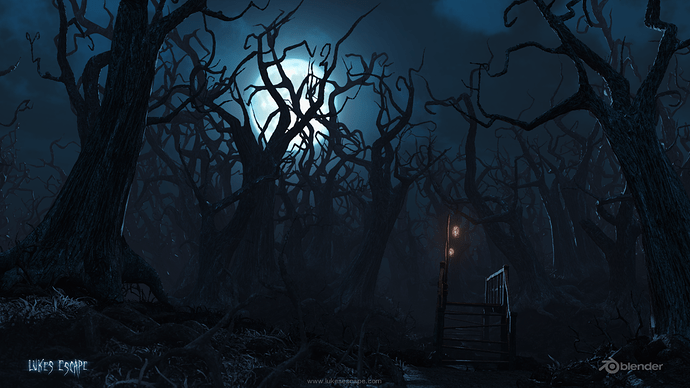
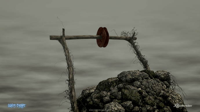
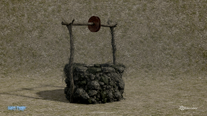
Hey guys:) I have an update on Luke’s Escape! I know we havent posted in a while but we are still on it and have a great team seeing it through to completion. There is a lot left to do but we are making progress:P I will be posting more environment renders this week…also maybe some textured props and character too. Enjoy:P
Reminds me of Monster House. I could only wish I can get a team together.
Wow how did I miss this thread. Love the renders. Also has a Tim Burtonisque look to me. Can’t wait to see more! 
Now the design is getting much much better.
can’t wait to finally score this thing.
Thanks guys glad you are liking the progress. A LOT of man hours have gone into this project already…we hope to have a trailer soon:P
