This thought occurred to me while in school. What exactly does the blender logo mean with its three orangey extensions and a blue dot in the middle? Perhaps anyone has any ideas? Seems like something interesting to know.
Well a while ago in Spain and somewhere else I saw people using a sort of blender logo, a cirkel with 3 lines, I think people stolen it. anyways the real blender logo is the orginal ony one made by ton and what it means? No idea.
Here a guess.
- 3 lines = fingers
- cirkel = 2 fingers making a cirkel
- dot inside = the abstract things for all, the cirkel around also fingers has to be package. So all in one package.
Hand ? yes the magnifque handsign what koks do, or scuba divers.
Conclusion, Magnifique all in one package  that’s the meaning of the logo.
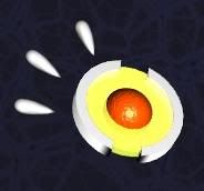
it’s an eye afaik.
It’s three fingers with the 4th and 5th making a circle
its a blender viewed from the top, with some of the orange fuzz spilling over it.
Yeah, I always thought it symbolizes a blender in action from top view with netherland colors (well I guess that color thing is easy).
It’s definitely an eye.
It would have to be a pretty wierd eye because then it would have three fat orange eyelashes :o
I’m of the opinion that it’s a top-down of a blender 
It’s an eye (it’s a bit - but not much - more clear what it is in the older blender logo).
It used to look more like an eye than it does now:
The new logo was created from the old one, for the release of Version 2.0
Could be an eye like the clockwork orange eye:

[clutching at straws]Y’know 'cos Blender runs like clockwork and well the logo is orange[/clutching at straws]
But I think it’s more like a hand as people have been saying. See:

It’s an eye, like WeirdHat and PlantPerson said.
Martin
Hm the logo plantperson posted certainly looks more like an eye to me. And I was thinking before this that the 3 “fingers” might have symbolised modelling, rendering and animation. Oh well. Though then again, what does the eye stand for?
i think its a
ORANGE CIRCLEwith three ORANGE LINE THINGS coming out of it. and a BLUE DOT in the middle
very cool IMO.
i slipped the logo into a book which is currently on display at my university, so i am subconciously having many people looking at the logo
i used it in my sequence of eyes though (had it around ther book about 3 times i think), so hey  it must be an eye
Alltaken
Anyone know why an eye was used? Is there some significance in the shape/ colour perhaps?
It’s both an eye and the OK hand sign.
hmm. ton should know it. somebody should ask him.
i always thought of it as the blending action. Putting multiple things in and get a “blended” finished product i.e. the blue and orange mixed to make being “blended”
Anyone ever notice how much it looks like the logo for the Philadelphia Flyers of the NHL?