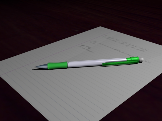
Here is a little picture I made a couple minutes ago.
It took me about 15 minutes.(I don’t think of it as done, though.)
Any comments?
Think I should add more objects, or leave it simple?
Attachments

Here is a little picture I made a couple minutes ago.
It took me about 15 minutes.(I don’t think of it as done, though.)
Any comments?
Think I should add more objects, or leave it simple?

It is pretty good. I would suggest adding like a desk lamp, and papers or something. and have the whole seen lit by the desk lamp. Still leave the scene somewhat simple but add a little more… is my suggestion.
That’s kinda what I figured on doing.
Here is the newest render.
I quickly added a paper to it.
Do you like the paper there?
Should I add more stuff?(I plan on adding a lamp, or maybe a clock)
P.s. Remember, this is just a test render. I don’t think it is done yet.

Very cool but I think the paper is too perfect. Paper isn’t just flat. Try having a corner bent over or a crease in it or something like that.
hey, nice work LIGHTspeed.
a couple (is that spelled right 'cause it’s getting really late and it doesn’t look right. lol) of crits:
the whole picture looks kind of fuzzy to me.
i think that the paper texture should be a higher resolution and the eraser also looks like it needs to be smoother.
other then that i like it alot. Very nice.
you might should have like a few papers in different directions or like pwnany said have creases or even tears in it. but it is getter there.
You might want to look at the lighting. It is very sharp at the moment, and the angle leaves little shadow. Perhaps try lighting from the back left of the pen.
Also, read up about composition. The rule of thirds is invaluable!
Thanks for the comments!
I may try some of the things you suggested.
But for now…here’s the latest render.
P.s. I took your advice Pwnany…does this look anything like what you had in mind?

yes… Much better in my opinion. Its not like you iron a piece of paper. It will always have something a bit different with it. At the moment your paper looks really realistic in my opinion. Exept how big the pencil is! Is that piece of paper ment to be A4? Because if it is that pencil is far to big.
It looks really good. One thing though, is that the eraser on the pencil isn’t entirely believable. Try rounding it out at the top a little bit and adding some black to the tip to make it look like it’s been used a few times.
I dunno how big the paper is supposed to be.
I really didn’t mean for this to be a big project…it’s too simple for that.
I just saw my mechanical pencil sitting on my desk, and said, “I’m gonna model that in Blender”. So I just started up Blender, and made it.
If you get bored, model the first thing that comes to your mind in Blender.
If this wasn’t supposed to be a big project, you should have posted in the work-in-progress forum instead of the focused critique.