@ToshiCG Thanks!
@higgsas Ah, thats true. I need to investigate.
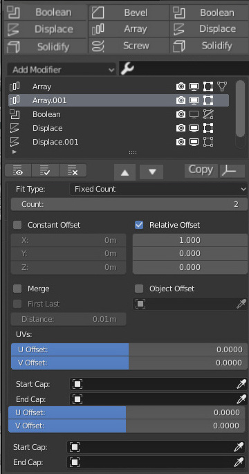
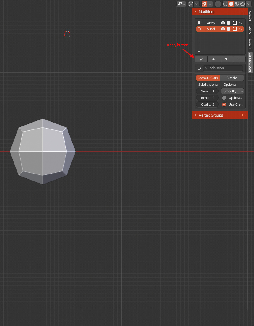
Sorry I didn’t answer earlier but unfortunately this can’t be improved. When you’re in edit mode with a heavy mesh, changing it’s properties is always slow. And when you click on a modifier in the list, you set the ml_modifier_active_index property for that object. Similary, changing the active vertex group is also just as slow.
In one word, it’s MAGIC. 
This really improves the usability of the modifier stack.
As others have said before me, this should be like that as default.
A really good job. Thanks for sharing 
Really cool addon. Thanks for making it. Improved the modifier stack usability by a mile.
A little UI suggestion.
Cut 1/5 area for more simple look and operation.
Is it possible support Drag & Drop modifiers for change the order , remove and copy (with shift key) ?
No, not possible.
Thanks for feedback!
I like small button for looks clean, mini, easy to click.
1.
Please consider that contrast in button size, contrast in area, contrast in height.
I think 3 columns, 3 row , 9 modifiers layout is the best. Clean and useful. Most of users just need 9 modifiers. not 10 , not 12. Those are the most frequently used.
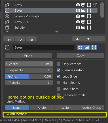
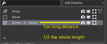
and the important thing is reduced 1/2 areas. Some modifiers have many options outside of box , we have to add one operation for scroll down or enlarge height.
2.
The button of “Apply”, “Copy”, “Add Gizmo”, " UP" , “Down” ,“Remove” layout are the same as idea.
I think if reduce the length for quickly click button…
Yep. I agree that “UP” ,“Down” button on the right is not good enough.
3.
Yep. I try to reduce number of buttons for looks clean .
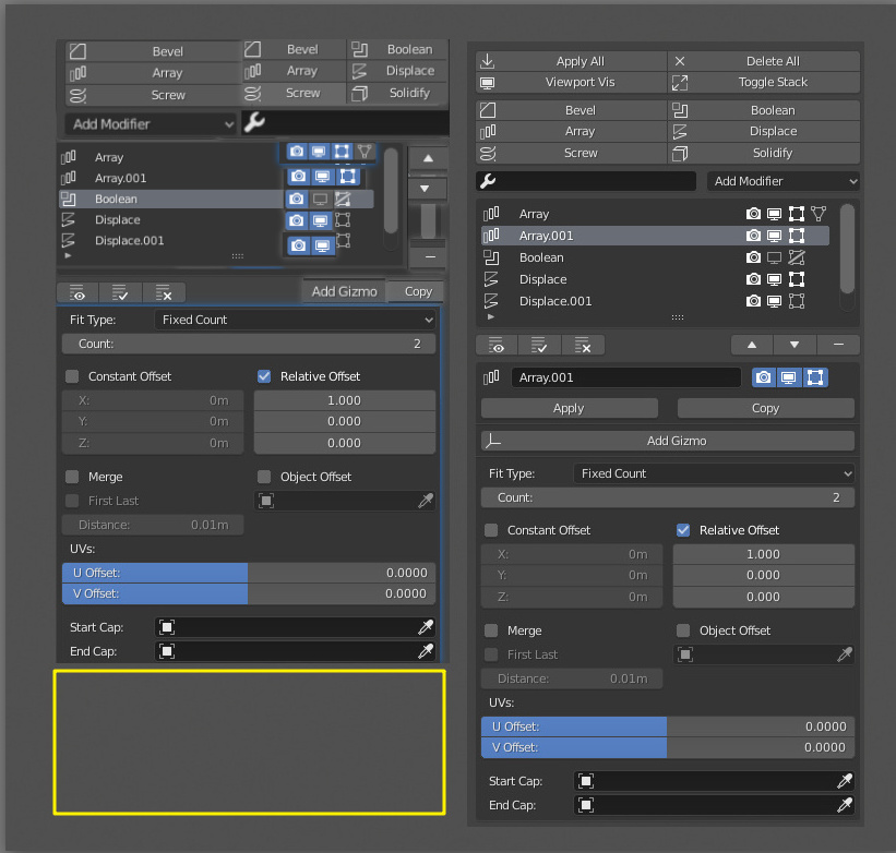
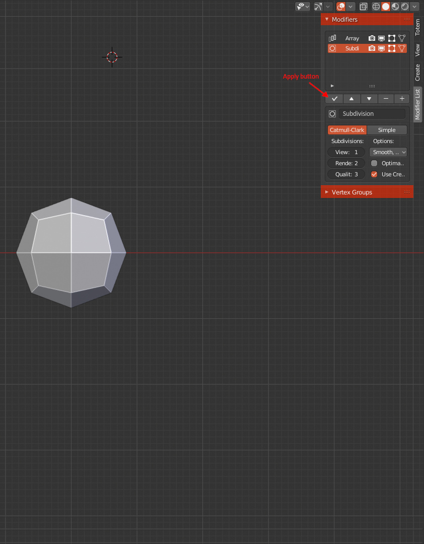
![]() Click for Apply selected modifier. Shift+ Click for Apply all modifers.
Click for Apply selected modifier. Shift+ Click for Apply all modifers.
![]() Click for Delete selected modifier. Shift + Click for Delete all modifiers.
Click for Delete selected modifier. Shift + Click for Delete all modifiers.
So, My final version. ![]()
If could , please let “Copy” replaced copy icon. the same as “Add Gizmo” for Gizmo icon.
And ![]() replaced
replaced ![]() .
. ![]()
4.
If it doesn’t support Drag & Drop. is it possible support shortcuts ?
Shift + Scroll up or down to change the order .
Ctrl C for copy modifier.
Del for remove modifer .
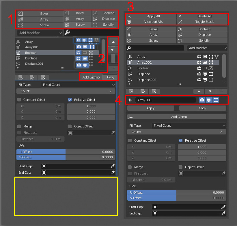
1. Three buttons in row maybe works if the modifiers’ names are short. However, if the names are long, this doesn’t work that well.
2. I think the distance is OK.
3. I’d rather not combine those buttons. I think apply all and remove all functionality would be too hidden then.
4. No, those are not possible either. Well, adding shortcuts to the buttons is possible actually, but that doesn’t work well. By default shift + scroll up makes the list larger for example. And they don’t even seem to work inside the Properties Editor. So, you need to make these suggestions to the Blender devs.
Thanks for reply.
From this things. I’m learned one thing. Don’t expect blender and add-on have the best UI & UX Design.
Thank you.
for 20 years the gizmo did not appear (or I don’t know something)
Yes but now in 2.80 there’s gizmos for different things: active tools, lights, cameras etc. So I’m hopeful. 
I did not upgrade to the latest version because of the gizmo button, it takes up a lot of space.
Thanks for feedback. Maybe that button should be hidden by default because you don’t always need it. I’ll try to find a better solution for this.
My suggestion…
Clean, compact and beautiful.
My suggestion 2…
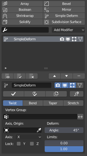
Is this possible to add for the addon? I kinda miss this feature otherwise it would be complete replacement to old modifier list with better functions. https://i.imgur.com/zqTtTTY.png
In short blender default modifier list gives red error overlay if your modifier does not have anymore linked object in the scene.
It’s possible but requires me to go over every modifier to learn when the name field should be red. So it’s not a priority right now. I’ll add it to my ToDo list.
@heyider Thanks for you suggestions. It looks compact indeed. But where would Apply As Shape Key, Copy and the Add Gizmo button go?
@SteveYang I added a setting for displaying three buttons in a row after all.
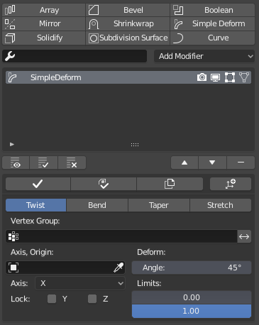
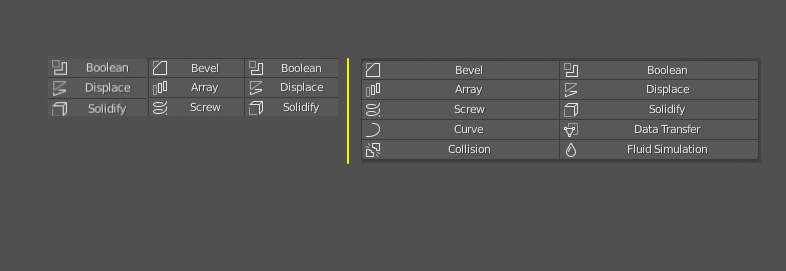
Here’s how the UI looks currently:
Default:
Hide General Setting Region on:
Favourites Per Row = 3:
Favourites Per Row = 3 and Use Icons In Fafourites off:
Feedback is welcome.