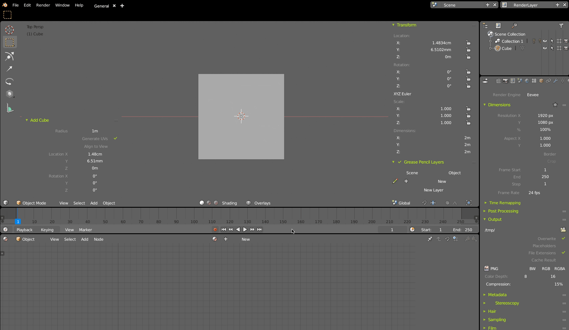
I opened one of my old theme called “EMPTY” (called for a good reason ![]() ) where I tried to “erase” all buttons by adjusting a theme. And because all “outlines” don’t have alpha option in user pref, the only one way was to use the same color for all. And even it was more for fun, at the end it was great start point to see what is really necessary to use in UI to make sence.
) where I tried to “erase” all buttons by adjusting a theme. And because all “outlines” don’t have alpha option in user pref, the only one way was to use the same color for all. And even it was more for fun, at the end it was great start point to see what is really necessary to use in UI to make sence.
If you look from oposit side, it can be probably good starting point how to arrange text and values on screen.
In some cases it already works well. I some places it breaks understanding what is related to what. But probably thats are areas where it could be arranged in better way. In ideal each widget will be able to be understandable without any framing. Frame (or rectangles) becomes only as additional visual support for user.
Here is an example of headers - on mouse-over became visible widget background
Low contrast on mouse hovering above widget (or mouse in editor window) is done by blender.
I don’t think I have an option via theme.
Here is a fullscreen casted GIF
(Safari didn’t play for some reason, Chrome works, click on anim to see in original size 1914px -to be pixel correct. Probably I could cast it smaller.Or try download GIF and play.)