Maybe something along the lines of the “OCR A Std” font, but if you think those are best then go with that. Yeah the balance of the text to picture is perfect, its nice to have them kind of separate like that as you can have just the image if you want.
Cool, will try out the OCR typeface when I have Photoshop and Illustrator to hand. I am using MS Paint and PowerPoint at the minute (so I’m a bit limited in what I can do!)
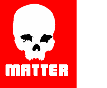
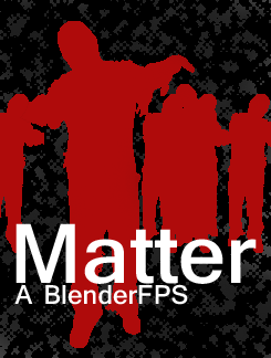
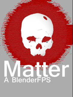
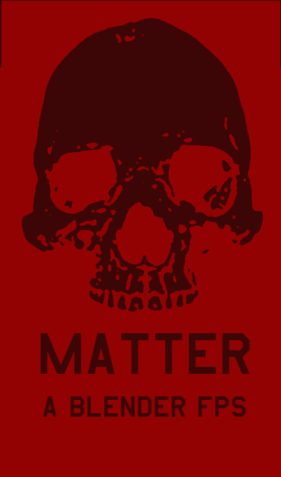
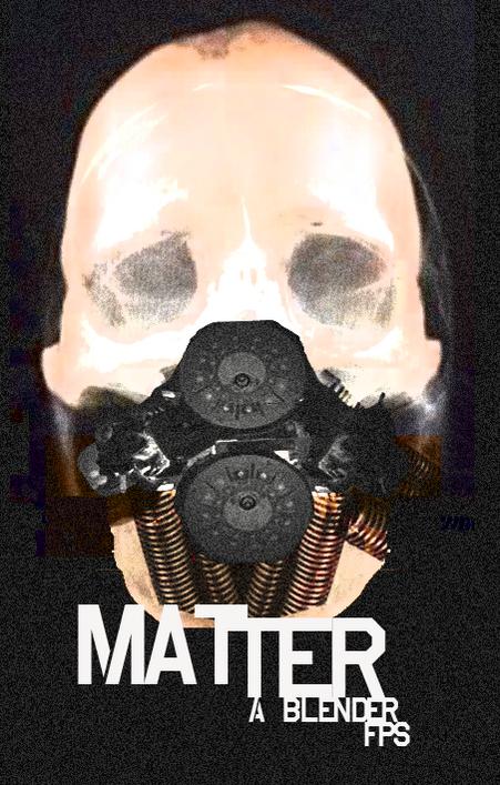
Here is another logo I have quickly put together, slightly reminiscent of the Resistance 3. I understand this game has Nazi zombies in it (or Nazi objects) and I do have a version with a swastika on its forehead. Now, is that too much? I have used German WW2 colours (white, black, red) to try to give a hint (plus a typeface that I’ve seen on postwar propaganda). I wondered if the M (for Matter) was enough in the last examples to fill the space.
Thoughts? Don’t worry, I will go crazy on it when I have the chance! What I will do is make a load of mini variations and post them all at once, and see which one is most popular. That is, if you go with this logo in the end!!!
PS: The font looks crappy due to the fact this is done using printscreen. If I do this properly the final picture will be nice and smooth.
Attachments
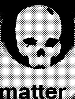
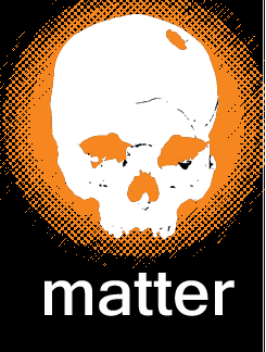
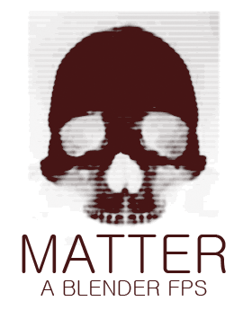
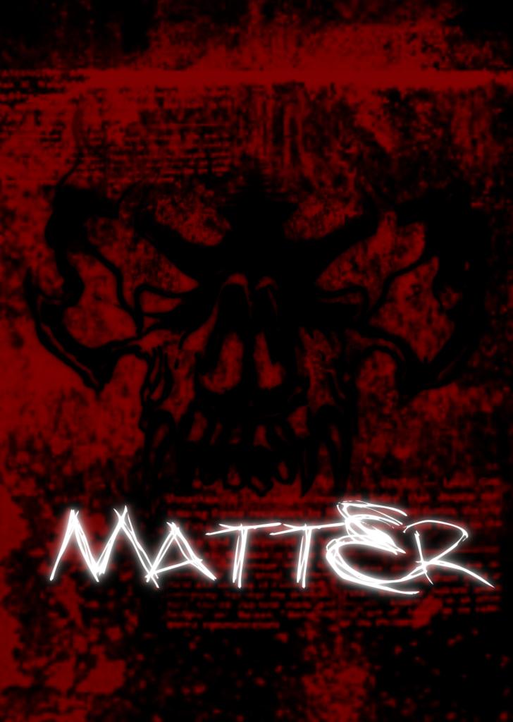
Good job for paint  I think a swastica on it would be a bit too much and kind of unnecessary. Looking forward for when you can work on it in photoshop and illustrator to see what you come up with. I think the font isnt too important at the moment though and the image is the important part, if you could try one with an actuall image of a skull, with some effects or filters maybe, it would be cool to see that.
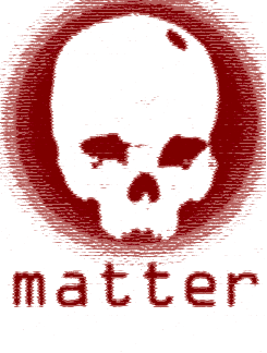
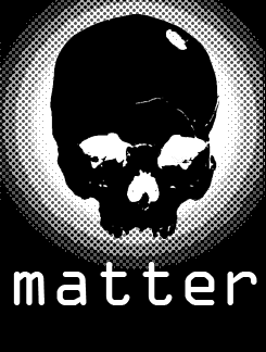
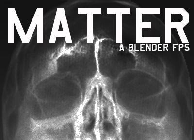
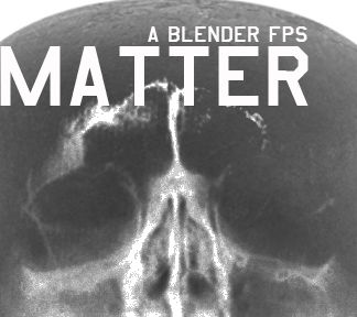
Managed to get some more time to play a little. My favourite is the first image with offset text. But what do you guys think?
Attachments
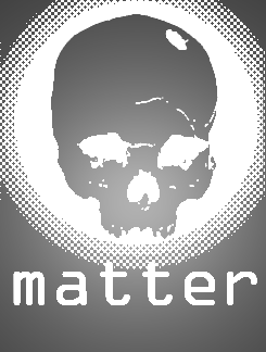
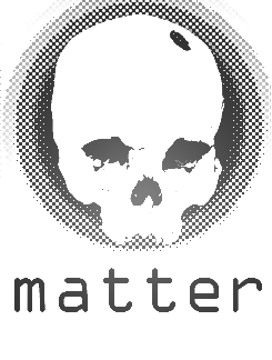
And some more:
Attachments
I like the second image (first set of images)!!
Very nice!
Sup agoose77, Fantastic job on the game dev. I know a guy who can do some pretty awesome vector zombies. I’ve told him you’re looking for a nice cover and logo so he’ll be on a bit later. cheers!
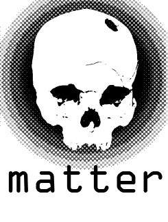
Here is one last example before I sign off:
Attachments

Thanks Wokjow! That would be fantastic!
Keep up the entries everyone, they’re looking quite professional (Again, rubbernuke i liked the red one)
This is quite therapeutic when stuck with a scripting problem! Here are some more (just ideas or play time fun).
Attachments
We’re in dispute over the logo we like best, so keep it up!
As for the rest of the community:
We really do need some character modellers; a main character, zombie character, and possibly 3 other variations that represent other players.
This is urgent, and if you were able to help, you’d be a member of the team, credits (and if revenue) money as well!
how about something like this?:
![]()
[EDIT] I dunno whats up with the black outline, ill have to take a look 
Your updated logo is much better Glitch999! The only thing I feel is a bit wrong is the clipped ends of the oval (they are a bit distracting for some reason- they may be more visible due to the black line).
If you could sort that plus the black line I think you have a winner!
A few ideas: try looking at some portholes, bulkheads or hatches from ships for some inspiration, as at the minute the grey edge looks like painted wood rather than metal (that is unless you want that!)
Plus I’m going to have to up my game to compete!
UPDATE
![]()
better?
![]()
![]()
Here is a logo I made in GIMP2 for Matter:
If you have any suggestions, please tell me
I hope you like it
hamstaq: nice!
Glitch999: much better!
Was having another play with a more retro militaristic approach, I don’t know if its worth continuing though… what does everyone think? Made some crude eyes but again, with/ without?
Attachments
Hi guys, I am not dead, I just have some complications around my college and I got a job.
So I don’t have any free time any more, my PC is gone, you probably noticed that I am offline on skype and dropbox.
However, I wanted to make this just to show that I am still here:

Wow, i really like Josip’s!!!
Nice work everyone!