hi guys,
Am writing/illustrating my second children’s book and these are the characters that will be featured in it. Let me know what your impressions are of them.
I will have more updates soon.
hi guys,
Am writing/illustrating my second children’s book and these are the characters that will be featured in it. Let me know what your impressions are of them.
I will have more updates soon.
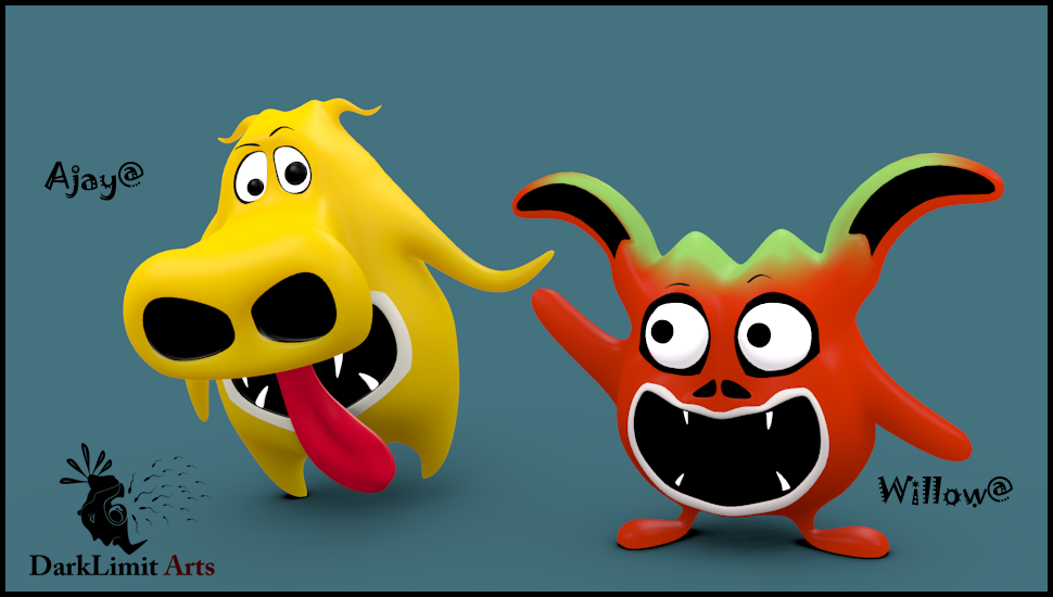
haha they look perfect for a childrens book  guessing the one on the left is the antagonist? and the two on the right are protagonists?
lol just assumptions on character styling
pretty cool characters! i hope to see the the updates as well the finished illustrations!!
Keep it up!
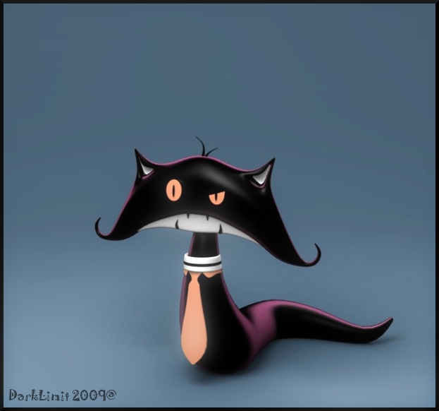
The cat is the protagonist ![]()
Thanks for the feedback guys.
i like the cat
Awesome! inspiring 
I think that the cat is outstanding. It incorporates some very interesting shapes, projects a lot of psychology, and ought to give an animator a lot of material to work with.
My opinion of the other two characters is quite a bit more reserved, I must admit. I say this simply because “I feel that I have seen these ideas (many times) before.” The dog is, at this point, rather a stereotypical “dog.” And the fish … or whatever-the-heck it is … “nope, sorry, gong-g-g-g-ggg.”
I suggest that you focus your creative energy on the dog. I mean, “okay, c’mon, no dog is ever going to come close to even the most doofus of a cat ;), but…” even though the poor dog is, after all, evermore destined to be a poor dog (instead of a cat …), surely you can find a way to give the creature just as much personality and (animation friendly…) expressiveness.
When the dog “comes alive” just as much as the cat now does, then turn your creative attention to the “fish-or-whatever-it-is.”
Hi sundialsvc4,
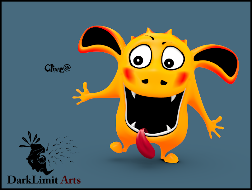
The other two characters have no label but “MONSTERS”, they are simply imaginary monsters that appear to the cat in my story from a child’s perception. The yellow character is not a dog, but I have left the design up to the imagination of the viewer/reader. They will not be animated, I am not clear as to what your trying to say. I get the impression you are saying that the other two characters have less appeal compared to the cat. I simply wanted some variety to the designs! Thanks much for your feedback.
Bat3a & Facingbook thank you ![]()
I like the cat. It needs that smug look of superiority that cats always have though.
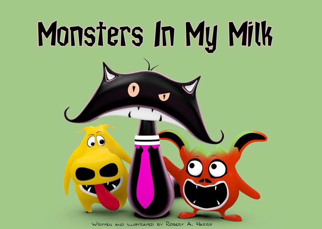
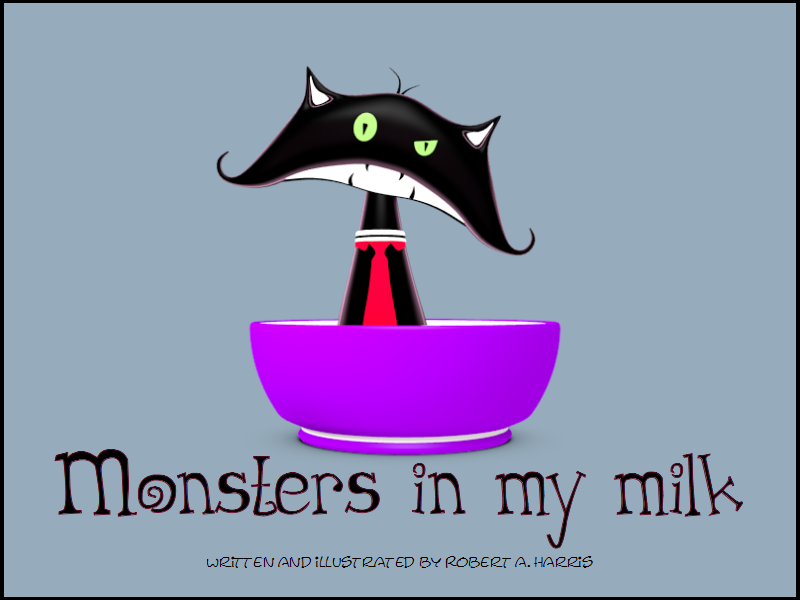
Here is the cover of the book.
I am in the process of creating the bowl of milk using Particles, hopefully I can get decent results if not I will have to model it.
I like number 2 better.
I also like #2 better.
I can also say I’ll be on the look out for a copy once you finish!
nice thread name
nice designs…
good luck.
The yellow fella is a dog right? Ajay? He may be too simple. But then again it’s a children’s book you’re doing so I guess it’s okay. Would look cooler if you added some ramp coloring on him, though.
I like the second cover as well. Good luck and good work!
Hey, that looks great. Nice job!
Thanks Icey.
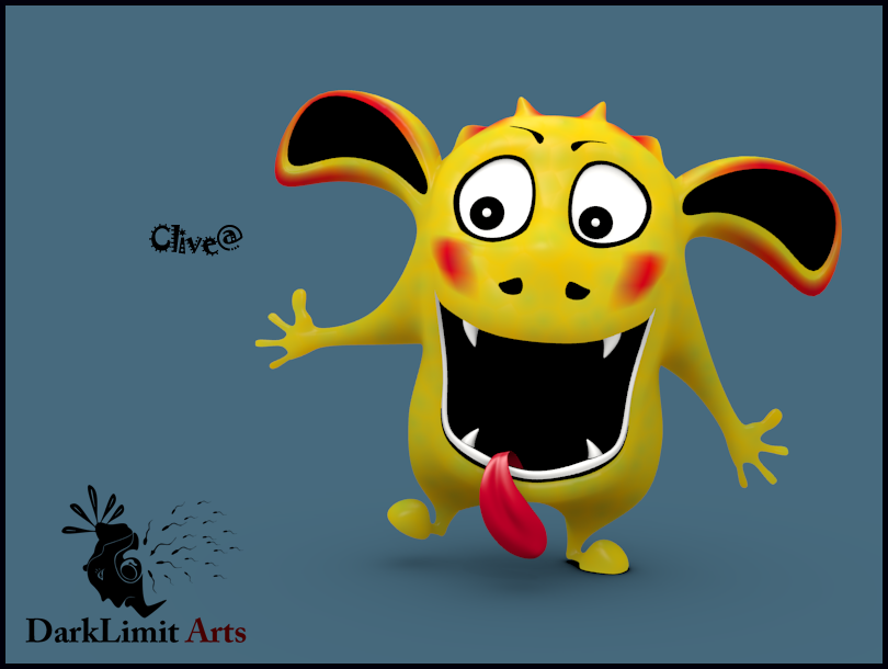
I have worked a bit more on Clive and am pretty happy with him, also I re-worked the book over. I will have more updates of the actual in-book illustrations soon!
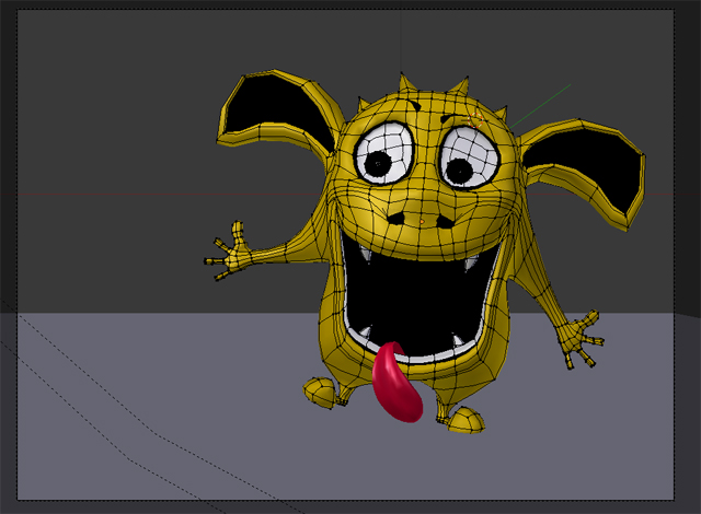
Acctualy i love the first design on Ajay, the big nose is certainly a feature you master well. As the cat it is perfect but key features on a cat for me is a triangular nose and whiskers =) perhaps adding that ? =)