Hi,
I’d like some critique on this movie poster for a short film about Danish castles (finished, but not yet published). The title translates to: “FORTRESSES - The history of Castles in Denmark”.
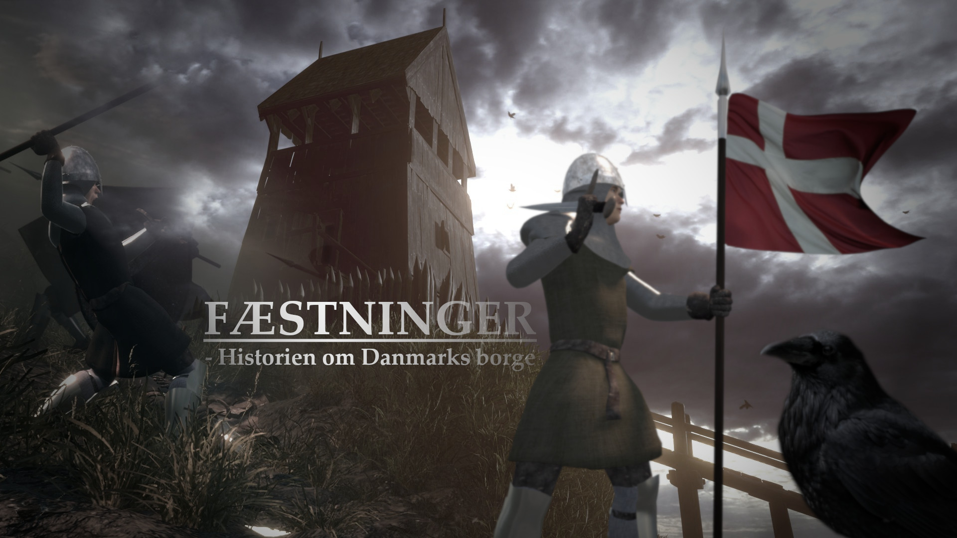
I need the poster to encapsulate everything in the 7 minute short movie, the drama, history etc.
Also, since the video/short film is supposed to act as a kind of advertisement for future collaborating projects with museums and the like who would be interested in such reconstruction projects of castles, abbeys etc. I need the poster/cover to encourage the audience to click on the link.
Please let me know what I can do to achieve this result, if I didn’t with this poster already?
I just found this by searching by unanswered topics. So it seems this poster didn’t in fact attract much attention. I think I know why.
I think each element is pretty good on its own, but looking at this image, I get the feeling you don’t know which part you want the viewer to look at or what kind of story you are trying to tell. There is a lack of a clear focus.
The man on the left has an epic and dynamic pose which should attract the eye, but he is fading into the clouds, making him look unreal and not really present in the scene. Also, there is a little bit of an extra spear that’s just barely visible and it makes the image look like it’s veiled by a foggy, glassy layer, with reflections in the way.
The other character is at the front and is holding the only colorful object in the image, but is out of focus, as if not important.
The raven is bigger than the human characters and seems like it’s been put there just to plug a hole in the image. Just from this poster, it’s not obvious why there should be a raven there and it seems like it adds clutter to the image.
The tower is pretty nice against the sky, but it’s hidden behind everything else, colorless and fading in the fog, so it isn’t the focus either.
The text is right in the middle of the most cluttered part of the image, with everything taking attention away from it.
Maybe the poster shouldn’t represent everything that’s in the movie, or if it must, there should be great care for where the viewer’s eye is attracted and what’s more important.
Kick some light into the area beneath the title. Put some rim light on the castle. Put a light in the tower room. Be sure that the knight on the left side is clearly illuminated. Use a color gradient from one side of the image to the other – for instance, "this image was taken at sunrise." The lettering becomes murky on the right-hand side: it should be clear across. The position of the sword in the hand of the flag-bearing person is not yet realistic: for one thing, it is not obvious that it is a sword. (Too small.) The figure on the left is in general “poorly illuminated.”
You definitely have a very good concept here. I look forward to watching the documentary.
I think you need to work on the composition and the lighting maybe find one thing you want to focus on such as the castle and have the light focus on that. As well as organise the placement of characters maybe have one thing on the screen instead of multiple. If you have more than one then you should find a way to have it lead the viewer’s eye to the main subject