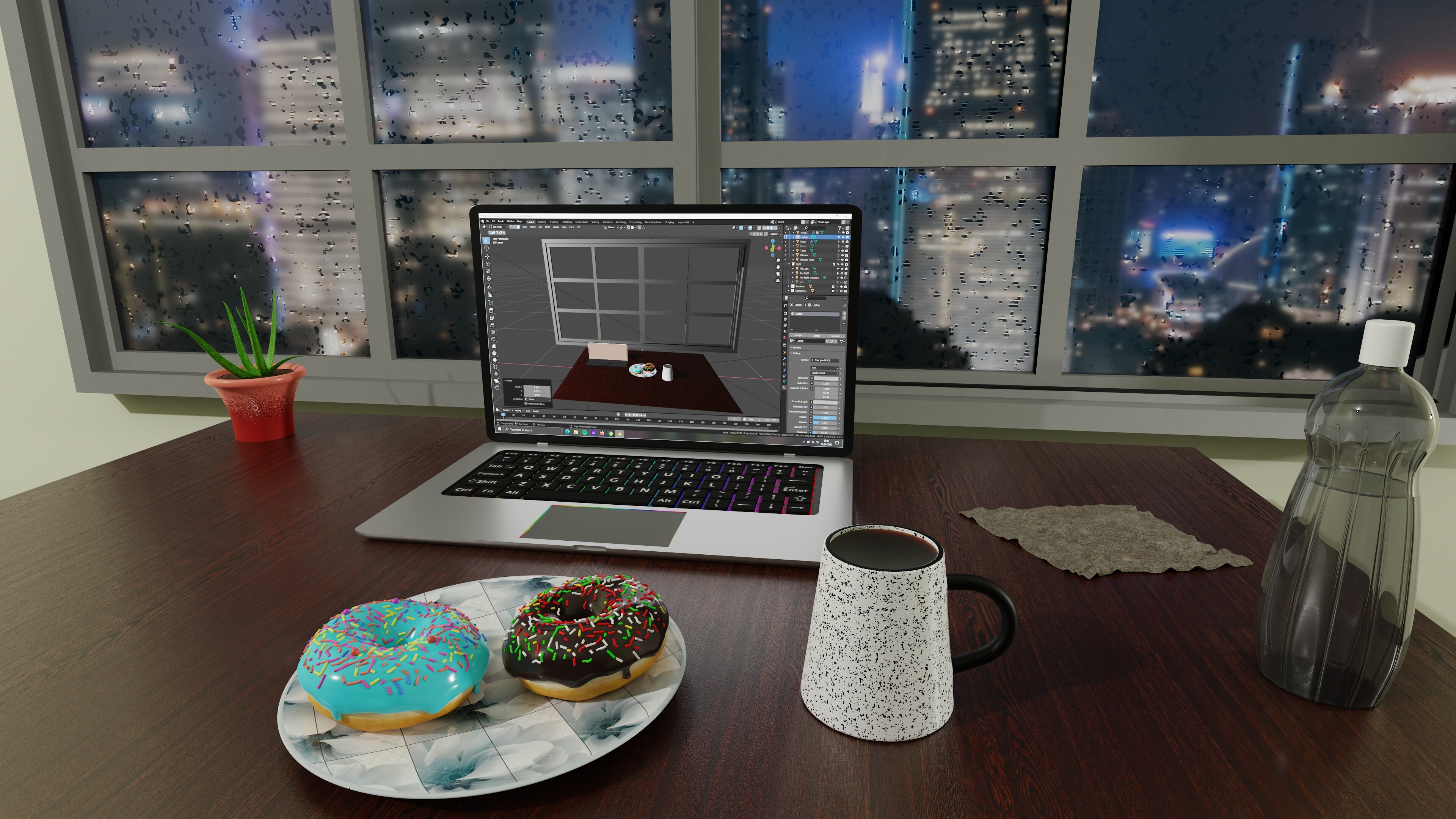
Everything in this scene i modeled from scratch.
Artstation: https://www.artstation.com/baiddsb
Instagram: https://www.instagram.com/baiddsb3dart
Special thanks to @moony taking his time to explain stuff.
Not sure what to do next.
Everything in this scene i modeled from scratch.
Artstation: https://www.artstation.com/baiddsb
Instagram: https://www.instagram.com/baiddsb3dart
Special thanks to @moony taking his time to explain stuff.
Not sure what to do next.
nice work!
Thanks a lot!
something for easter!!
Congrats on your first bigger project!
It looks pretty good!
You asked for a critique, here it is:)
Let me start with the good things:
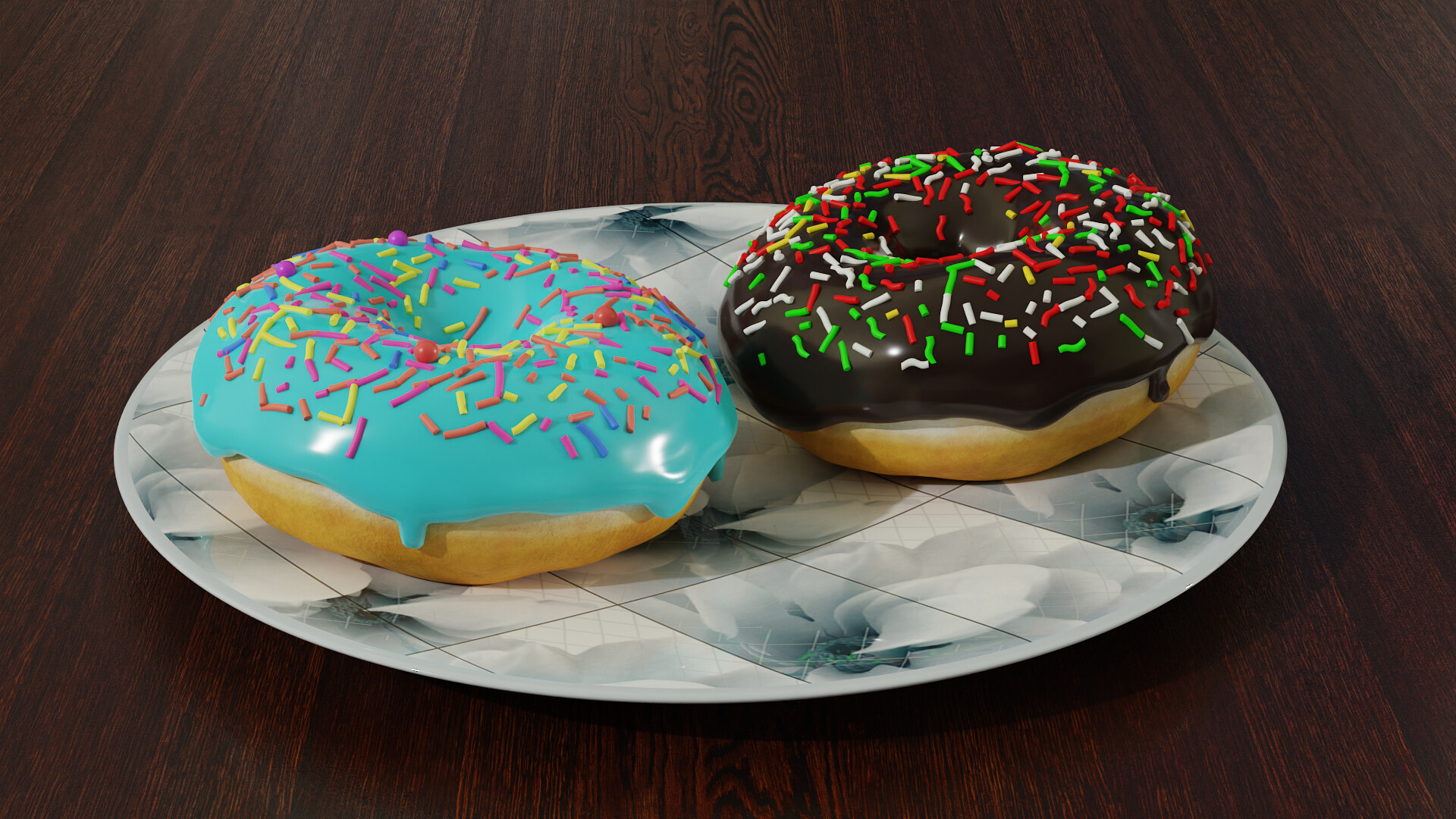
The doughnut material looks really nice!
The plastic bottle material looks quite good as well.
The laptop has some nice detail too.
Now moving to the things that I think need more work:
You have a lot going on in every part of the image. Lots of colors, lots of contrast. I don’t know where I should be looking. The placement of the objects is not helping either. Think of the story you want to tell and instead of randomly placing props, imagine how it would look like if it was real.
The keys on the keyboard have the letters way too big(or at least I have never seen that that big). It makes it look cheap.
I would also ditch the rainbow key highlights. Too much going on there.
The screen is a fun idea but it’s so strong and sharp that it draws too much attention. I would lower the contrast, make it a bit more greyed out and add reflection to the screen itself and maybe some fingerprints too.
The window has too little detail for a closeup shot like this. It looks like it’s made of one piece and has edges and corners sharp enough to cut your fingers. Take a look the windows you have around you and try to recreate those smaller details. For the edges, just add the bevel modifier or bevel node in the material.
The wet glass is pretty cool but I think the contrast between the fog and raindrops is too strong.
The cloth on the table looks really filthy:P I don’t think you would want to have it there in real life. Its position doesn’t make much sense either. Maybe instead of that you could put a coaster under the coffee cup?
The cup itself has a weird design in my opinion:P I think that cups usually get broader towards the top, not the other way around. I also think it would look better if the inside of the cup would look better black. But in general I would change it all together cause it doesn’t fit that much to the rest.
The plastic bottle lacks important detail - the cap does not look like that at all. You could add a label too, or if you want to go with the current trends ditch the pet bottle and make a reusable one;)
The sprinkles on the left doughnut have such strong saturation that I can’t look at them directly:P Just lower it like in the other one and it’s gonna look so much better.
I would make the plate one color, without the print. Check some designs on Ikea website and just copy what you like. It’s actually a good idea for all the other details too.
The flower looks a bit fake and the pot itself looks strange too. They both look a bit stylized and don’t fit the whole scene. Plants are really difficult to get right if you want to model them from scratch and showing them so close up makes all the mistakes very noticeable. Maybe it would work if it was blurred out in the background, but unfortunately not like this.
I think that’s all from me. I hope you find it all useful and don’t feel discouraged!
I’m looking forward to seeing more of your stuff! Never stop creating!
Cheers
hey thanks for the comment!
I want to give some context here for my design choices.
The cloth is supposed to be a dirty rag thats used to clean the table and stuff. its just laying around because i wanted to give it a home feel.
The coffee cup was actually a design choice. I wanted a convergent top cup and i found a similar design from here: https://i.pinimg.com/originals/54/cf/08/54cf08f5c95f1cf1d85448e4d91b14c7.jpg
As for the texture of the cup i thought it my look good from that artsy pattern. does it not look good?
Same for the plate’s texture. We actually have plates with design like that here in india [monocolor stuff arent popular here].
rainbow keys was actually a last minute idea. seems i shouldnt have changed it lol.
as for the blue donut sprinkles, is it the pink that stands out too much?
and the bottle cap is identical to something we actually use in our home. see the cap in this example https://5.imimg.com/data5/LA/GD/MY-11874215/16-oz-clear-pet-bottle-500x500.jpg
again. im just providing context on why i did the things. the plate, the rag and the bottle are directly lifted from my home. Thought they helped in realism.
Nice job !
About the doughnuts - sorry it was my typo, I meant the right one:P the red and green are too saturated in my opinion. They don’t stand out that much on the first image but on the close up shot you loose the shadow details.
Okay, I understand what you mean with the cloth. We do have something like this sometimes in Poland too:) As much as I understand your intentions I think it looks a little bit out of place. It’s mostly a problem with composition. I think it would look better somewhere else on the table, maybe if it was folded, maybe if it aligned with the table. Maybe if it had a delicate checker pattern or something it would look a bit less like a used tissue:P
The reference image you included is not a cup actually but a milk jug. They do get narrower towards the top but they also have a lip and a different handle, all serving a certain purpose. Anyway, if that was the design that you liked, then it’s okay. That was only my subjective opinion.
As for the texture of the cup, the issue I had with it was the strong black and white contrast and the size of the pattern.
I’ve never seen a cap like that. I didn’t know there is a different type:P
I have seen plates similar to this one. The lines do help with understanding the shape so that’s a good thing. The reason I pointed it out is that it didn’t fir with the hi-tech laptop and sky-scraper view outside. Both of those things suggest a certain interior style and the plate and cloth didn’t fit in my mind. Maybe if you put more props that would create an even stronger metropolitan-rustic contrast it would actually tie the whole scene together better.
Ya the right one makes more sense. i thought the left one was really good.
For the cloth, the pattern thing never came to mind. thanks. ill keep it in mind in the future.
As for the plate, im still new to this. What kind of plate or props would you think fit this hi tech scene? i didnt plan for the high tech scene actually. the background was something closest to what i wanted to use. didnt need to be skyscraper galore.
In my opinion, to make the scene more coherent I would make it a bit ‘cleaner’. Kinda like an Ikea interior, minimal patterns and colors. Or a different approach would be to make the table really messy with things, showing an artist’s workspace littered with empty cans and dirty plates. With this approach many patterns could work together well.
I featured you on BlenderNation, have a great weekend!