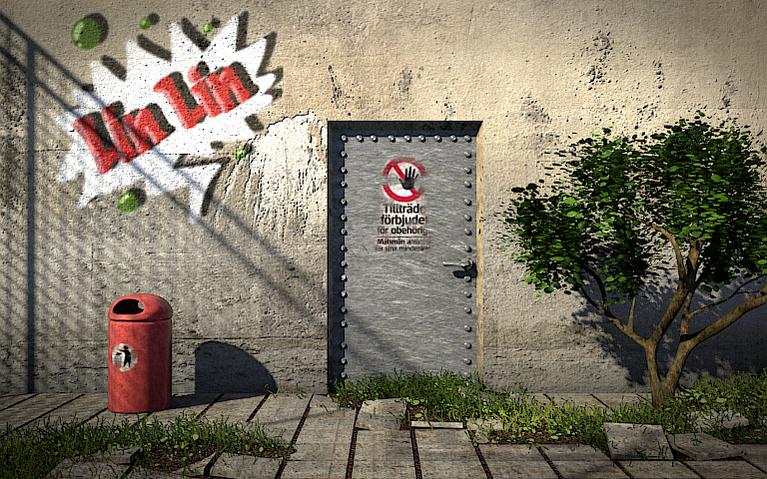
I posted it here because I think it’s one of my best works so far, and even though I consider this finished I’d like to know what to improve next time, so give me your worst!
It’s quite decent, oh and fun to see another Scandinavian, I noticed the text on the poster. You asked for critics, so here goes: I think the bump strength is a little too strong, and perhaps you should find a better texture for the tiles. The poster should have sharp edges, not soft, because of its thickness and crispness. And the bolts seem to have some weird color splits, a regular texture on them would do. The specular color of the tree bark could be darker and more brown to make it less plastic.
Otherwise great work, I like how you mix the mold into the industrial.
I just watched that tutorial. I can see the parts you picked up there.
The grass and tree are nice.
The rivets on the door need to be rounded.
The granite slab at the lower left corner of the picture is warped. Broken I could see, but not warped.
Thanks for all the feedback! I did another render in which I fixed the texture of the tiles, reduced the bump map on the bin, fixed the spec of the tree and some more things… I did however left the sign with soft edges as I see it as a sticker, which would after some time out in the rain look like that, you know the glue kind of sticks but parts of the paper have disappeared…
Anyway here it is!
Looks much better now, well done! I thought about that kind of sticker, and I know they are awful hard to get right, especially in the fade areas, since in that case the poster is layered, and the worn areas will be more desaturated and whatnot. I really like the improvements on the bin.
Nice image. I always like dirty sort of images. Don’t like those 100% clean.
I don’t know what was your goal for this image, but just to let you know it draw my attention to the white graphite since that was the bright thing on the image, but overall it’s good work.
Also too hard shadows for my taste, make it softer, 15 is usually the setting for realistic sunlight (for sunlamp rayshadow).
also the bumps on the wall are inconsistent, the chipped off paint is ok but the rest is sticking -out- which is not as good.
i can see that the chipped off paint is probably white/black while the dirt is the opposite in the bumpmap, just separate the two and it will be fine.

 You asked for critics, so here goes: I think the bump strength is a little too strong, and perhaps you should find a better texture for the tiles. The poster should have sharp edges, not soft, because of its thickness and crispness. And the bolts seem to have some weird color splits, a regular texture on them would do. The specular color of the tree bark could be darker and more brown to make it less plastic.

