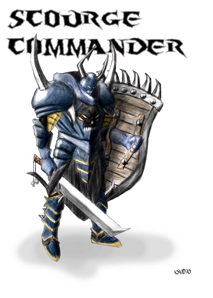
Recently started drawing this. First just with pencil, coloured in PS.
I like it already, but can anyone give me some feedback/critique on how to improve it?
feel free to say anything you like, I really need someone else’s look on this.
Thx in advance,
meemio
BTW: of course, the real file is a lot bigger!
update: Here is the last version, less dull, more agressive. fixed the foot. Don’t feel like changing the pose, it would undo a lot of work I did. Please tell me wat you think.
I like it - especially the textures on the wooden shield. However, for something of this scope the rather overall dullness of the image lets it down. You may wish to impress upon on the reflectiveness of the metal toward its surrounds for effect ie the glare of the sword against the body. The eyes also could be emitted increase the pierceness into the soul of the viewer.
Regarding the pose - back in days when I was a rather young 'un and me old man was seeing something of tennis player in me, he kept chewing me for pointing the tip of the racket to the ground - it leads to a defeatist body language which ye oponents feeds off ye. …lol yeah I ended up athletic, but I am more geared towards long distance running.
You may wish to have the tip of the weapon pointing at the sky and always in an alert intimadating battle stance for impact.
Wow! Thanks a lot!
Exactly what I needed.
I will take this in account when I have the time to work on it again^^ (rather busy)
I also changed the colours. Black and orange, instead of blue and yellow. This gives it a more fierce look.
If I’m in the mood, I think I can create a background of some kind to decrease overall dullness.
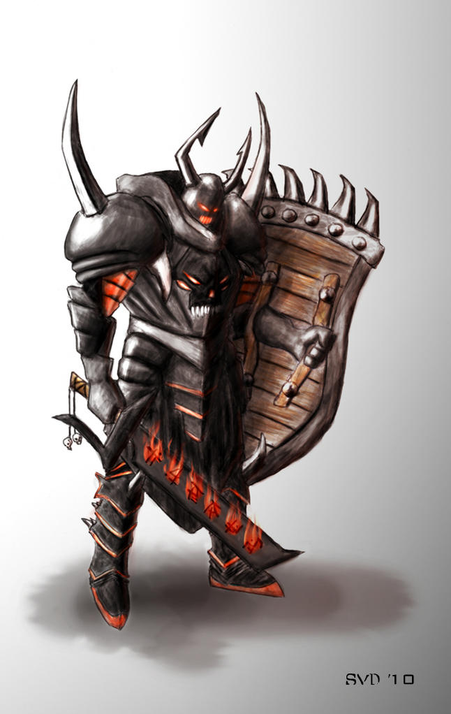
 I’d change the position of the right foot, it is not correct in my opinion.