Seriously, can people read my posts properly?
Yet you keep arguing that following industry standards are a bad thing, despite it was following more industry standards in 2.80 that got Blender that support. I am fully on board with rawalanche, your arguments don’t hold up to scrutiny. Your ideas of what make a good UI and user experience are fairly naive and your insistence that you know better than the industry that does this every day for a living is honestly quite nuts.
4 Likes
Where?
I don’t see that.
Point to it, quote it.
"I find this to be honestly hilarious.
All those things just because people couldn’t accept right-click-select, and modal tools.
Because by and large, those are the changes to the ux in 2.8. Most everything else is still roughly where it was, and looks very much similar, and works basically the same. The only significant exceptions are where things have changed to support new features.
Amazing how stubborn/short-sighted the industry appears from this, if you paint blender up like photoshop, go all mono-colour, add some big tool buttons and give them left-click, all of a sudden they see blender, it’s like they wanted blender but didn’t, because they couldn’t be arsed learning a new program."
Need I say more? Or do you want me to quote nearly every post?
1 Like
That doesn’t say that following industry standards (or rather, including them) is a bad thing.
That’s me finding it amusing how even when the toolset doesn’t drastically change, including industry standards all of a sudden garners attention. It’s me finding it amusing that people ignore the toolset simply because it’s not in a format they like.
I’m quite careful about what I write, generally. People typically find it difficult to twist my words. Maybe I missed something this time and you’ll find it, but looking through these posts, I doubt it.
Oh my gosh. Really guys, you think he was saying blender shouldn’t have supported these things? I haven’t read this whole thread, but from what I’ve seen, hes simply saying that its funny that people refused to look at blender before making these things the default. He wasn’t saying these changes shouldn’t have been made to blender.
You guys are talking as though hes saying left-click select shouldn’t have been improved or that folks from other software should have been forced to learn right-click select or something. Do you mean to tell me blender wouldn’t have gotten this new wave of funding if RMB-select and 2.7x keymap were highlighted by default when you start blender for the first time? I seriously doubt that. The main changes outside of improvement to these areas were the ones made to discoverablity. In my opinion that is the main reason blender has caught people’s attention. Ignoring the lack of active tools and refinements to LMB-select, all these options were configurable (and easily shareable) in the 2.7 series.
3 Likes
If I were in the market for a car, I would immediately discount one that had the accelerator and brake pedal reversed.
You might find it odd that I would not even listen to your arguments about how it is otherwise better. It could be best car ever, and I am not beyond training myself on that differing arrangement. But I would so quickly discount the car that I wouldn’t even entertain the thought of listening to its list of other features.
5 Likes
Right, which is why blender 2.8 calling attention to having the brake and accelerator on the “right” way is bringing it this new surge of attention. That is different from an argument that the default needs to match what the industry expects. If that were really the case, then blender wouldn’t have gotten this current surge of funding without making the new “industry compatible” keymap the default. The new “blender default” keymap is more like the old one than maya or 3ds max.
From what I saw antaioz was chiding people for needing the defaults changed before they realized blender could operate the way they expected it. That wasn’t an argument that improvements shouldn’t be made to how the alternate keymaps or LMB-select works when you enable it.
In my opinion it’s the improvements to the discoverablity of these features that brought blender this attention. Here is what people from other software saw in 2.79 everytime they opened it:
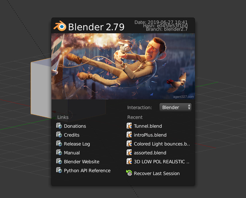
A kind of generic looking splash screen that most users have conditioned themselves to ignore.
However, there is one important difference from what folks are used to seeing and what they see in blender:
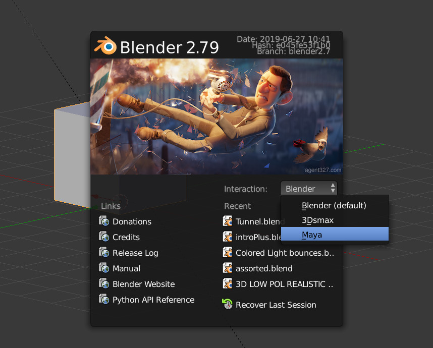
They can change what the default keymap is from this screen. Unfortunately, it just a dull grey box that is easy to over look, and even when you find it, you aren’t told that these change the way you select to better align with how its done in these programs as well.
Some users from other apps found this, but a lot simply ignored it, launched blender as is, then without even looking to see if there were a way to change the selection mode and shortcuts, quit blender. Plus, the fact that other apps don’t let you chose the “selection mode” didn’t help blender any. Folks would just rather assume stuff and move on.
Now look at the changes made to how blender starts up in 2.80:
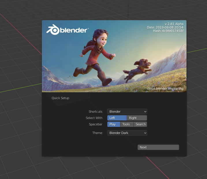
It’s more of a startup wizard (something users from other software have seen before). Folks immediately see that there are different ways to select and can change how that works with one click. There’s no information that isn’t related to setup, so these users can more easily see that blender ships with more keymaps than the default as well.
In my opinion, these are the UI changes that mattered most in blender. Folks are used to having less options as far as setup, so pushing this ability to customize blender to the front is what contributed the most to its current popularity. If RMB-select were highlighted as the default here, I don’t think it would have hurt its adoption rate because everyone can see how to change it to LMB-select from the start.
1 Like
Hey guys, do you know how decided to change the bound selection behavior?
https://twitter.com/pitiwazou/status/1162754652368252928?s=20
Bound should only be for visualisation, it should not restrict selection.
Now, for booleans, it’s useless ![]()
Also for snapping, there should have an option to not snap on it.
2 Likes
Well, the result of 2.8’s development speaks for itself as to what you get when things get even just a little more standard (as there are still a number of things 2.80 does that doesn’t copy other apps.).
-
In the 2.79 era, the development fund was maybe 5000 bucks a month and couldn’t quite hire a single developer at market rates.
-
When 2.8 was released, the development fund got a lot of corporate backing and the BF can now hire up to 15 developers at market rates.
All of our favorite Blender workflow concepts are still there, you can activate tools via hotkeys and the 3D cursor isn’t going anywhere for those who want it. The active tool system is actually pretty useful if you want to do a quick succession of the same operator, though I mainly use it for loopcut and spin operations.
3 Likes
May I propose that if people have a common tendency to misread your posts, that the issue is with how you articulate your points?
Please do note, I mean no offence by it, this is meant to be constructive, is all.
1 Like
No offence taken, but unfortunately my points are articulated as such, specifically to say and mean only what I intend to convey.
Were I to change that, arguments I make and statements I make could be construed to mean something different than what I intend to mean. It would also likely introduce areas where people who have a problem with my opinions are able to twist my words, as I mentioned, and I’m not fond of that. As a result, I typically write in a very logical, rigid, and often explanative manner that people find boring, but I do so because it is typically concise and clear, at-least on a thorough (not skimmed) reading.
To be short, were I to write differently, I could only see it being used by those who dislike or disagree with me in the moment to twist my words into whatever form is convenient for them.
But enough about my writing tendencies.
1 Like
You would have a point if the Maya/Max navigation in 2.79 wasn’t an absolute mess that broke functionality in Blender.
Also i don’t subscribe to the notion that the majority of 3D artist is this stupid and did not discover that Blender 2.79 had other navigation options. The general census was that these are broken and nobody talked about them or even used them.
All other DCC’s have options for changing navigation and more often than not, these are hidden in some preference menu. To say that people coming from other DCC’s would not realize that Blender had these options too is unbelievable.
What you are saying ONLY makes sense for absolute beginners, which have absolutely nothing to do with the attention Blender got from the industry or 3D veterans.
3 Likes
This is a rather bad analogy. The usability of a car pedal is of direct life critical importance, the selection key in your CG app is not. Your car also doesn’t feature an undo key for the case in which you pressed the wrong pedal/button, your CG app does.
2 Likes
if it’s a regression from 2.80 then you should report it as a bug, probably some commits broke it .
Litterally besides the point, in terms of getting work done which is how an artist makes a living, constantly hitting snags like that is a figurative killer.
Haley was pretty on point, though I would rather say that a better comparison would be being used to other tools, coming to blender is like going from left hand driving/traffic to right hand driving/traffic(or vice versa).
That can be quite a change, though some are bound to adapt better than others.
1 Like
It is a rather bad analogy and didn’t do a good job of making the point I really wanted to make.
Because, more generally I would reject a car for many really silly reasons. Turn signal a bit creaky, cup holder on the wrong side, etc. And would do so early on in the decision process and so would never take the time to find out how fast or efficient the car was.
So my point was that this is a common trait, to judge things early for superficial reasons. It is quite often only when something passes the superficial tests that we start to dig deeper. It’s dumb, but many people choose their car color first. LOL
And to be clear, this wasn’t really about selection, but more a response to the “its so strange that people are only paying attention to Blender now because it is prettier”
1 Like
There are many examples of accepted standards that on analysis have better alternatives. For example, the medical industry has standardised on the tablet form for dosing, even though the stomach is a poor delivery system and often detrimental. In many cases, under the tongue or up the bum is better. Have you ever tried to feed a cat tablets? Cat medicine should as a standard come in a tube in the form of a super sticky, tasty, thick paste. Cat lovers will understand this. With shooting, I always thought hitting the target was the point, yet most people support and aim a rifle with their weaker and non dominant hand. Apparently this legacy comes from when rifles were match/flintlocks and much more difficult to cock and came with stands to support the front end. Eye dominance is a much more important, so luck makes me a great shot.
Most of my working life has been in front of a computer. Now I have failing eyesight and terrible CTS/RSI. What makes my hand start to pain? Click and hold. On the keyboard, key combinations. Hold down shift/alt/ctrl/fn with one finger and stretch to select key with another. Why not tap modifier key and then tap key? It’s quicker and less strain. On mouse, holding down any mouse button for extended periods. Moving selections, for example tweaking lines in my vector drawing software. Click and hold to grab point and move while holding down button. Adds strain and reduces accuracy. A simple click to select and a click to move is faster, more accurate and less strain, irrespective of which buttons are involved. I suspect many of these legacies (standards) are from when mice (mouses) had only a single button and no scroll button. The absolute worse is holding down the scroll button and scrolling at the same time.
Much of the evidence provided is anecdotal and subjective at best. There are no tools or systems in our software to accurately track efficiency and effort GUIs have imposed. No tracking of number of clicks, duration of clicks, distance traveled in total and between clicks, which buttons clicked, the same for keys and combinations, the distance and amount of eye travel, finding icons, info etc away from active focus area. Without solid data and evidence, it is all just speculation.
There are routine things I do that take a few simple commands in the CLI that take a spectacular amount of hunting, mousing and clicking to achieve the same result. I, hovever, grew up with text based interfaces. Many people avoid GNU/Linux systems, because OMG!!! the dreaded CLI despite not needing to touch it in most popular distros for a decade. I personally would make the effort to change my habits to properly researched methods that provably improved my efficiency and reduced effort, especially strain on my hands. I am left-handed and have forced myself to use a stylus in my left hand and use the mouse and keyboard with my right hand, hold my smartphone and tablet in my left hand and use my right hand for input. This has helped a lot. I now also have a large collection of reading glasses scattered all over the place, which I can never find when I need them, so I can add an addled failing mind to the mix…
According to Ancient Astronaut Theorists, the answer is yes!
Chronicles of a new Blender UI announced almost one year or maybe more ago.