Scrolling is operational. I don’t have it drawing the control yet but the event hook catches (and passes on to the user written event function for whatever user purposes may exists) the mouse scroll wheel and the up and down arrow keys.
Works pretty slick actually. Can’t show a static image that demonstrates scrolling but the gui code is unchanged and the events are handled automatically. The mouse position is the context that determines which scroll control is active and by extension which gui controls are affected. So for mouse wheel and keyboard you don’t have to click on anything.
I’ll likely do a quick video and post it soon for those interested in seeing the scrolling in action.
And here is the video (two sizes available). In real use scrolling is not allowed if the ui fits the area but for demonstration purposes it is allowing free scrolling. The video contains a combination of mouse wheel and keyboard scrolling (smother in real life but the capture software captures at 200fps and I’ve converted to 24fps). It also demonstrates the use of the image buttons and the collapsible sheets.
looks very good to me :yes: I would be happy with that
just to be sure - all current UI elements are supported inside a sheet and for scrolling?
sorry about not getting back to you sooner re the extended idea
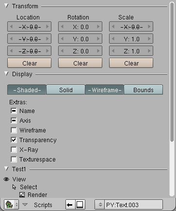
here is a rough mockup of what I thought of at the time (sorry for the large size)
it may not be such a great idea though…
aside from your very good scroll and expansion/collapsing of a script vertically
I would like to be able to keep a script open in a horizontally minimised state off to the side of the 3d window as another option for dealing with a very large script UI.
I have shown it overflying the adjacent window but I guess it could just toggle expand the whole existing script window sideways to show the sheet width
Probably you can think of something better to do to achieve something like this though
It was only a first idea
Yes, DrawX is a full wrapper for Blender.Draw, so anything that you can call from Blender.Draw you can also call from DrawX.
Just for fun I modified a couple of scripts by removing the importing of Blender.Draw and added “import DrawX as Draw”. The scripts ran without incident as well as being scrollable. Testing this I did find that Blender 2.48a appears to be broken in the area of showing the UI control tooltips. I set the scripts back to their original state (i.e. not using DrawX) and the tooltips still don’t appear.
Flyouts: While I think it is technically possible to allow for hooking into any UI script such that it will run as a UIBlock (the popup version of the Blender Python script UI) the current state of the UIBlock implementation would likely require the scripts to be modified for this to work as expected. Something work experimenting with at a later stage).
Next up is to actually draw the scroll control(s) and implement the horizontal layout code.
ok some questions:
1)
how does a popup integrate with this collapse/scroll?
I think a popup requires you to specify co-ords in terms of the whole blender window(?) although I think the last time I used a popup I took a clue from the mouse co-ords…
In using Image.Load myself in a viewer for IES light previews I notice this propogates the image availability throughout blender
ie if you load images/icons they will be shown in the UV map image list etc.
this would seem undesireable and esp if there are a lot of them.
could it be possible to have a .Load variant that doesnt propogate like this? Image.View perhaps…
The default collapse state of the sheet when the script is first opened is nominated in the Draw.Create statement?
another thing I have contemplated is auto scaling of loaded images to a certain size.
I thought of this to conveniently display various sized images at a fixed location/space in the UI for blendigo - really thinking of in UI render previews and such…
I know this can be done with code in the script but it might be handy to do it with a simple purpose made Draw command esp in this case for handling the icons.
This would mean it is possible to author images say at 60x60 but draw them as 10,12,15,20 square - this could assist those with poor eyesight too. :eek:
keeep up the good work - sorry if by discussing these things I am complicating things unnecessarily for you
Yes, for UIBlocks the controls are drawn relative to the screen space (lower-left being the 0,0 origin). The size of the block is determined by the elements drawn onto it.
Collapsing/Expanding will still work with UIBlocks (the size would adjust itself as mentioned above). Scrolling could be made to work as well but would require a non Blender API UIBlock function signature to specify the desired height of the UIBlock. The scrolling mechanism for DrawX does not draw controls that are fully outside the scrolling area. You would get some odd behaviour in UIBlock scrolling for DrawX when handling controls that are only partly outside the scrolling area however. Other considerations along with that make scrolling the UIBlock something with a low return on investment. I could be wrong and is also something to experiment with at some point. But…
As I alluded to before there really is no easy way of making a non UIBlock script behave as a UIBlock script without modifications. The button event (in Draw.Register) is not used. For these you need to use per button callbacks. Further when the UIBlock does receive a button event it closes. To get around this if needed requires the script writer to make a loop in the script to re-render the UIBlock (basically a home-grown Draw loop that is handled automatically by Blender with “normal” UI scripts. Again, not impossible since DrawX is a wrapper but not something I plan to do right now.
The UIBlock implementation (as handy as it is in some cases), in my mind, is too “bolted on” and needs better integration with the way scripts are normally writen and how they normally behave. Perhaps these limitations (and others as noted in the UIBlock documentation) will be dealt with in the future.
“using load”? Not sure I understand what you mean. Do you mean running one script from another?
ok so popups are not suitable for this treatment… will make a note of that :D… and I agree ordinary popups need some work yet
re Image.Load I think this is how you are getting the icons in there
here is an example of using Image.Load to review IES renders to make choosing one easier for blendigo
I have cycled through the reference pics in the UI and they are now listed for use elsewhere where images are available in blender and presumeably held in memory.
Here it is the UV/Image editor but also it crops up in the texture image load etc
If you had 25 icons with on/off states they would all be listed here too I think
This is why I suggest a slightly different Image.Load capability for images you may want to use only in the script UI
Oh no, keep the thoughts coming. Helps me get an idea of what others are maybe thinking about.
So to followup on your numbered items:
My previous post covers most of what I was saying before. Only to add: Yes, my Layer Manager script also uses the mouse coords as a starting point for calculating the location of the UIBlock version of the UI. Seems like a reasonable thing to do if there is not absolute positioning scheme in mind (like a small icon that is offset from one of the corners of the 3D view or something).
Just tested that and you are right. The images do show up for the rest of Blender. Not sure if there is an easy way of doing that. You could delete the datablock but since the unused block would not go away until a Blender re-start you aren’t achieving the desired goal. In my own defense, the stock icons for DrawX are all within a single image. Beyond that it is the script writers responsibility to do the same to avoid masses of individual images. If possible. Although in your stated case I think you would be dealing with individual images.
2b) One alternative is (for stock DrawX icons) is to draw them using OpenGL commands. Doable but so much easier to have an image. Especially since I plan to have the look and feel of the icons change with the selected Theme. Which also allow Theme writers to create their own set of themed DrawX icons.
Yes it is. Example: DrawX.Sheet(“Transform”, 1111, sheets[0].val, “Transform Widgets”) creates a sheet. The sheets[0] reference in this line was created using DrawX.Create(1). A value of 1 is expanded and a value of 0 is collapsed.
Yes, this can be done. And you are correct in that it would require a different call that what Draw.Image does now. I plan to experiment with zooming of the UI as a whole and want to get everything going with the API that currently exists before starting to explore expansions to it. All in due time though.
Be sure to come back though. Once I get visible scrollbars, horizontal drawing, and three state toggles I’ll be ready to write the multi-object property changing script (the mockup for which I saw in the BConf GUI video). At that point I may change some scripts to use DrawX and see what happens with different script windows sizes “out of the box”. After that I can experiment with some of your suggestions.
yeah ok will do
these things wiil be great additions to scripting :RocknRoll:
I am kind of surprised no one else is having an enthusiastic wee say about it :eyebrowlift2:…
but what you are doing is going fine AFAIK
if the python editor was updated in due course to write these new Draw statements quickly it would be the icing on the cake :spin:
and yeah it would be handy for situations like I have re the IES libary to not have all .Load images listed but I suppose if there cant be a special hidden or on demand .Load case I could just put up with it as now, or use your new code to view a few tiled images - they would just be v. large icons to all intents and purposes - say 120 square
later BF
EDIT:D
btw where will these icon sets reside? in the scripts folder? .blend folder? how will you keep them together and referenced to the correct script? (I’m not sure Image.Load works with relative paths…)
If I download or update the script I want to be able to add/replace the icons/images easily as well - I dont think blender can handle a folder for each script ATM but that might be a handy thing to do in regard of bundling and inclusion of notes.txt etc :evilgrin::eyebrowlift:
I know the blender UI icon sets have a home in an ‘icon’ folder inside the ‘.blend’ folder -and dont show in the image lists…- perhaps this is a matter that could be thought about and integrated at a higher level (Ton?) considering the whole UI overhaul in progress
I think @broken did the code for the incorporating icon sets…
The icon set(s) will reside in the bpydata folder under a “DrawX” sub-folder. Actually I think Blender does scan the script folder and all sub-folders when building the script menus. Not 100% sure of this but I think I read it somewhere.
What I’d like to do is store the image data in the module file as Base64 encoded data and then just save the image to the disc if the stock set does not yet exist or needs to be replaced by a newer version. I say “like to” because I’m not sure if the Python subset in Blender contains any Base64 encode/decode functions and I don’t like to write scripts that require a full Python install if I don’t have to (and so far I’ve not had to).
Failing that I’d perhaps do something along the lines of have the user extract the script archive into the scripts folder and if the scripts folder contains the icon file then move it to the bpydata folder.
As far as not having too many people stopping by and commenting; I figure everyone else needs to see a little more of what is planned come to fruition before they learn to bow down before me and flood this thread with their praise
I kicked around the idea of having “up” and “down” buttons too but for now have decided against it. Clicking on the “trough” will attempt to center the “slider” on the location the user clicks (if it can’t be centered then you are either at the top or bottom of the UI). Doing it this way, however, mean that the scroll-bar does not behave like a Windows scroll-bar (and perhaps other OSs, UIs). Wherein a click on the bar simply scrolls in the direction indicated by the location of the click. I did this because (1) I’ve always thought that’s how scroll-bars SHOULD work and (2) I don’t have to then implement some sort of click and drag for the slider.
fine fine seems all generally adequate thus far ( dont want you to become conditioned to excessive praise at this stage…) :no:
we like hungry coders here at blender artists…:yes:
report back to us when you have done something significant :spin:
there’s a good fellow
btw these are still true?
Not all objects would have to be added to the list. Thus allowing for part of the UI to scroll and the rest to remain static (see footnote 2).
The UI if needed could have more than one vertical scrollbar that scrolls a different set of objects for whatever reason (see footnote 2 again).
i.e. a scroll can be nested? a scroll could exist for part of a sheet inside a scrolled whole? :eek:
The comments you mention are based on non-sheet UIs. For UIs that use Sheets there is no particular code needed to get them (scrollbars) to show up. However, for ones that don’t use sheets there will also be a Draw.Sheet function. As mentioned somewhere previously any scrolling region will take up the entire vertical height of the area, but not necessarily the entire horizontal width.
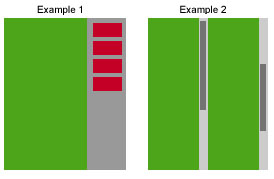
A picture:
For both examples the green area is the scrolling area (although in Example 1 I forgot to add the mock scroll bar).
For example 1 - The red buttons are not associated with the scroll control and will not move during scrolling. The controls in the green area will scroll.
For example 2 - Two scrolling areas are created. They scroll independently of one another. Either by clicking on one of the actual scroll controls or by arrow key or mouse wheel. The location of the mouse pointer will determine which scrolling area is active for key and mouse wheel events.
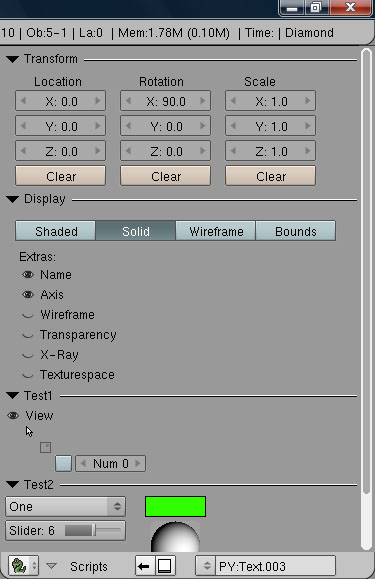
Button default values can now be lists. Which activate their third state rendering (various degrees of success from a graphical perspective – did what it would let me do.).
The module now uses the button background color set in the active Theme.
Modified some existing and added some new icons.
Scroll-bar tweak, seem to be working dead-on now.
There are now seperate calls for:
[LIST]
ImageButton (where you supply the image)
IconButton (where you specifiy the internal icon type you want – there are three: Visible, Selectable, Renderable)
Checkbox
Radio (not really needed since we have Toggle but did it anyway
Some other minor clean-up. Almost time to refactor a few areas.
[/LIST]


 and then think of something else to say or a way to say it better :no::yes:
 - say 120 square