Some of You may remember the topic I started about twelve years ago: icons for Blender 2.5.
Time is passing, life’s running, things are changing without the exception and Blender does it too. It looks like it’s time about to design new icon set, since there’re lot of calls for modern, flat, less obtrusive pictograms and even some effort has been made already by user Vklidu - “monoicon” project.
why:
icons are secondary to the content and work best in local context.
An icon is a shape in first place and doesn’t need to have colour.
Current icon set containing pictograms that are illustrative and multicolor - often too detailed to be read clearly in small sizes and confusing with too many color cues. Some of icons pop out too much because of their colour, attracting user’s attension to particular (inapropriate) parts of interface.
Iconography for Blender 2.5 was designed to be visible on any background - dark or light and thus some crucial space has to be dedicated to double outlines. It consumes a lot of precious space; old icons actually are not true 16x16 pix, but tad smaller - 1 pix, two pixels… That’s further space loss.
Present icons are small masterpieces with individually matched colours, gradients, pixelsized details. It’s really hard to replicate the style when there’s need for a new icon - even for me…
goals:
Unified look across whole GUI.
Best possible use of given 16x16 pix space.
Simple composition rules and guidelines that are easy to follow - new items should be effortless to create.
Monochrome look potentially with colour codes in places where it’s needed, with assumption, that chosen colours are global across UI and are bound to most important operations or different functions, such as (random colours):
blue - modifier;
green - creation (new geometry, new item in the list etc.);
purple - modification of existing geometry;
red - delete / erase / remove…
and so on. Colour must cover whole icon, and will be restricted to icons crowded spaces.
Vklidu’s work was so inspiring, that I decided to try my hand at this and - as a proof of concept - redesigned some of “old” colorful icons making them monochrome, more flat (in most cases) and even more symbolic by removing redundant elements, discracting details an colours.
So far I covered:
row 1 - some of Editors - I bet You can name them
row 2 - Object / Edit mode
row 3 - vertex / edge / face snapping points
row 4 - mesh primitives, Empty object and Light object
@Joel_nl
It’s true constatation only if You’re talking about all icons gatheret together, but in real use, they’re apposed in UI in small bunches that are contextual. Colour ain’t that much needed here. Honestly, some of current icons pop out too much because of their colour, attracting user’s attension to particular parts of interface.
I plan to incorporate some colour codes though, the way Vklidu suggested here: LINK - it could work best in File Browser, Asset Manager or Outliner. Every place, where one has to manage big lists of items.
Not a fan of this kind of icons…
Following design trends is not a good thing… stuff gets dated real quick…
Those so called “modern/flat” designs are a curse in interface design imho…
Nope they look minimalist, professional and clean, They are blessing of the modern interface, this is why gimp 2.0 also jump in this bandwagon and many others will follow. Keep your ugly rainbow icons with 2.79, nobody forces you to switch 2.8 with beautiful flat icons
they were designed to be visible on any background - dark or light and thus some crucial space has to be dedicated to double outlines. It consumes a lot of precious space;
old icons actually were not true 16x16 pix, but tad smaller - 1 pix, two pixels… That’s further space loss.
colour agression, I alredy talked about above.
With such small space avaliable and need for double outline, icons got less and less distinguishable.
Those are problems that I will try to adress.
Welcome back @jendrzych. You did a great job in the icons for 2.5.
As a reference, I suggest taking a look at Archicad new iconset. In my opinion, they’re very simple and have a great readability.
What kind / style of icons does the right job from your opinion? Thanks for direction.
Your critism is fine for feedback, but your comments does not move us to make a progress in a way you would like to see the new blender icons.
If you have a tip or vision what works better share it with us.
Flat icons in general are not just a trendy in these days, but from all history of design you can clearly see the simplest design resist longest. See some logos evolutions
Simplification of shape is definitely benefit of this process.
My question about flat icons is unification, that makes icons similar to each other, that makes hard to say what is what. So some color could help, but make it harder to keep some general rulles for extending icon set in a future as well.
Shape simplification, combined with really tiny space avaliable per icon, seem to be a problem, but it’s exagerrated IMHO.
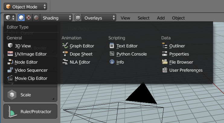
Another remedy is to avoid long lists with an icon assigned to every position in the list - the best of wrong examples is the File menu in Blender 2.7x (fig. 1). Those complex lists/menus can:
use carefully designed colour codes or
have only a few icons assigned to most important rows or
be divided in sections - right the way Devs did it in Etitor type menu (fig. 2)
@TheRedWaxPolice
Your comments are not very positive, perhaps as a balance try to give each post also a positive / constructive push which I am sure would be greatly appreciated here.
@jendrzych
Your icons remind me of this recent right click select proposal by user fabiocroldan . It has rather interesting aesthetics and reminds me a little bit of Sketchup or Adobe software or some newer Microsoft interfaces.
Although I don’t believe that this kind of look is popular with the mainstream blender crowd one big advantage I see are the customizability as icons are treated equal to text in terms skinning - which makes elements in the UI more consistent. E.g. if you want a very light theme with the current blender icons it does not always look nice - the current icons work best with certain theme colors.
I resource I professionally and personally use for TexTools for example is https://www.flaticon.com/ as a starting point sometimes for icons I have to design / or wireframes. Although not a lot of 3D related icons available you will find a lot of style like icons there for inspiration.
Good luck with you project, looking forward to see more progress.
Sure icons should not be rainbow fiesta, but have some solid style and color standardization, however I have to agree with TheRedWaxPolice and Joel_nl that removing colors completely is bad design. Blender isn’t some mobile app with few buttons.
I never made an icon. I do not know how this works.
I like the flat icons. But I do not like discolored icons.
Because, IMHO, the color can be used to organize and separate the icons from each other.
Example (it is not necessary to use these colors, it’s just an example)
Green - to create
Yellow - for editing or adding
Red - for removal
etc.
For example. If there is only text, I need to literally read every letter to understand what this text means.
If there is text and colorless icons, I will navigate the icons by additionally reading the text, if necessary. But I still need to look at all the icons in order. That is, I need to “read” them all to find the right one. It’s a little faster than just text.
But, if I have colored icons. I can not read all the text, and do not view all the icons. I can immediately exclude all the icons that do not fit me in color. And just look at the icons of the color I need.
@renderhjs
Examples You provide are really great - creme de la creme! The bar is raised really high…
Lot of fear I see in You. Afraid You must not!
Actually, coloured icons doesn’t make much sense in most parts of Blender’s UI. Here’s proof, that flatty mono-icons work well:
It’s not the case. Resize them to 16x16pix and check if they’re still descriptive. Linked icons (C4D?) suit well spaces similar to Blender 2.8’s toolbar, and I’m not goin’ to design them. Not right now, at least…
Anyway - this topic ain’t a wishlist. I clearly stated what’s my goal and I’ll try to fulfil the plan. I’m goin’ to listen requests untill they fit my basic concept. It’s meant to be demanding practise and fun challenge in the same time.
So no - I won’t use peacock or puke colour palette