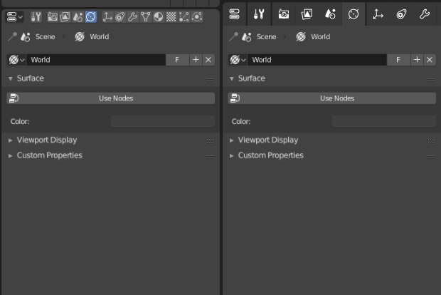
As vertical tabs are pretty ok for me, I want to present mockup for horizontal with much more space to show you that those icons are really amazing. UI isn’t. I do not understand many UI choices across Blender, but for years those ‘tabs’ which are not behaving as tabs are mine biggest concern.
Take a look at this (yes more scrolling):
