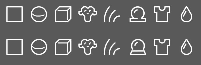
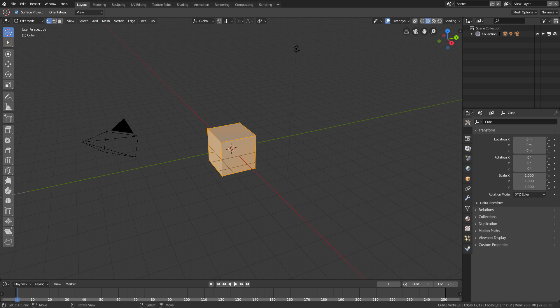
Is there any way we can get some tweaks to the “shader ball” icon? It looks a bit lopsided, and doesn’t quite read right to me. Current version is in the top row, some proposed changes to it in the bottom row:
Yes, I prefer the second version. To be honest, the first thing that came to my mind the other day when you showed me that, is a Pacman looking to the left.
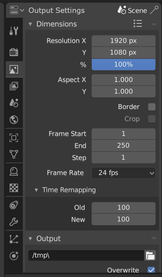
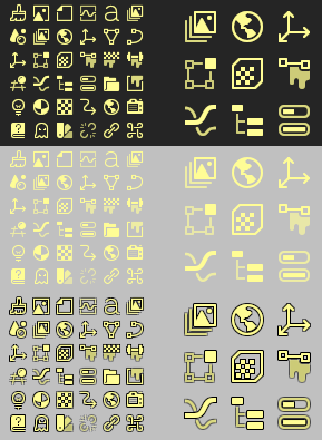
There has been some comments that the new icons, when used on light backgrounds, must be shown near-black for them to be legible, so negating the use of color.
I know this isn’t perfect, but I wonder if this is good enough. An option to draw the icons multiple times with offsets in a dark color to make a base shadow layer. Some icons look okay, others are less than perfect. But at least this does not require creating a custom shadow layer since it just uses the existing icon images.
The following shows how yellow on dark has nice contrast, the middle showing less contrast on a light background. The bottom using these fake shadows.
The fake shadows solution for light icons on light background is good for me.
Reading the replies in the 2 threads I wish we could move on a bit from taking entrenched positions and getting a little short with others views about the matter. Everyone please try to be constructive and fair minded. Its plain quite a number of people have issues with rapid comprehension of the icons without colour clues, etc… This isn’t putting down the coolness of new icon set or a matter of being difficult. Its just a practical reality. As I understand it Harley is coming up with a way to augment the standard monochrome set for those that need/desire it. If we can have fake shadows and coloured bars as an additive option to the monochrome set that would be fine by me.
@jendrzych, don’t know if it makes sense talking about this here, but since this is a “new icons for blender” thread it’s the only place I find right to talk about it.
@William, jendrzych icons are more or less approved by everyone I was wondering if the ones on the toolbar will get revamped since they seem a little bit of compared to the new ones at least IMO. I know that maybe you guys won’t spend time now on them, since beta is close and there must be tons of work more important.
But the icons should get overall coherence no?
I’m not good with words, where is what I’m trying to say:
(forgive me @jendrzych if I butchered your style )
Should those icons be done the same way as the icons on the left, which can be changed by dragging their container: One column, two column, wide but text? Sure, the text version would take up a lot of real estate, but would help newbies get oriented with what is available where. Collapse it when familiarized.
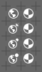
Some variations of the World icon. The goal is to make a bigger difference between this icon and the Material pictogram.The first one on the top was just slightly altered, by moving land masses to the left. The other shrunk a bit and got sun/moon.
IMHO the problem is not that the World icon looks too much like Material icon, but that the Material icon looks too much like World icon. World icon looks fine. Material icon instead looks to me like someone tilting his head while wearing a superhero mask.
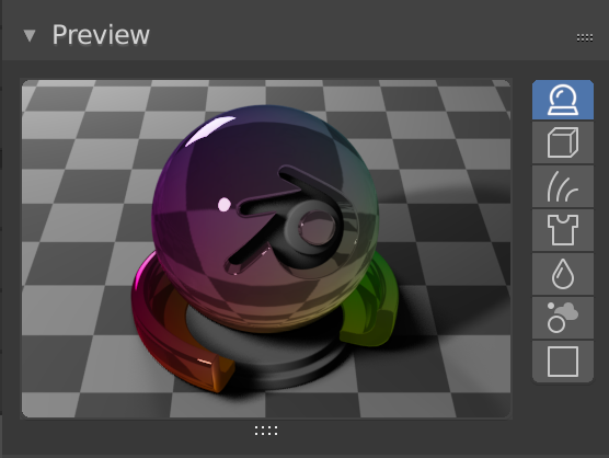
The argument for using a (reworked) “shader ball” icon for Materials has been getting a bit stronger over the last week.
I’ve been using 2.8 more and more recently and I really felt first-hand the confusion about monochrome icons. I find myself spending a lot of time scanning the icon row in the properties editor, trying to find what I need.