I have no problem building the latest straight-out-of-the-box 2.8, but can anyone tell me where to put the new icon file to try them out?
Hi, on Linux it is in: /home/xxx/blender-git/blender/release/datafiles/
Cheers, mib
Big update - check the first post for details.
Thank you.
I agree those are much better… just plain white/black color icons is just awful… color in icon when done well and consistently such as green tones for certain icons, red tones for others etc… just make it much better than some lame single color icons.
Perhaps even procedural outlines? In mobile games world, a hacky brute-force method for text outlines is to render additional 8 (or 12 or 16) copies underneath the original text and offset each copy in its own direction (like on a compass).
Just one copy with an offset and blur can do the trick 
Everything is so precise and crisp and beautiful. But I personally dislike the file folder. The bottom-left area shows a thickness and bend radius such that it looks like a file folder that is about a centimetre thick.
Its too busy for such a small space.
What exactly do you mean?
You mean the big one (48x48pix) or the small one (16x16pix)? The small ones thickness is limited by pixel size, while the big one can be tweaked to look skinnier.
I drew it like that simply because I like it this way. Every flad’n’curved thing in the set is depicted like that.
They say that tastes are like a heinie - divided 
It just seems like a lot of detail for a 14x14 pix area. But idk im not a icon designer.
I still have no idea what do You refer to - what has too many details. What particular icon You’re talkin’ about?
I mostly mean the big one. Although if I tried to improve on it then it would only get worse. You really have a gift for these things.
Just to be clearer, the rounded bottom is okay on its own. Would normally imply that the folder has some contents inside that are making it bulge. But the folder also implies a thickness of the folder material itself by the location of the fold at bottom left. The result is that the folder looks empty but is made out of very thick material.
In the end it doesn’t look bad, but doesn’t match the style of the other icons by being too whimsical.
I just scaled the folder up and tweaked it a bit, but I’ll lean over this particular pictogram to find out if thinner look was better.
Thinner is better (although I touched only the filled one).

Yes, that is a subtle change at that corner but does look better. The folder has a rounded shape but does not look like the material itself is thick anymore. Thanks!
The *.svg’s updated.
I really like the core concept of this proposal, where you color portions of icons rather than the whole icons. I’ve actually become a fan of the monochrome icons now that I’m used to them, and I would personally better like a consistent color-coding, rather than just generally colorizing the icons every which-way, if any color at all has to be added to them. And for color-coding, I think your proposal is a valid approach.
Thank you. I do believe they make sense (as a user and as a designer too) but the noise is so big on all forums I can’t seem to find a way to have a meaningful conversation about it. At least not with the devs.
I’m also very curious about jendrzych opinion about my solution but he seemingly avoids commenting on it ![]()
(though I guess you read everything so I’d love to hear your opinion too. Thanks in advance!)
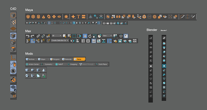
A note about other 3D suites’ solutions:
I’m not trying to copy any of them (actually I collected these examples just for this post) just as they don’t copy each other in this regard. They simply use something which is not obtrusive but still easy to read. And they pretty much all end up with a 2 color solution - color coding only different categories of buttons.
I also wouldn’t go into the topic if they look good or not. Personally I only like Max’s new icons better then jendrzych’s set. Because they are bold and strong, extremely functional and I love the 3 colors they chose.
But our current form language is great. It deserves an award honestly. It’s just unnecessary hard to read now.
I’d love if I could help in this in any way.
