C’mon, don’t ask me or anyone why the world went after one icon. It just happened
Me too. I like to debate and I am open to any decision if it makes sense. That’s why I find myself against @William motivations* which are just arbitrary in my opinion.
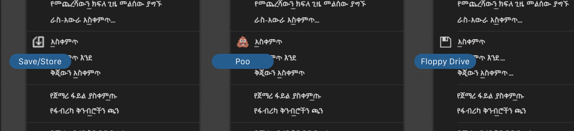
*“floppy icon incorrect because we don’t save on floppies”
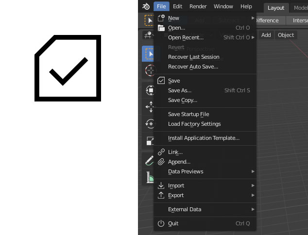
Wasn’t something like this introduced a while back? It gets rid of the ambiguous meaning of the arrow, and retains the floppy silhouette (or page curl silhouette, whatever you prefer).
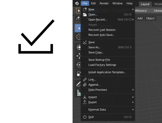
Or this, which is keeping in line with the Import / Export icons:
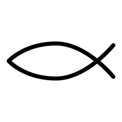
How about this for the save icon? It predates the floppy by a couple of thousand years.
(Disclaimer: Due to the total failure of my past attempts at humour on the internets, it seems I am unable to correctly identify the emoticon for irony and mean no offense. Why so serious? Is idle banter frowned upon now? It saddens me to think that Ton finds this forum a little toxic for his tastes and that my slow days at the office have been reduced to putting up with Russian bots, Creimer and apk on Slashdot…)
@ouraf
For behavior icon - stomach, guts are reserved
And a bit more about our nonsensical prudence — Does a floppy disk resemble an SD card or does SD card look like a floppy disk or is it a CF card. Maybe its a SIM… Yup, most memory units are square-like & an arrow shows an action.
Simple, fast to get used to and easily distinguishable, recognizable in a set - should be easy even for newbies in 22nd century after an ignorant glance.
Nah - just the minority who seem to be pushing a change for no real reason/benefit. The poll appears to show that the vast majority are quite happy not to give it a second thought and accept iconography already in widespread use.
I don’t know how many users have been able to immediately understand the meaning. I did, maybe also because I live in Italy. Your post is really ingenious.
Wow, how many days has it been arguing about the Save icon? Is this some kind of filibuster?
To be completely honest, this is all totally irrelevant. You could put a poop emoji there and eventually your eye will adjust to it. You can plainly see the word “Save” written right next to it. You’ll just go to the poop to save your file: . It’s all a matter of letting yourself get used to new things. Obviously, that doesn’t work for all things, but for icons with words right next to them, you eventually get used to it and you won’t even notice it anymore.
Where the argument is much more valid is when icons exist without an explanation of what they are. Those are really the only ones warrant a discussion. But again, once you learn what they mean, you get it and just adjust to hitting that button for the function you’re looking for. Right?
On the plus side though, at least you guys aren’t talking about color icons anymore.
Yep - and that is exactly the point with the arguments around the floppy icon. It doesn’t really matter how it was derived, what physical tech it represents or how outdated that tech now is.
The point is - people associate the floppy icon with the save function because it is so widely used in that capacity.
Many icons are pretty arbitrary when you get down to it. They have just been adopted to have a certain meaning and we continue to use them to this day.
Who decided a cross X should mean close window - but it does and now most programs with windows based interfaces utilise it (including Blender) because everybody understands that what it means.
We could of course decide that the cross isn’t the best representation of the close action and implement something else instead - but to what end? Who would it benefit?
Yes changing the floppy icon to something else isn’t a big deal in the grand scheme and people would get used to it - but why go out of the way specifically to make Blender different to 90%+ of sofware in existence.
I thought the idea was to make Blender more accessible and mainstream - but stuff like this simply makes it appear more niche and inaccessible than it should.
But if you follow that train of thought to the end blender will not evolve past the other programs if we’re afraid to do something that other software doesn’t do. Blender shouldn’t aim to be a competitor, blender should aim to rule, and that can’t happen if we worry what they do.
Little things can matter, and maybe people will look at it and say “wow, they replaced the old floppy with an SD card, that’s pretty cool.”
But, well, you know, that’s just, like, my opinion man.
You know, forget what I said. Blender is probably not going to rule.
Over the years I’ve watched release after release and every time people gush over how Blender will take over the market this time. Almost as zealous as Linux fans going on about taking over the world from Windows.
Sorry, but it doesn’t matter how shiny, fast, and stable Blender can become, the big studios have insane amounts of money invested in their workflow and that is a major change that they will not want to even consider. Nope, for Blender to knock out the big boys it would take Autodesk to really screw it’s customers over. Way more than they do now, it would take a massive mistake from AD for Blender to hit mainstream.
Not at all. Change can be a good thing if there is a clear and justifiable benefit.
Nobody is advocating no change - but change for change sake is rarely a good thing and that appears to be what is going on here.
I have worked in software development and currently work in a role which is heavily involved in change management and experience this type of thing day in and day out.

 . It’s all a matter of letting yourself get used to new things. Obviously, that doesn’t work for all things, but for icons with words right next to them, you eventually get used to it and you won’t even notice it anymore.
