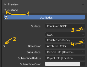
I wonder why no 2 isn’t the same as no 1. The same applies to no 3, which does exactly the same what no 4 do. Increasing the number of differen ‘glyphs’ doesn’t seem to be valid here.
BTW, I slightly tweaked the Mesh Object icon. Looks good enough to me and follows visual style of other Objects.
I agree. It’s a messy, inelegant piece of UI. It’s also not very functionally clever, because it’s only useful if you use the Action Editor in conjunction with the NLA. I think we should move this to the NLA instead. Sigh…
Yes, this UI is not very clear at all. I’ll try and explain what they do:
The Track buttons performs a camera tracking backwards or forwards in time. The buttons on either side only tracks forward one frame.
‘Clear’ clears the tracking forwards and backwards in time from the playhead.
‘Refine’ does a tracking refine backwards or forwards in time.
This would be great to make clearer. For example, the distinction between tracking, clearing and refining is not communicated at all the the current icons. They are just arbitrarily different, with no actual communication of what the features do.
This is also currently really bad. It adds the current Action as a strip in the NLA. But the ‘push down onto the NLA stack’ wording only makes sense if the NLA is actually below the Action Editor in your layout. For now, maybe we should just re-use the NLA Editor icon here. Ideally, we should rework this entire UI - it’s really pretty bad.
Yes, it would be. Only thing is, I can’t think of a good icon for ‘solo’ other than headphones, but I agree it’s misleading.
I was thinking about the star icon. I think, if we stop using the star for ‘solo’ (which never made sense), we can use the star for presets, rather than the current sliders icon:
Regarding 1 & 2: Yes exactly. That’s why I think we should use an arrow icon, just like panel headers.
As for 3 and 4, they are not the same. When the ‘3’ glyph tries to communicate, is that this is not a normal dropdown menu, but a list of things you can connect, or override that setting with. We could make that more clear as well, by making it look more like an input socket, which is what it actually is:
This is a nice improvement. It’s more ‘meshy’ at least now.
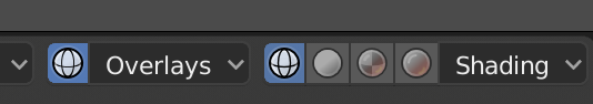
Hi again. So now we have a Wireframe Mode again. I saw you made a nice icon for Overlays, which is nice. But we’ll now also need an icon for Wireframe Mode too. IMO I think it could look more or less like the old WIreframe Mode icon, but updated to fit the new style.
To me it doesn’t really communicate wireframe. I don’t really get what the pattern is supposed to be? The old wireframe icon was quite clear I think, it’s just the wrong style to fit with these new ones.
In edit mode are mostly green icons in side panels, and I thought icon for it could have same color. Sculpting is like editing you can preserve number of vertices but with dynamic topology you create entirely new geometry from sphere.
There is too many icons and the may need more colors.
Orange color for objects similar to old blender.
Dope sheet itself looks exactly as old icon.
Non linear animation with light blue line, because it is default color dark them.
Blue line as Z axis in 2 spherical icons.
Red material, because material output in dark them have red top bar.
Last but not least weight paint with rainbow colors of all weights
But it could be only my angle of view to try associate that colors.
My three cents…
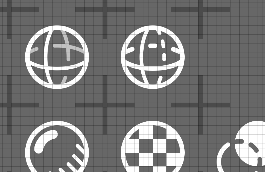
First of all, it’s way too detailed for such a small icon. My goal is to get pictograms, that are clear and distingushable in their native resolution (14x14 pix) even at high-res screens. The one above will not meet noted goals.
Secondly, icons for World (an angled globe) and URL (commonly used globe + cursor) are too much similar to this concept.
Thirdly, marcoG_ita’s proposal is stiil similar to Sphere Primitive. The very icon should get different pattern.
Lastly, I deconstructed most of icons in this very set and reduced them to their simplest form, so that they’re really symbolic. That’s why I try to avoid making photorealistic representations of real objects in favor of depiction the simplest ideograph. Now, I agree, that my current Wireframe proposal is far from perfection. Actually it looks like Easter egg… So, I made another sketch, that is clear, reliably different from other icons in the very bunch and reesembles triangulated mesh in somehow coarse manner.
Yep, but I tried to draw it and it has too many details in tight tiny spaces. I’m extremely not happy with results…
You know very well, that it doesn’t work the way You’ve suggested - user do not guess a functionality basing on a pictogram. One checks what the pictogram means once (that’s why You made tooltips, isn’t it?) and then he knows that this very icon is a Wireframe Mode. No more guessing.
Guessing could work with bigger, more detailed icons.
You, guys, cheat a bit, making sketches of icons way bigger, than 14x14 pix matrix. Start working on crisp icons in 1:1 scale, pixel by pixel and You’ll see what I mean.
EDIT:
Screenshots to visualise what I’m talking about.
Closeup of vectors against pixel matrix (everything looks good, so far):
I just can’t help it but for some reason none of these imply the wireframe to me. I think it’s because I perceive all the 4 icons to be a sphere with different shadings, and as a 3D artist, I know that the sphere in wireframe mode has those distinct latitudinal and longitudinal lines intersecting each other. That’s why the zigzag patter does not work. It doesn’t look like a common sphere primitive displayed in a wireframe mode.
If it has to be distinct from Sphere primitive (despite those two icons never appearing anywhere near each other), would at least something like this work?:


 It’s not a photo - its reduced symbol.