Hi! Nice to see you back on track again!
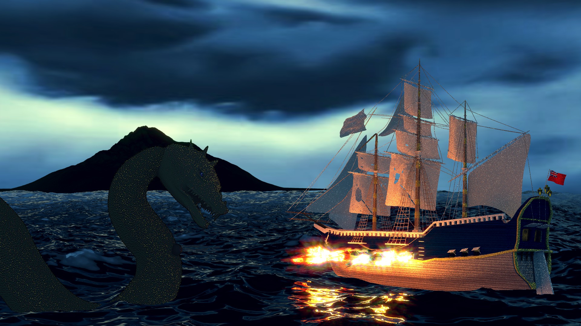
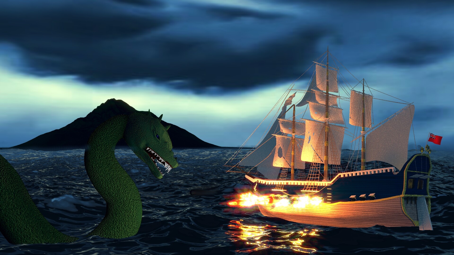
Like 1st one, except island and monster clash and struggle. The last one looses too much because of fire imo.
While looking at, i recall there are some good picture composition tutorials, one even related to the subject…I would suggest taking a look, you might come up with some ideas.
If you’re going to keep composition like this, see if you could add more evenly spread light from top onto Taniwha. There’s nothing atm for me as a viewer attracting my sight to it. As soon as i start to look at picture, i see ship, then blackness of island on the contrast of sky. I do recognize that because i’m familiar with pictures of these things. I do not know anything about sea monsters, i need to be guided, attracted to them.
But, I barely can see the monster, which is probably not what you as an artist want. That’s how i see it right now.
idk… it’s loosing drama because of lighter clouds imo. Do you have thunderstorms over there? Could it be that something on a horizon suggests one being around (clouds already are there) and we start to think that lightning bolt atm is shedding light on the battle?
Just idea fix…
Or take 3 best shots and call for a final vote?
The sea monster looked much better as a silhouette. It looked more ominous, and now…
Well, I’ll just tell you some things that could improve:
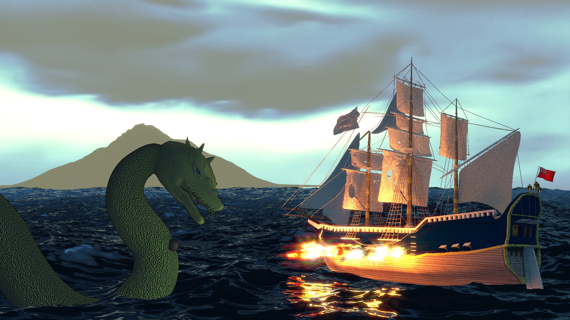
The normals that are the monster’s scales are WAY too high. He looks like rough concrete now.
The monster’s mouth asks for a lot of work, as it is now green and smooth. Add materials for his teeth and tongue at least.
The cannonball doesn’t look right. First, it looks a bit cartoony, but second, it doesn’t work for it to just be sticking out of the monster’s chest. The only realistic way to avoid a bloody and gruesome scene in this case would be to delete the cannonball, or render it just before it hits.
Other than that the muzzle flashes are greatly improved.