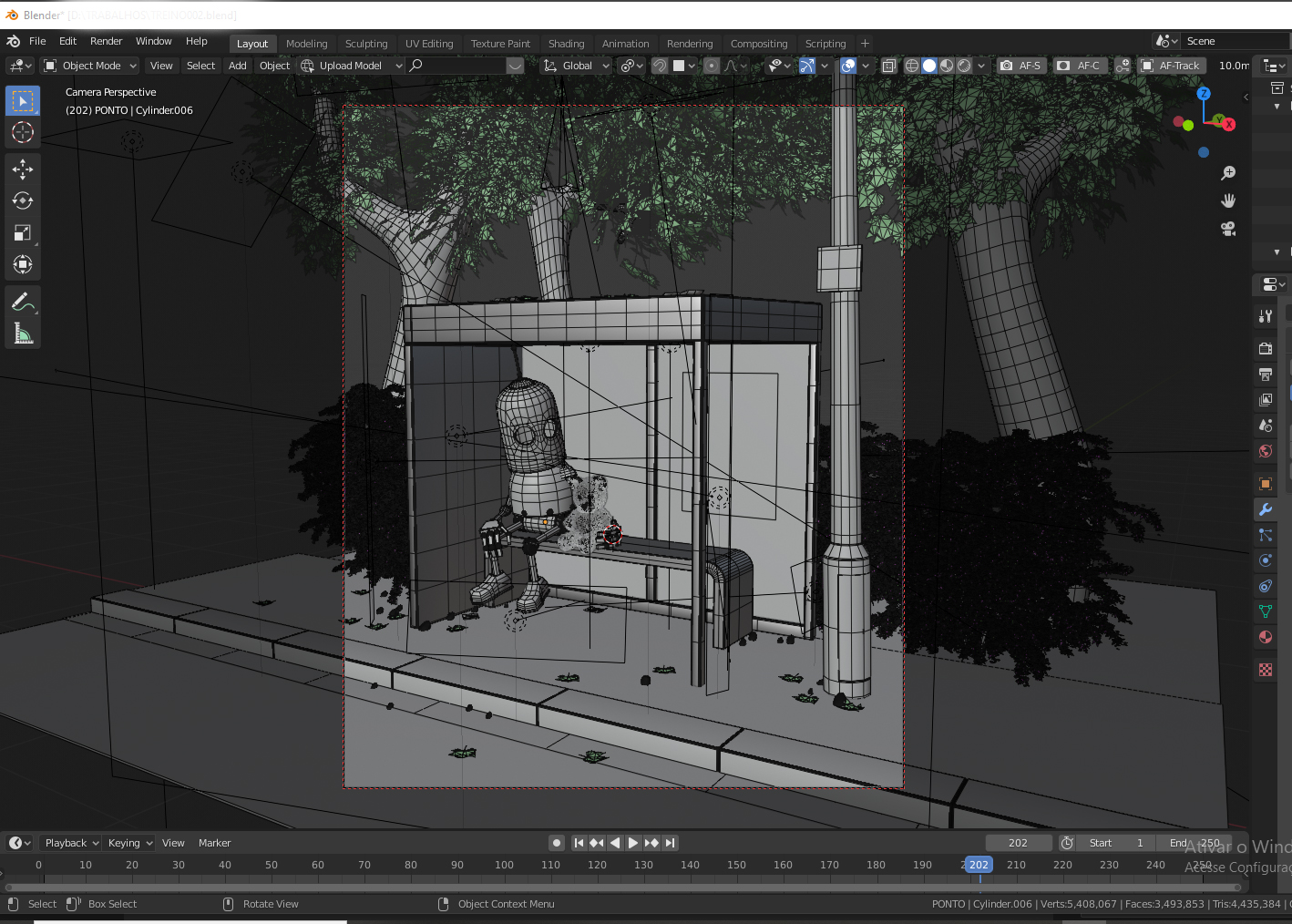
Hello, I made this art to study lighting and composition, the concept was based on ILLUSTRATION by Matt Dixon, (NIGHT SERVICE)
SEE HIS WORKS.
https://www.mattdixon.co.uk/transmissions/nigh-service
](https://www.mattdixon.co.uk/transmissions/nigh-service!%5BNIGHT_SERVICE%7C411x500%5D(upload://2HmUeXCPg2xhrZ3ft9AKiciV3Ne.jpeg))
22 Likes
Haha… Hard to tell who is comforting who 
1 Like
I featured you on BlenderNation, have a great weekend!
Very nice  . I like the texturing in particular.
Honestly I had no idea Matt Dixon is so popular. I’ve done three of his, and I’ve seen 3 others (not including yours) on here and other places.
Great work, especially on the material front! Regarding composition, I feel as if it is a bit unbalanced in terms of detail, with the bottom left of the image looking more flat compared to the top right. Maybe some extra leaves could help alleviate that. As to lighting, the poster is probably the most high contrast area in the whole shot, which deviates the attention from the robot to there. In the original painting, the highest contrast areas are the robot’s eyes, and the booth itself, so the painter is luring the viewer to where he wants them to see.
Hope this constructive criticism helps!