Hello everyone. So I just need to know what I can do to make this look more realistic. Like the sand and the holes on the ocarina. Also some ideas for sun and camera placement would be good as well as some different backgrounds or scenes.
(rendered using cycles)
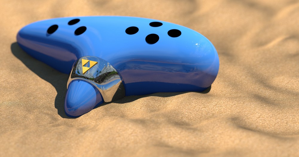


Two things jump to the eye: The holes don’t look like holes but rather like black discs glued on top of the ocarina. The metal ring is way too thick IMHO.
As for the sand, to increase the scale of the texture improves things but the shadows are too dark and the grains of sand lack of depth and variation. Add some particles instead of increasing the depth of the bump map. The grains should also sparkle a bit at this size. Just google some reference images.
Still, the 3rd image is nice. If only the holes were more realistic…
I agree with Kaluura,
Add a few random objects, cubes, icospheres and edit them to make them look like little rocks and particles of sand,
give them a few different colors and spread them out on the sand-plane using a particle system with a lot of random stuff, this will increase your rendertime offcourse, but adding in some geometrized sand really gives it so much more.
Yes, the holes need work. I would try to add a bevel to the edge of the holes to make it more rounded.
On a more design-related note: how could this ocarina ever work? I can’t see any openings apart from the holes for the fingers. You’d need some way to push air through it I think… I know it’s a video game ocarina, but the rendering style makes it look very realistic. the current design is contradicting the look.