Hello.
In blender 2.8 I am still hoping that the one column design for the properties is rethought.
I like the idea of having a one column properties design, but I don’t think it’s implemented well.
There is just too much horizontal space wasted, and having the text not align on the beginning of words makes it harder to read and it does not look that elegant.
Also, this design is not implemented in 3D view overlay and shading menus, so it lacks consistency there.
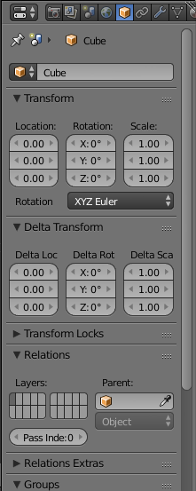
Also, what is up with the text on panel headers? When there’s a checkbox on the panel header, it forces the text not to be aligned. It just looks weird.
We always had a one column design on nodes, for example, and it is vastly superior in every way.
Am I alone on this?
These popover menus are mainly a grouping of checkboxes + corresponding labels.
I am still in favor of another alignment of text.
I don’t remember if it was already proposed.
But if I understand you correctly, you are proposing to mimic popover menus.
decorators then values then labels instead of labels | values | decorators.
I think it is unavoidable in a single column design.
What annoys me the most is that grid layout is increasing waste of space.
Subpanels headers are taking the whole width of editor like panels header.
I repeat it.
One column per panel is good for readibility. But if we want to have more panels visible at same time, solution coherent with that is columns of panels : not one grid per panel.
Well, it’s unavoidable, in any design, unless we go back to blender 2.4, where buttons were a complete mess, but filled everything…
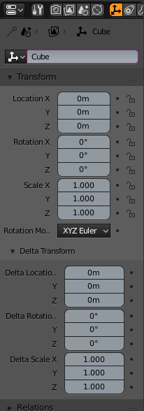
A little bit of empty space is alright. But notice that you can get the Node-like one column panel way thinner than you can the the current 2.8 design, without losing any readable information.
I agree. There are lots of weird cases like this one.
The rule of one half for label and the other half for value+ decorator results in a stupid unaligned separation, unreadable label for a value that will never reach a 2 digit number.
Here, two sliders arranged differently under same tab.
One with label inside readable.
The other one unreadable because it is grouped with Start/End values.
It would not be dramatic for comprehension of setting to have slider not part of group and label readable.
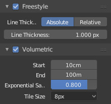
Under freestyle panel, it is same label that is used twice. First one is unreadable.
Using same dropdown list like for alpha of background would make it readable and unnecessary second one.
There are lots of things like that.
But 2.8 is still just an alpha.
There is time to modify the rule and avoid to follow it where it is not adapted.
“brita” has commit the modifications for “Single Column Layout - Suggestion to have text left-aligned” in this new branch to be reviewed: temp-ui-layout-2.8
Checkboxes. Maybe text aligned on the left, checkbox aligned in the right. Yeah, might be quite a gap between them in some cases, but then they’d align with number boxes (Label on the left, value to the right). Maybe the label and the checkbox could be within a different shade of a rectangle to visually connect them.
Also, if Checkboxes were on the right, the Panel labels would align. Currently, Labels of panels look kind messy, as some of them are notched because of a checkbox.
The Keyframe button on the right. Why do we need it at all? Just use a keyboard shortcut. The UI looks cleaner without them. Maybe they could be optional…
Also, this could be aligned. Some value boxes pop out:
The idea is a status icon.
Not just to add keyframes but to add an icon more meaningful than a color to explicit use of drivers and overrides, too.
I agree this should be aligned.
There is also something in brita’s screencaptures that should be fixed. It is label of dropdown lists.
Labels of buttons or on top of them but not labels of dropdown lists that are unreadable.
I should test the branch to see if it is more practical. What is the minimal width that is usable with that.
IMO, William’s panels are always two times too wide. We should be able to display 2 columns of properties by neglecting labels in that space.
We all agree that is unusable.
But honestly, you are already able to identify tabs by their icons.
You can identify panels by their first word.
To be usable, an expert, just need values with 3 digits after coma.
Add an option to hide labels in right click menu and you have something practical for advanced users at an extremely low width.
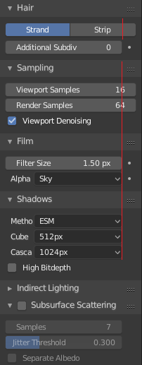
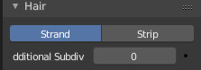
Are the buttons ‘Absolute’ and ‘Relative’ (‘Strand’ and ‘Strip’) either or? If so, a single click toggle button would suffice? Peg the width to longest text. Also, why not have the label to the right and the value box on the left. Left justified text is the norm, easier to read and can be gracefully concatenated when it hits the right margin…
I agree on that. As it is now it is a bit distracting and the information gain is not worth compared to the clutter it creates. (not only the border is shifted, but also the text fields gets misaligned.
I really like the way 2.8 is going, but in this particular case, the old solution (the color of the button changes) looks sharper and cleaner in my opinion.
In our layout system, we should make sure the labels are always the aligned the same, even if we don’t use the decorators for all properties, to avoid this kind of alignment mismatching. The way it’s coded currently makes this not so easy, hopefully we can solve that.
Now, that I have tested the branch.
I have to say that this ability to have narrow width for properties is great.
I simply can double number of settings displayed and things are readable.
For same width than default properties editor in default screen, I can completely eliminate the need to scroll by dividing properties editor in half.
I understand that is less beautiful but that is practical. More than Grid layout.
Although it would not be the choice by default, I would like to have it as an option.
That layout works for a multicolumn properties editor more efficiently than the rest.
Just let user make a vertical split and define column width proportions.
He would order panels to have something that make sense and be happy.
I’d say, if the user scales the properties wide enough, they could turn into two columns or more. Just like the Tool palette in the 3D view.
That would totally work.
Something as narrow is still usable. So, I am in favor to let user controls the width he wants according to panels that are OK. Panels with lists inside would be unreadable at this width.
In many discussions about Blender 2.8 I have to run into the arguments of “industry standard” guys that suggest why one or another thing should be in this or that way because most softwares work that way.
Now I’m wondering, is this really weird ordering and alignment to the right in current layout something that standard or some of these other programs have, and that is why it is being implemented?
as my personal opinion, having my Italianity to the bone I consider myself an obsessed esthete,
I consider this choice a regression, a loss of identity, a waste of space, an ass licking to styles that are not necessarily better.
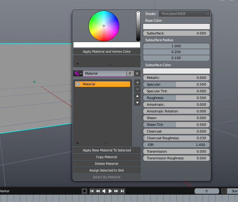
always as a personal opinion, if I had to be inspired by some style, in terms of space optimization, I continue to consider lightwave 3D the best one to inspire, by its nature much closer to blender, and where every single menu is willing to give a sense of zen, and large spaces available … also makes use of pop-up windows … that good blender user I do not look favorably, but at the same time, I consider the use of popups in 3d space, which are not overlapping windows, something really useful that only appears when needed … I’m thinking about the popup material menu that created @heavypoly in its customized version of blender …