Here’s one of my first attempts at Archviz .Hope y’all like it. Need help with your critique and advise.
7 Likes
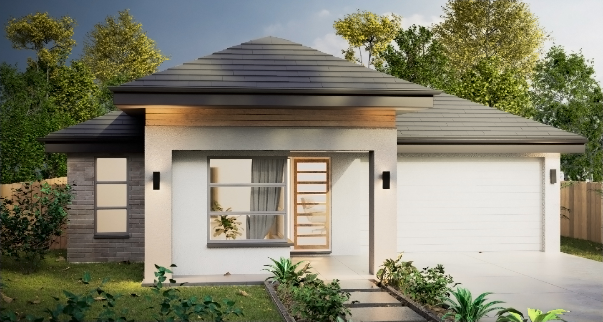
Howdy,
First off, this looks amazing. This is coming from someone who hasn’t touched ArchViz, so this is purely from an outsider’s POV.
Something is a little odd with the plants, but more so with some than others. I think they look somewhat like fake plants? Perhaps trying some translucency or subsurf?
The bricks on the left do look a little fake too.
But overall I think it’s a fantastic job you’ve done. Keep making more stuff, learn from your mistakes, and you’ll improve!
Hey - overall the result is quite impressive, trying exterior archviz is a next step in my learning process as well and I would be quite satisified if I would mange to get similar result 
There are some minor details that bring attention - like the view of the chair through the door - which I suppose was tempting to show as some point of interest but you usualy rather not see people sitting at their desks right through the main door 
Where I feel is the most room to improve is the lighting and still more micro details on the hard surfaces - the light fallofs at the roof and the front look nice but still some areas looks quite flat and a perhaps a bit too uniformly lit. I’m having tone of problems with this myself, with just setting some seemingly good HDRI I usually still somehow spend an hour or so tweaking the values and rotation and adding sun lamps cause I just have everything too bright or too dark with no pleasing shadows and balance…
The first thing that distracts is whatever is in the big window looks like something motion blurred. Lighting inside a home is rarely brighter than the outdoors, try making a bit dimmer inside. Where the house is painted white is clashing with the cream color either change the beige or change the white to give it more contrast. I would make the sidewalk slabs a bit more mat it’s a bit too marble slab and slippery.