'Orthographic' Lighting for repeating game tiles.

I’m trying to use blender to re-create some game tiles that I have previously created using Inkscape. I’m finding it hard to setup materials and lighting that allow me to tile the individual images together without noticeable seams or patterns, due to highlights, shadows, and reflections.

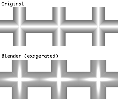
Image showing original tiled image and (exaggerated) blender version…


The images are pipe sections which are viewed top down in 2D and need to tile together. So any gradients need to match perfectly edge to edge.

I was hoping to take advantage of blender to create some depth, with shadows and highlights, similar to my original. With a view to eventually making better looking images with more interesting shapes and textures, and finally moving to isographic 2.5D images in the future. I’ve tried lots of things but I’m not sure if I’m missing something fundamental to allow this kind of use where highlights and shadows will match perfectly edge to edge.

I feel like I need “orthographic lighting”. I guess I’m looking for a “non realistic” image from blender which may not be possible. I’m mainly experimenting with cycles and have tried sun lamps of all sizes, different background settings, giant emission planes…

Any ideas if this is possible?

Thank you.

Attachments


I have different result here. Hope this is closer to your original.
http://www.pasteall.org/blend/27519

Thank you. That was the result I was trying to achieve… I will study your blend file to see how its done, and no doubt see where I went wrong! ( I Wonder if it could be the blender internal renderer thats getting the result, I was trying to use cycles because I had just spent a month learning blender with cycles!)

… I’m at a loss to know what I did wrong. Using your example, I can’t get it NOT to work now, switched to cycles, still works. I can only imagine I have some rogue setting that I picked up somewhere over the last month. I had spent a couple of days trying to get this to work with no luck, starting over a few times. Reading up on all the lamp types etc.

I shall keep investigating…

Ok, found the problem. I have been using cylinders with faces on the ends. I was in orthographic view and directly above so wasn’t going to see them anyway but it seems that having the end faces present and using the ‘smooth’ shading setting together alters the geometry slightly, seemingly making the ends very slightly narrower than the middle, causing the highlight pattern shown.

Thanks for your help!