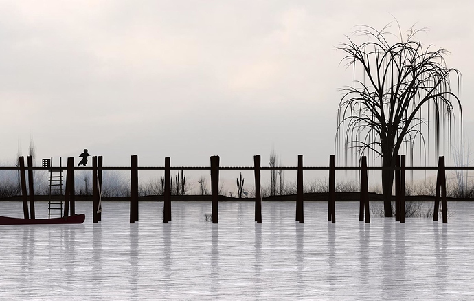
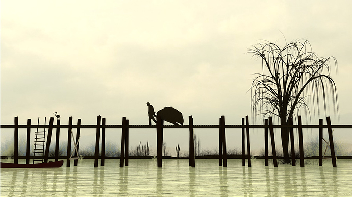
This is my third finished work, or at least I hope it to be so I really need some feed back. Do you get board, what do you not like, give me a skill ratting, i think i am a 6 out of 10 but I want to grow so give me the truth. How can I make this better. I would like to know as well out of the two what one you like better or maybe hate the least either or.
great scene, deep and well-made but it’s missing composition, read up on the rule of thirds and things like that, also, find what you want the focus to be, and add something to gude your eye to it, find the first thing a person will see, and make it point towards the focus
The bottom version follows the ‘Guideline’ of thirds in one aspect - the top of the walk-way is pretty much exactly one third of the way up. That guideline is not universal, and is occasionally useful (it was just one mans opinion circa ~1800, and plenty of masterpieces were conceived well before some people starting explicitly discussing composing in thirds). That said, the boardwalk works well at that height (lower pic), and the child might be better placed in the top pic if it were further to the right.
Hey jefferywvgd,
First of all I agree with Blender Matt:
For your two scenes you are following a horizontal composition that is balanced on both sides (tree on left, box, ladder, and canoe on right) and to me it works. One thing that bothers me are the crossbeams on your bridges and everything in your picture is a silhouet except your crossbeams and they show up against the supports for the bridge.
I like your second one better, it is more sepia toned and I personally like that, the first was a little too desaturated and silvery for me. The second one also has a subject that grabs my eye immediately, The child in the first one took a while for me to notice and didn’t hold my attention.
I really like the concept of both.
Hope this helps
i disagree, yes there are some basic rules, but one doesnt need to follow them strict. rules of 3 or 4 or natural numbers…
I believe this is a great scene almost real photo, for the lower, well just dont put the man in the middle, put him a bit more slightly off. The problem with putting something in the middle is that people always wonder if it is the middle or is it slightly off.
Especial some neurotic people hate such problems, therefor when i paint i usually keep in mind the middle as an invisible object.
Put everything where you like and keep in mind there already is an elephant in the middle … so that way you keep balance.
In some of my best works i keep the middle empty so people can wonder over the horizon; which usually is empty outdoors.
in short great work, for the first time here i see something that could resemble a painting, well done.
I like the monochromatic color scheme in the first image. I like the composition of the second image. In addition to the strong horizontal element, you have a nice diagonal working from the detailed mass of the tree branches, to the solid blocky silhouette of the man pulling the cart (?) down to the ladder and boat. The ladder and boat is a bit weak, the detail doesn’t quite match the detail of the tree branches. Maybe you could add some rigging, or increase the size of the hull, or something of that nature to put a bit more fusty detail down in that corner? You might also consider desaturating the horizontal elements in the far background, so they don’t read as the same distance as the pier.
I’m not going to give you a skill rating. They really are pointless. You are here to improve, not to get a grade. Post your work, get critiques, improve your work, rinse and repeat. When you can’t find anything to improve, or the advice you get just makes things worse (hey, it happens…) call it a day and post the finished product in the Finished Forum.

