2.2 if you are on Windows and/or Linux/Mac when calibrated for 2.2? 2.2 being the standard for sRGB? As a Linux user should I be calibrating my CRT’s / TFT’s to 2.2?
Output Gamma.
Gamma correction performed on renders, to match gamma of the operating system. Windows systems are calibrated for gamma 2.2, while Mac and Linux are calibrated for 1.8.
Input Gamma.
Inverse gamma correction performed on render input, which are textures, shader colors and light colors, so the render engine can work internally in the linear space. Gamma input value should be equal to output gamma, unless you a looking for gamma correction effects.
ah, my apologies. I was not aware Yafaray already applied a gamma correction and/or BlueTygr had accepted the defaults. I think he used all procedural textures, so those are linear like the rest of it.
Regarding texture images as input, if images are not in a sRGB colour space do they get converted to linear assumed to be sRGB.
It’s often mentioned about using hdr’s as image textures, as there is no dcraw implementation in blender, if camera raw files were converted to linear .exr’s with something like qtpfsgui would they pass straight though blender 2.5 + colour management.
As a Linux user should I be calibrating my CRT’s / TFT’s to 2.2?
Yes.
Output Gamma.
Gamma correction performed on renders, to match gamma of the operating system. Windows systems are calibrated for gamma 2.2, while Mac and Linux are calibrated for 1.8.
That’s funny. I just privately replied to someone who had the same misconception.
The Mac OSX has its own color management and this gamma 1.8 can no longer be assumed true. The old Mac OS, previous to OSX had a manufacture gamma correction of 1.8 through a lookup table. That is not the case anymore. When I developped on the mac between 2004 and 2007, My HD cinema display had a gamma of 2.2 following the sRGB standard.
Concerning Linux, I don’t think there are any standard body in the Linux world that is there to fix Linux gamma systems for everybody. Every Linux user is pretty much his own master when setting the monitor gamma just like on Win. There was a time when Unix workstations coming from SGI and HP had a manufacture set gamma of around 1.8 I think. But unless you are still working on one of those workstations, you cannot assume anything about your Linux system. You should use at least a gamma chart to check the actual gamma of your monitor instead of assuming some non enforcible values.
Even people using monitor calibration devices still have the choice of the gamma for their monitor. Most people working in the printing industry like to set their gamma to 1.8 because what they see on the screen is nearer to what will be printed without any color correction. But this is an archaic and not very serious way of working now that color management is available not only at the OS level but also in about every paint or graphics applications.
Input Gamma.
Inverse gamma correction performed on render input, which are textures, shader colors and light colors, so the render engine can work internally in the linear space. Gamma input value should be equal to output gamma, unless you a looking for gamma correction effects.
Input gamma value should be equal to the device that produced the image in the first place. If you are using a digital photo, there it is definitely safe to assume a gamma of 2.2. For color values that are picked on the screen through color palette or color widgets, then the gamma correction should be that of the screen. So if the screen gamma is 1.8, then the inverse correction for texture colors should be 1.8. For this reason, it complicates the matter considerable if your monitor is set with a gamma of 1.8 because you have to apply a different gamma correction for your material colors than for the textures that are coming from photos.
Of course, RAW or HDR photo data are already linear and should not be further gamma corrected on input.
No. That is a misconception. Procedural textures are in the color space of the screen that was used to design them so they are not linear. If the procedural textures were designed on a monitor with a gamma of, say, 1.8, then the color space of the procedural has a gamma of 1.8 and this should be inverse corrected too before passing it to the renderer.
I’m more confused now that I know that Operating Systems can make a difference(?). I was thinking it would be more of a screen issue, with a more obvious example being that CRTs are often very dark compared to my laptop where more colours can be told apart.
My Nvidia controls (using Ubuntu) are set to gamma=1.0. Changing them to 1.8 makes blotchy images.
Yves, thank you, I was reading that 1.8 for unix was outdated but I was unsure if Linux generally had done what Mac had and moved to 2.2. I shall take a closer look at my setup.
Yup. You are obviously confused :eek:. The gamma thing is indeed a display issue. And all you need to do is make sure the display has a gamma of 2.2. You would adjust the display gamma with your NVidia controls. But the gamma value in the NVidia control does not tel you your monitor gamma. It only tells you how much gamma correction is applied. Normally, in a system properly configured, the NVidia control gamma should read 1.0. Your display should naturally have a gamma of 2.2. So if that is the case, you would normally not need to change anything. The cheapest way to know your monitor gamma is to use a gamma chart such as the one available on Norman Koren web site. That said, if you have a cheap LCD monitor that changes gamma as you move your head around, then forget about all this gamma correction stuff. It is just hopeless.
Ok, so the gamma guy’s not just in my thread, he’s running it! Again, just kidding, Yves. Keep up all that good gamma-correcting work. I am but a humble chemist and am totally lost at this point. I tried to adjust my monitor once. I couldn’t. Which reminds me that my renders will probably look alot darker on your screens than mine.
Just added some details. I’m in a little bit of a time crunch here, so I’ll jump in on the whole gamma thing when I have time. Again, my renders will show up darker on your screens than mine…and this one is a little dark on mine.
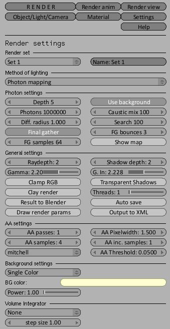
I’ve attached the render settings for this one too if yall wanna puzzle over em. I turned both the gamma numbers up to 2.2 (cuz that’s seems to be the number out there right now) and I don’t think I like it. Let me know what you think about the lighting (not just the gamma). Thanks
The color of the background should be bluish. You can put an arealight outside in front of the windows and very close to it, pointing inside, with the same background bluish color and with same the size than the windows. It will shoot some photons inside, simulating sky lighting.
Test your lighting components separately: start only with the sun light in direct lighting, and change its color and power untill you have a consistent result. In a second step, disable the sun light, enable photons & final gathering with the arealight and the background color and tweak it untill you get a lighting like at dawn but before the sun appears. Then enable the sun and see how they mix together. Increase sun samples a bit.
A better wood texture, using a coated glossy material for kitchen boars would improve your render, also some subtle beveling would be nice in the kitchen marbre. Using fresnel reflection would be more realistic.
Put more detail in objects the closer to the camera they are
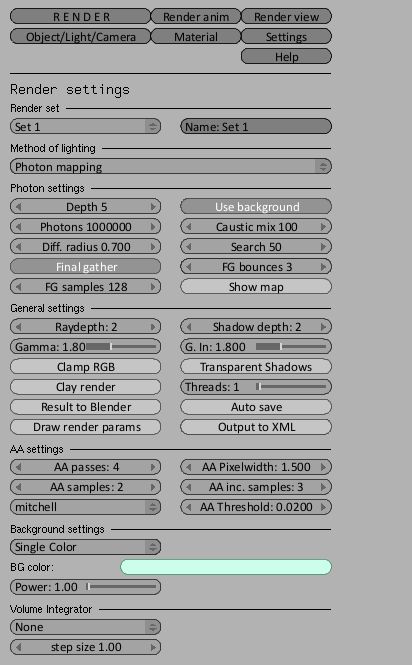
There are some sampling errors you should try to solve, I’m not very keen on the ceiling patch of caustics, it seems a photons leak to me. Be sure the walls have some real thickness and the box must be closed except fron the windows. Increase photon count another million, and reduce Radius a bit and search as well, like Diff. Radius 0.70 - Search 50
There is white dots in corners and below the upper boards on the left.
Use a different sampling strategy, with more FG sampling (256), less AA samples (2), more AA passes (5), and more AA inc. samples (5), reduce AA thresold to 0.1, and reduce filter size to 1.1 for instance.
You’re definitely on your way to a great render! What’s really missing here isn’t so much the detail such as buttons and number of objects, but detail with the modeling/texturing. This usually separates the good ArchViz renders from the great ones. Most appliances have subtle nuances in them that add interest, and a little bevel or relief on the surface can go a long way along with details in texturing. Around the dials on the oven you could add a texture for controls, and on the counter adding a slight bevel or nice contoured edge could really help. Heading over to CGTalk to look at some of the renderings over there might help too–I know getting inspiration was one of the things that really helped me improve.
Well, back on topic. Gamma aside, There are two main suggestions I would like to make. 1) Bevel your counter and 2) use a rougher surface for the counter. It is way too smooth and reflective like a mirror.
While I would agree that the counter is too reflective, I wouldn’t say that it’s too smooth (maybe doing slightly blurred reflection, but that’s it). Bump up the fresnel on it, and you’ll get a nice falloff that looks more like real marble. All around though, it needs softer corners
OK, thanks for all the helpful feedback. I’ve tried to take most of your advice without working my tail off (this was supposed to be low priority project…). The toaster has been informed that’s location was in violation of Mr. Newton’s Law of Graviation and has ammended it’s behavior accordingly. Unfortunately a new set of woes has beset me. The biggest woe was that Alvaro’s amazing render settings bumped my render time somewhere upwards of 5 hrs which is disgustingly not worth it for this project. All the same, thanks Alv, I learned stuff which I guess is the point here.
In addition, the faceplates appear to be hovering in front of the wall instead of connected to it even though this is clearly not the case. And the bevel I added to the counter didn’t really show up and it’s still too shiny…
I’m thinking about calling this one finished, not because it is, but because I am not interested in taking it much further (we are in the finished projects forum ). I might do one more render…

 I am but a humble chemist and am totally lost at this point. I tried to adjust my monitor once. I couldn’t. Which reminds me that my renders will probably look alot darker on your screens than mine.