Hi all,
I’m trying to create realistic interior scenes but I don’t know what I could do to improve my renders. The main goal is to make it look as realistic as possible. Hope you have some tips for me, thanks.
Here my latest work:
Hi all,
I’m trying to create realistic interior scenes but I don’t know what I could do to improve my renders. The main goal is to make it look as realistic as possible. Hope you have some tips for me, thanks.
Here my latest work:
Plants, dust, something you have on your desk… or on the floor  (This shelf is useless because it’s almost empty.) … maybe a cat
  … nice so far
Edit: after seeing this An interior - just for fun and learning i recognized what i was worried about: the inner lights are on but there is bright light in the windows… okay the shelfs are also almost emtpy ans the open window with sun is super vfx and maybe for architectural render not so wanted but a blurry bush outside and/or the silhouette of the next building…
Hey, thanks for your feedback. I tried to copy this reference image:
Thats why I didnt use plants and the desk is also pretty empty ![]()
I tried to add some dirt to the floor but it doesnt look so good:

ahhh… then you may have just said this because i think while toggleing the two this quite nice… interesting to see that the even brighter sun and additional light spheres does make such a different in the original composition… and i notice: the mirror !!! what a nice trick (have to remember that) to make the room bigger… okay more work because of the mirrored room… but just an image of a room to test it could be… almost a solution…
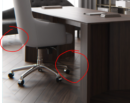
Overall, you did a very good job reproducing the reference image. I’ll upload an edited image of your render to point out the specific spots and areas you can improve, imo, in order to boost your realism.
I really hope this helps. Your lighting setup looks quite good and accurate, compared to the initial image, so these little details might help you a bit, the floor being the most important element of all.
Hey, thanks for your feedback. Nice tips, I’ll try it 
run it through the math power node