Must be an awesome house if you have trees in it lol.
Hahahah. Not inside, you know what i mean. I don’t know how to say that. Hahahaha. Hmm… In the yard.
I think i need to think more my ideas before post them. Haha.
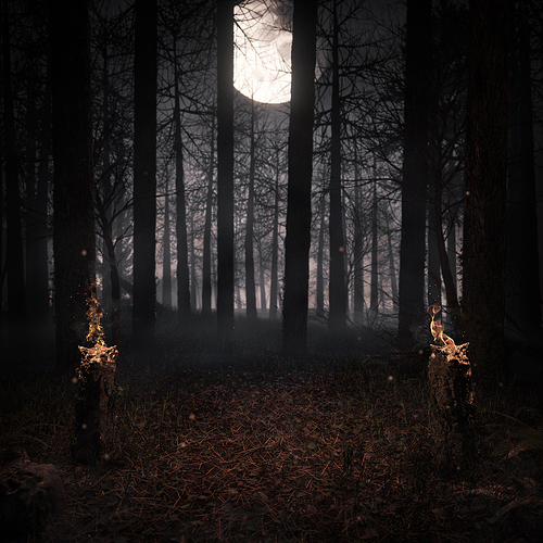
Your night forest render has come a long way, szapata93! It is looking very good, I like the additions you’ve made from the original starting point.
I agree that the mist seems a little bit bright and seems to take away a bit from the light from the flames. I would try either lowering the mist/sky brightness slightly, and/or shifting it into the blur/green a little bit.
However, really great work so far!
Hey James! Thanks, i’ll try that
I’m agree with you. The mist looks bright because of the linear light blend node, i can make it look better by lowering the mist. Soon i’ll update the render. Nice to read your your suggestions. Thanks, James Candy!
Cool project. It’s looking really good. If I could offer any opinion I’d suggest maybe randomizing the illuminated undergrowth a bit more, as it looks just a little repetitive.
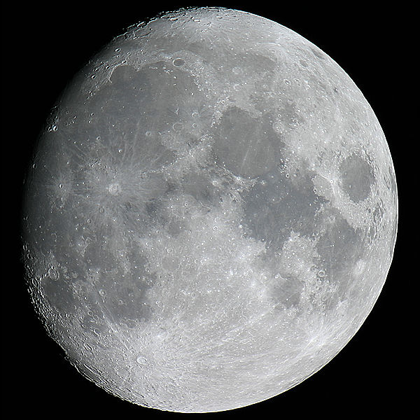
Just from a purely astronomy background, the moon is much too large and shows too much contrast. Think of it as the size of your thumb held at arms length. The dark shades this shows on the lunar surface are actually just a slightly darker shade of grey.
Normally those flames would ruin your night sight and drown out most of the rest of the image. But it’s art, so…
Thank you, rjshae. i’ll see what i can do for the flames and the moon. i’ll upload a new render soon.
You’re going for realism, I would suggest scouring the internet for coniferous trees you like for the scene, masking out what you need and swapping the background 3D mesh trees with it. It would probably give a much more realistic result since realistic trees are really difficult to make in 3D, especially with Sapling. They don’t seem to need much postpro work since they are mostly black, lit from behind.
But really, it looks great and realistic, it’s only the background that takes me out of it
Also, it seems like the plane you have used for the foggy effect in the background has a pretty harsh edge with the ground, try adding a bit more layers of fog, just at the ground, this will also give more of a mist-creeping-along-the-ground feel
Thank you, mStuff i’ll add those things.


