Playing around with a bit of custom theming

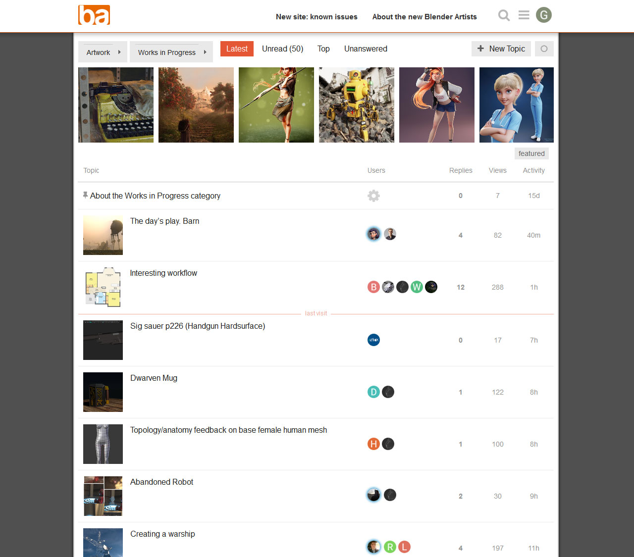
Since some people have been grumbling about the Categories page, and since I wasn’t keen on the default layout either, I’ve done a bit of messing around with it. It’s starting to look more like a useful page to me now. YMMV.

Note that this has not yet been checked for cascade problems due to re-use of classes elsewhere in the app, but IMO it starts to sort out the Categories page anyway. Will check more stuff later when I can be bothered.

Edit: Obsolete code removed.

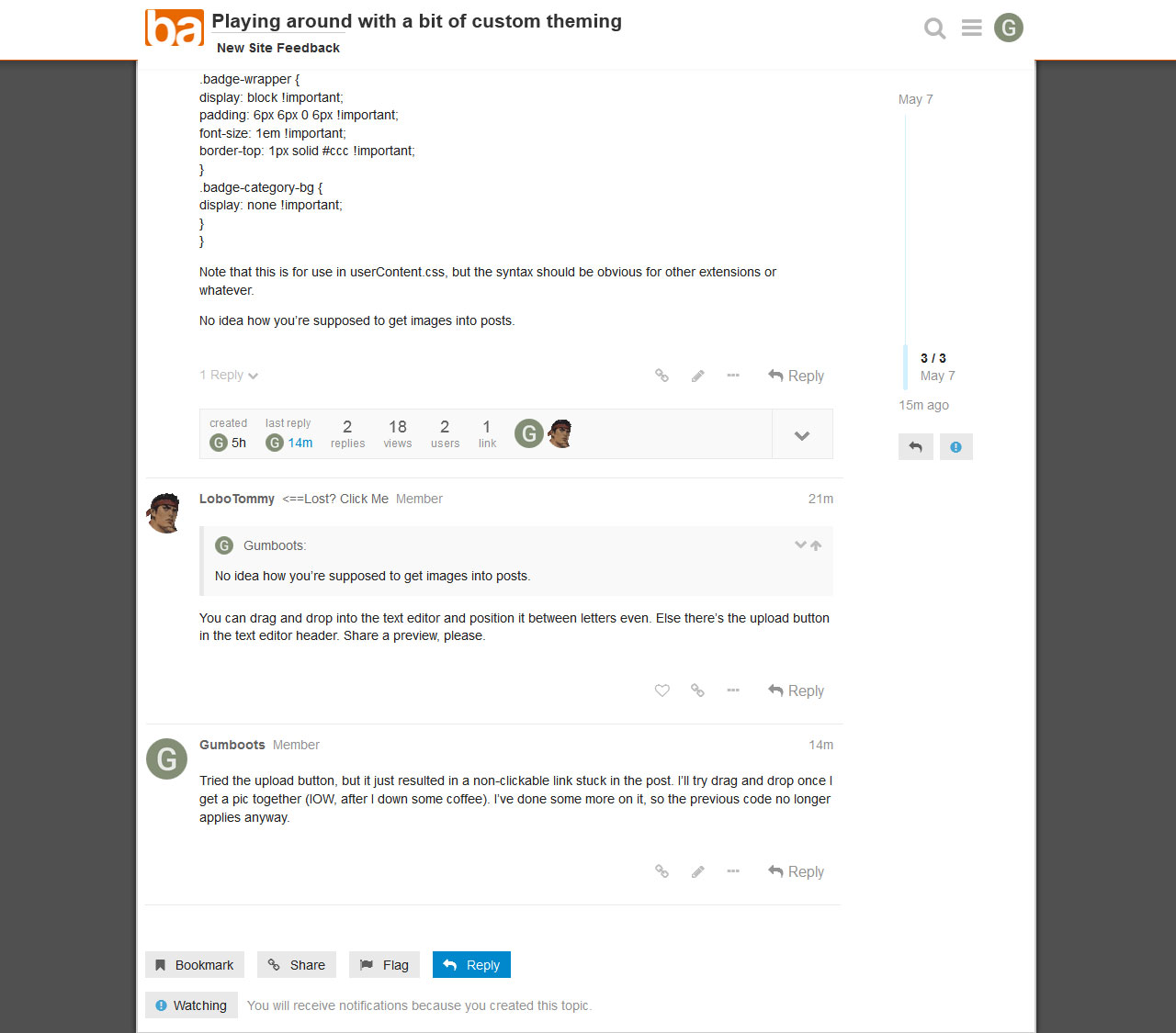
You can drag and drop into the text editor and position it between letters even. Else there’s the upload button in the text editor header. Share a preview, please.

Tried the upload button, but it just resulted in a non-clickable link stuck in the post. I’ll try drag and drop once I get a pic together (IOW, after I down some coffee). I’ve done some more on it, so the previous code no longer applies anyway.

Ok, bear in mind this is quick and rough WIP, and for my preferences on desktop.

If you want the current code, this is it. Runs on top of the current default light theme.

@-moz-document domain(blenderartists.org) {
	body {
		background: #505050;
	}
	.wrap {
		max-width: 960px !important;
		background: #fff;
		border: 2px solid #ccc;
		box-shadow: 0 0 6px #111;
	}

	.d-header.clearfix>.wrap {
		border: none;
		box-shadow: none;
	}
	.panel-body {
		max-height: 12em !important;
		overflow: hidden !important;
	}
	.categories-and-latest {
		flex-flow: column-reverse nowrap !important;
	}
	.categories-and-latest>div {
		flex-direction: column-reverse !important;
	}
	.latest-topic-list {
		height: 10em;
		overflow: auto !important;
		resize: vertical !important;
	}
	.badge-wrapper {
		display: block !important;
		padding: 6px 6px 0 6px !important;
		font-size: 1em !important;
		border-top: 1px solid #ccc !important;
	}
	.badge-category-bg {
		display: none !important;
	}
	.panel-body-contents.clearfix .notifications,
	.category-list>thead, td.topics, #suggested-topics {
		display: none !important;
	}
	.category-list>tbody {
		border-top: none !important;
	}
	td.category {
		color: #444 !important;
		border-top: 3px solid #e9e9e9 !important;
		border-left: none !important;
	}
	.subcategory {
		line-height: 1.7em !important;
	}
	.subcategory>.ember-view {
		float: right;
		line-height: 2.2em !important;
	}
	.thumbnail {
		max-height: 152px;
		max-width: 152px;
	}
	.topic-thumbnail .thumbnail {
		max-height: 80px;
		max-width: 80px;
	}
	.timeline-container {
		margin-left: 820px !important;
	}
	.timeline-container>.topic-timeline {
		margin-left: 0 !important;
		width: 100px !important;
	}
}

Oh yeah: the latest posts section on the categories page is expandable (resize: vertical for CSS nuts). I’ll throw a min-height on that too.

I like it compact by default. I can easily stretch it out to scroll through all the recent stuff if I want to.

And I dunno why Discourse chopped the code formatting after the first couple of declarations, but CBF’d trying to figure that out at the moment.

Is that with Markdown or something else?

A line with just three `, before and after the code, should give you:

code
1 Like

That’s just standard CSS running in my browser’s userContent.css file. But IIRC most browsers don’t support that these days, so you’d probably need an extension of some sort.

Thanks for the reminder about the code tag syntax. I haven’t used Shithub for yonks, so that detail had slipped my mind.

The Markdown reference was about how you wrote the reply. The editor seems to support multiple things. BBCode code tags also work, it seems, yet differently.

code

No color.

I know it’s CSS, and already using some tricks of my own, that I also pasted in different threads.

Not bad. Gets quite close to the old main page.
To bring it even closer I’d:

  • Drop the latest feed / box, keep it to its own page.
  • Add the last active thread of each sub forum (Latest News - Off Topic) left justified on the same line (possibly truncated), or below sub forum label (better for mobile?). One or the other though, don’t mix.
  • Make those thread links dump users at latest post as before.
  • Drop the unread / new info.

The two tone alternation between Categories (General - Misc) that’s current works, but @rawalanche ManuelGrad and @IkariShinji also made nicely separable designs here: Suggestions for category color codes?

Anyway, keep them coming @all. Compete, collaborate, poll for feedback, the site’s obviously receptive to considered change.

I’m not trying to get it as close as possible to the old theme. I’m just messing around with ideas, and I haven’t taken it far yet.

I’ll take a look at what the other guys have done.

That’s fair enough, just describing a mockup based on yours that may appease some hoping for the familiar.

Bugfix. Code is now this:

@-moz-document domain(blenderartists.org) {
	body {
		background: #505050;
	}
	.wrap {
		max-width: 960px !important;
		background: #fff;
		border: 2px solid #ccc;
		box-shadow: 0 0 6px #111;
	}
	.d-header.clearfix>.wrap {
		border: none;
		box-shadow: none;
	}
	.panel-body {
		max-height: 12em !important;
		overflow: hidden !important;
	}
	.categories-and-latest {
		flex-flow: column-reverse nowrap !important;
	}
	.categories-and-latest>div {
		flex-direction: column-reverse !important;
	}
	.latest-topic-list {
		height: 10em;
		min-height: 10em;
		overflow: auto !important;
		resize: vertical !important;
	}
	.badge-wrapper {
		display: block !important;
		padding: 6px 6px 0 6px !important;
		font-size: 1em !important;
		border-top: 1px solid #ccc !important;
	}
	.badge-category-bg {
		display: none !important;
	}
	.panel-body-contents.clearfix .notifications,
	.category-list>thead, td.topics, #suggested-topics {
		display: none !important;
	}
	.category-list>tbody {
		border-top: none !important;
	}
	td.category {
		color: #444 !important;
		border-top: 3px solid #e9e9e9 !important;
		border-left: none !important;
	}
	.subcategory {
		position: relative;
		line-height: 1.7em !important;
	}
	.subcategory>.ember-view {
		position: absolute;
		right: 0;
		top: 0;
		line-height: 2.2em !important;
	}
	.thumbnail {
		max-height: 152px;
		max-width: 152px;
	}
	.topic-thumbnail .thumbnail {
		max-height: 80px;
		max-width: 80px;
	}
	.timeline-container {
		margin-left: 820px !important;
	}
	.timeline-container>.topic-timeline {
		margin-left: 0 !important;
		width: 100px !important;
	}
}

Half the !importants probably aren’t needed, but at the moment I’m just walloping things without getting fussy about optimal CSS.

Here’s the way I went(using stylus in firefox):

.wrap{
    max-width: 96% !important;
}

.timeline-container {
    top: 5em !important;
    margin-left: 90% !important;
    float: right !important;
}

.timeline-container>.topic-timeline {
    top: 10% !important;
    margin-left: 0 !important;
    width: 100% !important;
}

.posts-wrapper {
    position: relative;
    /*
    Still need to figure out how to make
    posts span site-wide from left to right
    man I've gotten rusty...
    */
}

Lol at the last declaration. :smiley: Yeah, me too. But if you make the posts full width won’t that conflict with the timeline slider?

And I usually run my windows at full screen size, which is why I wanted forum content restricted to something readable. 1900px long strings of text are too hard to parse, particularly if there are long paragraphs.

Once I figure out how to make it span full width I’ll add margins/padding in.
About 4% for the left side and about 10% for the right should suffice. :slight_smile:

Div class .topic-body has CSS restricting it to 690px wide. That should be your culprit. :wink:

Ah, there it is! With that might not even need to do anything else, just settled for 88%:

.wrap{
    max-width: 96% !important;
}

.timeline-container {
    top: 5em !important;
    margin-left: 90% !important;
    float: right !important;
}

.timeline-container>.topic-timeline {
    top: 10% !important;
    margin-left: 0 !important;
    width: 100% !important;
}

.topic-body {
	width: 88% !important;
}

Works for me but most people probably wouldn’t like this. :wink:

That’s the wonderful thing about custom CSS. You don’t have to argue with any other bastard.

Back in the bad old days I sometimes used to try and make themes please a bunch of people. Dunno if you’ve ever tried it, but it drove me nuts. Everyone wants something different and they never agree with each other.

Pleasing yourself and ignoring everyone else is much easier on the brain. :smiley:

1 Like

Indeed it is.

1 Like

I think I’ll play around with the featured row up top. I reckon I can tweak the CSS so it scales to any screen width. I’m damned sure I could do it if I was writing the entire thing from scratch, but I think I can still do it on top of what’s there (which for some daft reason has inline styles locking in the thumbnail size. D’oh).