True, their mobile theme is optional, but enabled by default. We could switch that off, but we’d need to do some pretty heavy testing before doing so 
I’m not sure about discourse but in vanilla you can either have 2 different themes, 1 for desktop other for mobile OR there is a line that can be inserted in addon.json to indicate that a desktop theme is also mobile friendly.
But again that applies to vanilla which is what we use for godotdevelopers.org - I’d hope the same is possible on discourse as well.
Probably best not to. I’ve had a quick play with Firefox dev responsive options, and it’s a bit odd what Discourse picks as “mobile” or “not-mobile”. Still, now that I’m aware of it and can see both stylesheets and both sets of markup I can work with it to some extent.
The catch is that I simply don’t browse on phones, so I’m not a good person to design interfaces aimed at them. I’d probably limit myself to only tweaking colors and content for visual balance on the mobile theme, or any details that phone users thought could be improved over the default. IOW, I’d be doing the cursory minimum on the basis that “if it aint effed”.
Me no savvy Discourse back end stuffz. Not that it matters much. It’s a bit of a mongrel for testing because I’m going to have to have two different sheets in Stylus and swap between them.
What Discourse is doing is changing the class of the root HTML element according to user agent, but the class of the html tag isn’t shown within the mobile or desktop CSS anyway. It’s just declared as html {stuffz}. Yet somehow it’s pulling mobile or desktop CSS bunnies out of the relevant hats. I think the sane option is to not care how it selects bunnies, and just shoot whichever ones pop their heads up. 
ye-yeah. My point being it might be possible to get away with just using the ‘give me desktop version’ toggle in mobile browsers.
Yeah but people won’t do that. They’ll just bitch about what they’re served, and then bitch more if they’re told to click a button. Best to head them off at the pass. Less trouble. Serve them a bog standard phone interface and they’ll just accept it.
No, I mean for your testing you might be able to get away with it so long as for the final theme plugin/add-on that gets up loaded to the server will be able to declare to discourse that hey I'm mobile friendly so when I'm selected don't serve any special mobile theme.
edit:
having googled a bit I don’t think discourse is as accommodating. But hey at least it’s easier to make style-sheets user select-able.
In vanilla I’d probably have to write a plugin to enable users to change the style-sheet for themselves(by default it would be possible for admins to chose different/optional style-sheets in a theme, but only through the admin dashboard, uggh. Luckily everything is an add-on and they are easy to develop).
Some forums (SMF is one) have built-in support for theme variants with user-selectable stylesheets. That sort of stuff is fine for picking your favourite presentation when you’re logged in, but less appealing for anyone who is just taking a quick look without logging in. Their preferences won’t be served because the app won’t know who they are, so they’ll just get the site default. And having to go to a theme selector every time they visit tends to annoy people.
Anyway, I think keeping the Discourse mobile theme is the saner option here. Like I said, I don’t really trust myself to do interfaces for phone users. I’m fine with tweaking it to make it better if people can specify what they want tweaked, but it’s not something I’ll ever use myself.
2 Likes
I’ve been trying a few browsers out.
I can run MS Edge on Android but unfortunately it is, as you’d expect from a Microsoft browser, a bog awful thing to deal with. No support for custom CSS at all. Even IE6 supported user stylesheets as an accessibility option, but Edge doesn’t have anything comparable. This means the only ways to test themes in Edge are to a/ run them as live betas on site or b/ set up a local server with a virtual machine and Linux and Ruby and Discourse and whatever else is required, then test on that.
Opera is, as I personally always expected from Opera due to dire experience, another bog awful thing to deal with. It will run the Stylus extension on desktop but, being Opera, the browser itself has some highly unusual rendering quirks. The team behind Opera are the underpants gnomes of web coding:
1/ Collect code.
2/ …
3/ Browser!
Short version is that CSS positioning is broken in some instances. Whoopee! 
So, Chrome. That can run Stylus too, but you can only get it by jumping through all Google’s of We-Want-To-Own-Your-Soul-And-Monetise-Your-Arse hoops (but hey guys, don’t be evil). Am still debating whether or not I want my arse monetised this week.
From memory Chrome was always more sensible than Opera, and even though they both run Webkit these days I would hope that the Opera version has been wonderfully screwed in that unique Opera way while the Chrome version has remained sensible.
Browsers.  Remind me again why I gave up theming for fun years ago…
Ahahahahaha! Right? I’m working on a new theme for godotdevelopers.org and testing with firefox and opera right now. So totally true, already ran into some bizzarro things, but hey get them resolved and you probably have an overall more compatible theme, right?
Well yeah, but if they made all browsers work the same we wouldn’t have this bother.
Anyway I got it sorted. There was only one glitch so far. Opera was insisting on setting absolute positioned anchors directly inside a table cell in relation to the whole table, when the table row was the element that had the position: relative; on it and the whole table was the usual position: static.
So you might think, in your innocence, that the anchors would be set in relation to the nearest parent element that had relative positioning but no, Opera wanted to ignore that and go looking for the (position: static;) table tag.
Why? Underpants gnomes. 

So I made up a basic html test case with the same markup (to test with things I can’t run Stylus on) and went through my memory banks and remembered some other odd things, then tried it without setting a top or bottom positioning. This made Opera behave, more or less, in that at least they were in the general vicinity of the correct table row. Left positioning doesn’t seem to screw that. It’s only top or bottom that sends them into space.
After that, a bit of playing around with vertical-align and paddings got the mongrels where I wanted them. It now works, in FF on desktop and Android, and Opera ditto, and Chrome on Android, and Edge on Android. Haven’t tried Chrome on desktop yet, but probably don’t need to.
And underpants gnomes are evil.
1 Like
Naaaaaaah, just a tad bit Vampiric.
By the way, I was checking all the devices that FF will emulate in responsive mode, and seeing how Discourse treated them. Short version is that the desktop theme will never be seen by anything less than 768 wide (when corrected for DPR). Anything smaller than that will be classed as mobile, and be served the mobile theme.
So desktop testing doesn’t need to go below 640 at the lowest. That would still allow desktop users to have two 50% windows on a 1280 monitor, which should be more than adequate.
1 Like
I’ve been trying stuff on the old tablet and found out two things. First is that the latest post list in a drop menu automatically gets converted to click-to-open on Android, instead of the hover operation it has on desktop. I don’t know if it’s Android doing this or if it’s Discourse, but it’s very handy anyway. It’s actually more usable on tablet than on desktop at the moment.
The second thing is that the hover expand on thread thumbnails in the Artworks category doesn’t work on Android at all. Which is weird, because it’s basically the same coding as the latest posts list. Not that it’s essential to have on touchscreen, but it would be nifty to have it working. I may be able to get it working with a bit more CSS trickery, if I can fool Discourse/Android into thinking it’s a drop menu.
I’m listing the data here for FF responsive mode in relation to a standard desktop monitor, in case it’s useful for anyone else’s testing. This gives the zoom factor on desktop to match the real life sizes for emulated devices, so I can get a better idea of how the interface will actually look on them if I’m testing on desktop.
My monitor (ASUS 24 inch)       N/A          N/A    N/A     N/A     1.0     24.10 inches      94    1920x1200        94            100%
____________________________________________________________________________________________________________________________________________
                            Discourse coding        FF responsive mode       Actual device specifications       Relative to my desktop
Device name                 html tag CSS classes    Wres    Hres    DPR      Screen size     ppi     Internal   Relative ppi    Zoom factor
____________________________________________________________________________________________________________________________________________

Amazon Kindle Fire HDX 8.9  desktop-view    touch    800    1200    2.0      8.90 inches     339    1600x2560       170             55%
Apple iPad Air 2            desktop-view    touch    768    1024    2.0      9.70 inches     264    1536x2048       132             71%
Apple iPad Mini 2           desktop-view    touch    768    1024    2.0      7.90 inches     326    1536x2048       163             58%

Samsung Galaxy Tab A        desktop-view    touch    768    1024    1.0      8.00 inches     160     768x1024       160             59%
(my old cheapo tablet)
____________________________________________________________________________________________________________________________________________

Apple iPhone 6 Plus         mobile-view     touch    414     736    3.0      5.50 inches     401    1080x1920       134             70%
Apple iPhone 6s             mobile-view     touch    375     667    2.0      4.70 inches     326     750x1334       163             58%
Apple iPhone SE             mobile-view     touch    320     568    2.0      4.00 inches     326     640x1136       163             58%

Google Nexus 4              mobile-view     touch    384     640    2.0      4.70 inches     318     768x1280       159             59%
Google Nexus 5              mobile-view     touch    360     640    3.0      4.95 inches     445    1080x1920       148             64%
Google Nexus 6              mobile-view     touch    412     732    3.5      5.96 inches     493    1440x2560       164             57%
Google Nexus 7              mobile-view     touch    600     960    2.0      7.02 inches     323    1200x1920       162             58%

Nokia Lumia 520             mobile-view     touch    320     533    1.5      4.00 inches     ***      480x800       167             56%

Samsung Galaxy Note 3       mobile-view     touch    360     640    3.0      5.70 inches     388    1080x1920       129             73%
Samsung Galaxy S5           mobile-view     touch    360     640    3.0      5.10 inches     432    1080x1920       144             65%
Samsung Galaxy S7           mobile-view     touch    360     640    4.0      5.10 inches     576    1440x2560       144             65%
The same deal can be done with any desktop. It’s just desktop PPI divided by logical device PPI (ie: physical device PPI corrected for device pixel ratio). If you can’t find the PPI specs for your desktop monitor, it can be worked out like this:
w/[(w / ((w^2 + h^2)^0.5)) x (size in inches)]
where h and w are monitor res in pixels.
I just learned something. Turns out it was Android that was converting the latest posts list from hover operation to click operation. So, after thinking about it, I’ve managed to trick Android into treating the expandable topic thumbnails as drop menus too. They are now click-activated on Android. 
The original code for the expandable thumbnails had the anchor around the thumb set to position: absolute; but the .topic-thumbnail div around that was set to position: relative. In other words, the div wasn’t something that could be a drop menu wrapper. It seems that if you try to make a bare link (anchor) a drop menu then Android will just treat it as a bare link, and will refuse to apply any repositioning or resizing.
To trick Android into treating it like a drop menu, the anchor has to be wrapped in another element that is set to position: absolute;. Presumably the logic is that if links are wrapped in something that has absolute positioning, then it’s a drop menu, which makes sense given how they are usually coded. So the .topic-thumbnail divs now have absolute positioning, with the anchors just being default static positioning inside them.
I’ve also added a ::before pseudo element (absolute positioned) on the anchor. This has the advantage of providing a fixed extension of the link, and a visual indication of the fixed extension when the thumbs are shifted and expanded, without extending the expanded anchor over any of the other thumbs. The only areas that are linked are the thumbnail images and the grey ::before pseudo. This will make usage more convenient on desktop, when the expansion is hover-activated.
This works perfectly in the basic test page, so just needs to be transferred to Stylus for use online. 
Hey would someone who has an iPad mind giving this a test run for me? It’s just a basic HTML file with a bit of CSS and a few images, so should run straight from any local folder.
The notes in the HTML comments explain things.
<!-- This has been tested on Android, but not tested on an iPad. -->
<!-- It works on Android with Firefox, Opera, Chrome and Edge. -->
<!-- It needs a guinea pig who is willing to test it on an iPad. -->

<!-- On an iPad the topic thumbnails should expand on click, but -->
<!-- without activating the link to the fake topic header. Thumbs -->
<!-- should contract again if you click outside the thumbnail area. -->

<!-- The link to the fake topic header should only be activated if -->
<!-- you click on the expanded thumbnail, or one of the other links. -->

<!-- NOTE: To test this on desktop, with hover activation, change -->
<!-- the second class for the html tag from "touch" to "no-touch". -->
<!-- That is how Discourse handles the classes anyway, and it means -->
<!-- CSS can change rendered markup via the use of pseudo elements. -->
Thumbtest.zip (776.8 KB)
How’s the theme development going? Do you feel it’s time to start asking more people for feedback?
Nah. The bastards will just complain about everything.
Ok, yeah, it’s probably getting on to that time. TBH I’ve just been happily using it myself, and haven’t yet got around to cleaning up every detail. Playing with boats, y’see. 
I’ve been happy to get feedback all along, but seem to have not received much. If you want to put the call out that’s fine by me.
Bear in mind though that from my perspective I’m doing it to make the site better for me, and I know what things can get like when you start trying to please everybody (oh fark, do I know…). If it comes down to trying to please everyone or pleasing myself, I know which one I’ll go for.
If anyone is interested, this is the code I’m currently running.
html {
background-color: #111;
color: #aaa !important;
font-family: 'Trebuchet MS', 'Helvetica Neue', Helvetica, Arial, sans-serif !important;
}
.d-header.clearfix {
height: 4em !important;
padding-top: 6px !important;
background-color: #181818 !important;
box-shadow: 0 2px 4px #000;
}
.d-header.clearfix .nav-link {
color: #aaa !important;
font-weight: 400;
}
.wrap {
max-width: 960px !important;
background: #181818;
border: 2px solid #090909;
box-shadow: 0 0 6px #000;
}
#current-user.active>.icon {
background-color: #181818;
border-right: 1px solid #000;
border-left: 1px solid #222 !important;
border-top: 1px solid #333 !important;
box-shadow: 3px 3px 3px #000 !important;
}
.d-header.clearfix>.wrap {
border: none;
box-shadow: none;
}
/* @WIP - Top right user menu droppy. */
.menu-panel {
background-color: #181818;
border: 1px solid #000;
border-left: 1px solid #222 !important;
border-top: 1px solid #333 !important;
box-shadow: 3px 3px 3px #000 !important;
}
.menu-links-header li {
vertical-align: middle;
}
.menu-links-header .user-activity-link {
margin: 0 !important;
border: 1px solid #000;
border-left: 1px solid #222 !important;
border-top: 1px solid #333 !important;
}
.glyphs>.widget-link {
display: inline-block !important;
padding: .5em 1em !important;
}
.panel-body {
overflow: hidden !important;
min-height: 226px !important;
}
.panel-body-contents {
position: relative;
}
.panel-body-contents>.logout-link {
display: block !important;
margin-top: 12px;
border: 1px solid #000;
border-left: 1px solid #222 !important;
border-top: 1px solid #333 !important;
text-align: center;
}
.menu-links-header .user-activity-link:hover,
.glyphs>.widget-link:hover,
.panel-body-contents .widget-link.logout:hover {
background-color: #202020;
color: #ddd;
transition: background-color .2s, color .2s;
}
.panel-body-contents hr{
display: none;
}
.panel-body-contents>.notifications>ul{
height: 134px !important;
overflow: auto !important;
border: 1px solid #000;
border-right: 1px solid #222 !important;
border-bottom: 1px solid #333 !important;
opacity: 0.7;
}
.panel-body-contents>.notifications li{
background-color: #181818 !important;
}
.panel-body-contents>.notifications>ul div {
color: #129acc;
}
/* Featured bar container. */
/* Holds links, thumbnails and "Featured" button. */
.tlp-featured-topics.has-topics {
display: block !important;
width: auto !important;
overflow: hidden !important;
margin: 0 5px 1em 5px;
}
/* Links container. */
.tlp-featured-topics.has-topics>.topics {
position: relative;
display: block !important;
width: 100%;
overflow: hidden !important;
padding-top: 16% !important;
}
/* Links (thumbnails containers). */
.tlp-featured-topic {
position: absolute !important;
top: 0;
bottom: 0;
width: 16%;
margin: 0 !important;
}
.tlp-featured-topic:nth-child(2) {
left: 16.8%;
}
.tlp-featured-topic:nth-child(3) {
left: 33.6%;
}
.tlp-featured-topic:nth-child(4) {
left: 50.4%;
}
.tlp-featured-topic:nth-child(5) {
left: 67.2%;
}
.tlp-featured-topic:last-child {
right: 0;
}
/* Image thumbnails. */
.tlp-featured-topic>.thumbnail {
display: block;
width: 100% !important;
height: 100% !important;
}
.tlp-featured-topic>.featured-details {
padding: 0 !important;
}
.tlp-featured-topic.show-details>.featured-details {
background-color: #333 !important;
opacity: .93;
}
.featured-details .title {
position: absolute;
top: 0;
right: 0;
left: 0;
overflow: hidden;
padding: 5px;
text-overflow: ellipsis;
}
.tlp-featured-topic.show-details>.featured-details .title {
color: #ddd !important;
}
.featured-details .user {
left: 0;
right: 0 !important;
bottom: 0 !important;
overflow: hidden;
height: 22px;
text-align: right;
padding: 28px 35px 5px 5px !important;
white-space: nowrap;
text-overflow: ellipsis;
}
.tlp-featured-topic.show-details .user {
background-image: linear-gradient(to bottom, rgba(51,51,51,0), rgba(51,51,51,1) 25%, rgba(51,51,51,1));
color: #fff !important;
}
.tlp-featured-topic.show-details>.featured-details .user::before {
display: block;
content: "";
position: absolute;
left: 0;
right: 0;
bottom: 35px;
padding-top: 1px;
background-color: #111;
border-bottom: 1px solid #555;
}
.featured-details .avatar {
position: absolute;
right: 5px;
bottom: 5px;
}
.featured-link {
float: none !important;
padding: 0 !important;
}
.featured-link>.discourse-tag {
display: block !important;
max-width: 100% !important;
padding: 6px 8px !important;
background-color: #181818;
color: #999;
text-transform: capitalize;
border: 1px solid #000;
border-left: 1px solid #222 !important;
border-top: 1px solid #333 !important;
}
.featured-link>.discourse-tag:hover {
background-color: #202020;
color: #ddd;
transition: background-color .3s .1s, color .3s .1s;
}
.featured-link>.discourse-tag::before {
content: "view all ";
}
.featured-link>.discourse-tag::after {
content: " topics";
}
/* @WIP - Testing latest posts as drop menu. */
.categories-and-latest {
position: relative !important;
display: block !important;
flex: none !important;
flex-flow: unset !important;
margin-top: 3em !important;
}
.categories-and-latest>.column {
flex: none !important;
flex-direction: unset !important;
}
.categories-and-latest>.column.categories {
margin-right: 0 !important;
}
.categories-and-latest>.column:last-child {
position: absolute !important;
z-index: 99;
top: -33px;
left: 5px;
right: 5px;
min-width: 230px !important;
max-width: 640px !important;
max-height: 40px;
overflow: hidden;
background-color: #181818;
border: 1px solid #000;
border-left: 1px solid #222 !important;
border-top: 1px solid #333 !important;
flex: none !important;
flex-direction: unset !important;
transition: max-height .2s .8s, box-shadow .2s .8s;
}
.categories-and-latest>.column:last-child .table-heading {
padding-left: 12px;
color: #999;
cursor: pointer;
border-bottom: 1px solid #333 !important;
box-shadow: inset 0 -2px 0 #000;
}
.categories-and-latest>.column:last-child .table-heading::before {
content: "Show ";
}
.categories-and-latest>.column:last-child .table-heading::after {
content: " Posts \2193";
}
.categories-and-latest>.column:last-child:hover {
max-height: 2000px;
box-shadow: 3px 4px 4px #000;
transition: max-height .8s .1s, box-shadow .2s .1s;
}
.categories-and-latest>.column:last-child>.latest-topic-list {
height: auto !important;
}
.categories-and-latest>.column:last-child .latest-topic-list-item {
padding: .5em 1em !important;
opacity: 0;
transition: opacity .2s .8s;
font-size: 0.95em !important;
border-bottom: 1px solid #333 !important;
box-shadow: inset 0 -2px 0 #000;
}
.latest-topic-list-item .avatar {
max-width: 36px;
max-height: 36px;
opacity: .8;
}
.latest-topic-list-item .avatar:hover {
opacity: 1;
}
.latest-topic-list-item .main-link {
max-width: 80%;
}
.categories-and-latest>.column:last-child .latest-topic-list-item .title {
color: #aaa !important;
}.latest-topic-list-item .badge-category-parent-bg {
display: none !important;
}
.categories-and-latest>.column:last-child .latest-topic-list-item .badge-category {
color: #777 !important;
}
.categories-and-latest>.column:last-child .latest-topic-list-item .badge-category {
padding-left: 4px;
}
.categories-and-latest>.column:last-child:hover .latest-topic-list-item {
opacity: 1;
transition: opacity .4s .1s;
}
.badge-notification.new-topic {
display: inline-block;
margin: -8px 0 -4px 0 !important;
padding: 0 !important;
color: #0f82af !important;
font-size: 2em !important;
line-height: 1em !important;
}
.categories-and-latest>.column:last-child .btn.pull-right {
display: block !important;
float: none !important;
margin: 1em !important;
background-color: #181818;
color: #999;
border: 1px solid #000;
border-left: 1px solid #222 !important;
border-top: 1px solid #333 !important;
}
.categories-and-latest>.column:last-child .btn.pull-right:hover {
background-color: #202020;
color: #ddd;
transition: background-color .3s .1s, color .3s .1s;
}
.categories-and-latest>.column:last-child .btn.pull-right::before {
content: "View ";
}
.categories-and-latest>.column:last-child .btn.pull-right::after {
content: " Recent Posts";
}
/* ----------------------------------------- */
.google-adsense, .badge-category-bg,
.category-list>thead, td.topics,
#suggested-topics, .topic-list .category {
display: none !important;
}
.category-list {
width: 100%;
}
.category-list>tbody {
border-top: none !important;
}
.category-list tr {
border-bottom: none !important;
}
.category-list .category {
padding: 12px 5px !important;
border-top: none !important;
border-left: none !important;
}
.category-list .category>div:first-child {
padding-top: 0.5rem;
border-bottom: 1px solid #333 !important;
box-shadow: inset 0 -2px 0 #000;
}
.category-list .category>div:first-child>h3 {
font-size: 1.4em !important;
font-weight: 400 !important;
}
.category .category-name {
color: #888;
font-weight: 400 !important;
}
.category-description {
margin: -0.25rem 6px 0.5rem 2px;
font-size: 0.9rem !important;
}
.subcategory {
position: relative;
min-height: 38px !important;
overflow: hidden;
border-bottom: 1px solid #333 !important;
box-shadow: inset 0 -2px 0 #000;
}
.subcategory>.badge-wrapper {
position: absolute !important;
display: block;
top: 0;
right: 108px;
bottom: 0;
left: 45px;
z-index: 5;
overflow: hidden;
padding: 10px 6px 0 0 !important;
font-size: 1.1em !important;
}
.subcategory>.ember-view {
position: relative;
display: block !important;
padding-top: 8px;
line-height: 22px !important;
text-align: right;
}
.subcategory>.ember-view:before,
.subcategory>.ember-view>.new-posts::before {
position: absolute;
top: 7px;
left: 0;
display: block;
height: 23px;
width: 37px;
content: "";
background-image: url(https://blenderartists.org/uploads/default/original/4X/b/2/7/b277e0d1fae7ba105b6d03e603c55efe2f52b59d.png);
background-size: cover;
opacity: 0.6;
}
.subcategory>.ember-view:before {
opacity: 0.4;
}
.subcategory .badge-notification {
display: inline-block;
width: 74px;
color: #0f82af !important;
font-size: 1em !important;
font-weight: 400 !important;
text-align: right;
text-transform: capitalize;
border-radius: 0 !important;
margin: -2px 0 0 10px !important;
padding: 5px 8px 5px 8px !important;
}
.subcategory>.ember-view:after {
position: absolute;
top: 7px;
right: 0;
display: block;
height: 23px;
width: 90px;
content: "";
background-color: rgba(0,0,0,.1);
border: 1px solid #000;
border-right: 1px solid #252525;
border-bottom: 1px solid #333;
}
/* Reposition thread posters avatars beneath title. */
.topic-list th.posters, .topic-list td.posters {
max-width: 0 !important;
padding: 0 !important;
overflow: hidden;
}
.topic-list td.posters {
padding: 0 0 37px 0 !important;
vertical-align: bottom !important;
}
tr.topic-list-item {
position: relative;
}
td.main-link {
vertical-align: top;
text-align: left;
font-size: 16px !important;
}
.show-thumbnail td.main-link {
padding-left: 76px !important;
}
.show-thumbnail .pinned td.main-link {
padding-left: 12px !important;
}
/* @WIP - Expand topic thumbnails on hover. */
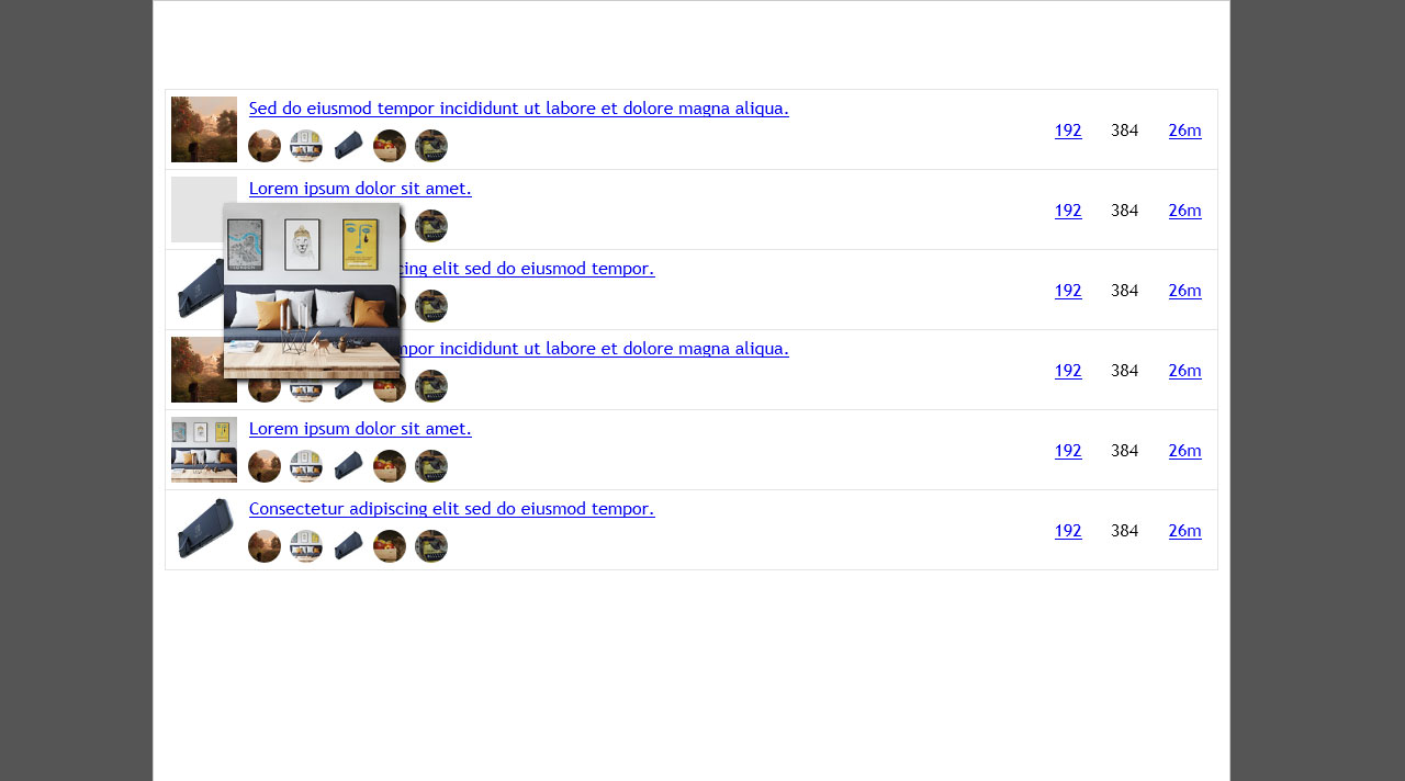
.topic-thumbnail {
position: absolute;
left: 6px;
width: 58px;
height: 58px;
margin: -2px 0 0 0;
padding: 0 !important;
box-sizing: border-box;
background-color: #121212;
border: 2px solid #000;
border-right: 2px solid #272727;
border-bottom: 2px solid #2f2f2f;
border-radius: 2%;
}
.desktop-view.touch .topic-thumbnail::after {
position: absolute;
top: -2px;
left: -2px;
width: 58px;
height: 58px;
margin: 0;
position: absolute;
display: block;
content: "";
z-index: 99;
}
.topic-thumbnail>a {
position: absolute;
display: inline-block;
top: -2px;
left: -2px;
margin: 0;
padding: 0;
box-shadow: none;
border-radius: 2%;
z-index: 39;
}
.desktop-view.no-touch .topic-thumbnail>a {
transition: margin-top .2s, margin-left .2s, box-shadow .2s;
}
.desktop-view.no-touch .topic-thumbnail>a::before {
position: absolute;
display: block;
top: 0;
left: 0;
width: 58px;
height: 58px;
transition: top .2s, left .2s;
border-radius: 2%;
content: "";
}
.desktop-view.no-touch .topic-thumbnail:hover>a::before {
top: -26px;
left: -66px;
width: 66px;
transition: top .2s .1s, left .2s .1s;
}
.topic-thumbnail:hover>a {
margin-top: 26px;
margin-left: 66px;
box-shadow: 2px 3px 4px #000;
}
.desktop-view.no-touch .topic-thumbnail:hover>a {
transition: margin-top .2s .1s, margin-left .2s .1s, box-shadow .2s .1s;
}
.topic-thumbnail>a>.thumbnail {
display: block;
margin: 0;
padding: 0;
width: 58px !important;
height: 58px !important;
object-fit: cover;
border-radius: 2%;
}
.desktop-view.no-touch .topic-thumbnail>a>.thumbnail {
transition: height .2s, width .2s;
}
.topic-thumbnail:hover>a>.thumbnail {
width: 200px !important;
height: 200px !important;
}
.desktop-view.no-touch .topic-thumbnail:hover>a>.thumbnail {
transition: height .2s .1s, width .2s .1s;
}
/* ---------------------------------------- */
.topic-list th, .topic-list-item>td {
border-bottom: 1px solid #333 !important;
box-shadow: inset 0 -2px 0 #000;
}
.topic-list>tbody {
border-top: none !important;
}
.topic-list-item-separator>td {
position: relative;
height: .7em !important;
line-height: 1em !important;
border-bottom: none !important;
}
.topic-list-item-separator>td::before {
position: absolute;
top: .5em;
left: 0;
right: 0;
display: block;
padding-top: 1px;
background-color: #952d14;
content: "";
}
.topic-list-item-separator>td>span {
position: absolute;
top: 0;
left: 50%;
margin-left: -4em;
display: block;
width: 5em;
background-color: #181818 !important;
text-transform: uppercase;
}
/* ---------------------------------------- */
.topic-details {
padding: 0 0 34px 0;
}
.topic-title {
padding: 0;
}
.topic-title .title {
color: #aaa !important;
}
.unseen-topic .topic-title .title {
color: #b27547 !important;
}
.main-link .topic-details .discourse-tags {
float: right !important;
margin: 10px 0 -44px 0;
}
.topic-details .discourse-tag.box {
margin: 0 0 0 4px !important;
}
/* ---------------------------------------- */
.show-thumbnail>tbody>tr.topic-list-item.pinned .posters>a,
.posters>a {
position: absolute;
left: 12px !important;
display: block;
height: 30px;
width: 30px;
opacity: 0.8;
}
.posters>a:hover {
opacity: 1;
}
.show-thumbnail>tbody>.pinned .posters>a:nth-child(2),
.posters>a:nth-child(2) {
left: 47px !important;
}
.show-thumbnail>tbody>.pinned .posters>a:nth-child(3),
.posters>a:nth-child(3) {
left: 83px !important;
}
.show-thumbnail>tbody>.pinned .posters>a:nth-child(4),
.posters>a:nth-child(4) {
left: 118px !important;
}
.show-thumbnail>tbody>.pinned .posters>a:nth-child(3),
.posters>a:nth-child(5) {
left: 153px !important;
}
.show-thumbnail>tbody .posters>a {
left: 76px !important;
}
.show-thumbnail>tbody .posters>a:nth-child(2) {
left: 114px !important;
}
.show-thumbnail>tbody .posters>a:nth-child(3) {
left: 152px !important;
}
.show-thumbnail>tbody .posters>a:nth-child(4) {
left: 190px !important;
}
.show-thumbnail>tbody .posters>a:nth-child(5) {
left: 228px !important;
}
/* Extra quick tests: nothing to do with featured topics bar. */
.timeline-container {
margin-left: 760px !important;
}
.timeline-footer-controls .fa-reply::after {
content: " Reply";
}
.select-kit.dropdown-select-box {
margin-top: 8px;
}
/* Post area elements. */
.posts-wrapper{
margin: 0 10px;
}
.topic-post.clearfix {
margin-right: 180px;
border-bottom: 1px solid #333 !important;
box-shadow: inset 0 -3px 0 #000;
}
.boxed.onscreen-post .row::before,
.boxed.onscreen-post .row::after {
display: block !important;
}
.boxed.onscreen-post .topic-avatar {
min-width: 55px;
border: none !important;
}
.boxed.onscreen-post .topic-body {
float: none !important;
width: auto !important;
border: none !important;
}
.topic-meta-data>div {
margin-top: 1em;
}
.avatar-flair-blenderartists-team.avatar-flair-image {
top: 50px !important;
right: 7px;
bottom: auto !important;
}
.small-action, .topic-status-info {
border: none !important;
}
/* Quick testing of in-post code boxes. */
pre code {
max-height: 20em !important;
}
.topic-meta-data .post-date {
float: none;
}
.topic-meta-data .relative-date {
position: relative;
display: inline-block;
color: rgba(0,0,0,0);
}
.topic-meta-data .relative-date::after {
position: absolute;
display: inline-block;
left: 0;
content: attr(title);
color: #aaa;
}
.topic-meta-data .relative-date:hover::after {
color: #ddd;
}
/* Quick testing of small screen widths. */
/* Override default Discourse media query. */
@media screen and (max-width: 850px) {
.topic-list th.views, .topic-list td.views {
display: table-cell !important;
}
.topic-list td.posters a:not(.latest) {
display: inline !important;
}
.topic-list td.posters a.latest {
width: 25px !important;
}
}
/* Override default Discourse media query. */
@media screen and (max-width: 767px) {
.names span {
display: inline-block !important;
}
}
/* Custom media query. Might not be necessary. */
@media screen and (max-width: 640px) {
.tlp-featured-topic .user,
.tlp-featured-topic.show-details .user {
color: rgba(0,0,0,0) !important;
}
.topic-list th.views, .topic-list td.views {
display: none !important;
}
}
Points to note:
1/ This is a dark variant only at this stage.
2/ This is only for desktop mode at the moment.
3/ Has been tested with Firefox, Pale Moon and Opera on a W7 desktop.
4/ Has also been tested with Firefox on a Samsung/Android tablet.
5/ Some functionality has also been tested with custom HTML pages on the tablet with Chrome, Edge and Opera, as well as the default Samsung browser. This is to make sure things work on browsers I can’t run Stylus with.
It all seems to work.
1 Like
Ok, one updated wodge of code, now with groovy keyboard a11y for the expandable topic thumbnails.
Haven’t tested the change on touchscreen, but since touchscreen doesn’t do the additional .selected class on the .topic-list-item table rows it shouldn’t have any conflicts.
html {
	background-color: #111;
	color: #aaa !important;
	font-family: 'Trebuchet MS', 'Helvetica Neue', Helvetica, Arial, sans-serif !important;
}
.d-header.clearfix {
	height: 4em !important;
	padding-top: 6px !important;
	background-color: #181818 !important;
	box-shadow: 0 2px 4px #000;
}
.d-header.clearfix .nav-link-container {
	display: none;
}
.wrap {
	max-width: 960px !important;
	background: #181818;
	border: 2px solid #090909;
	box-shadow: 0 0 6px #000;
}
#current-user.active>.icon {
	background-color: #181818;
	border-right: 1px solid #000;
	border-left: 1px solid #222 !important;
	border-top: 1px solid #333 !important;
	box-shadow: 3px 3px 3px #000 !important;
}
.d-header.clearfix>.wrap {
	border: none;
	box-shadow: none;
}
/* Hamburger droppy clean-up. */
.hamburger-panel .panel-body {
	height: auto !important;
}
.menu-container-general-links,
.panel-body-contents>.category-links,
.menu-container-footer-links>.menu-links li {
	display: none;
}
.menu-container-footer-links>.menu-links li:last-child {
	display: block;
}
/* @WIP - Top right user menu droppy. */
.menu-panel {
	background-color: #181818;
	border: 1px solid #000;
	border-left: 1px solid #222 !important;
	border-top: 1px solid #333 !important;
	box-shadow: 3px 3px 3px #000 !important;
}
.menu-links-header li {
	vertical-align: middle;
}
.menu-links-header .user-activity-link {
	margin: 0 !important;
	border: 1px solid #000;
	border-left: 1px solid #222 !important;
	border-top: 1px solid #333 !important;
}
.glyphs>.widget-link {
	display: inline-block !important;
	padding: .5em 1em !important;
}
.user-menu .panel-body {
	overflow: hidden !important;
}
.panel-body-contents {
	position: relative;
}
.panel-body-contents>.logout-link {
	display: block !important;
	margin-top: 12px;
	border: 1px solid #000;
	border-left: 1px solid #222 !important;
	border-top: 1px solid #333 !important;
	text-align: center;
}
.menu-links-header .user-activity-link:hover,
.glyphs>.widget-link:hover,
.panel-body-contents .widget-link.logout:hover {
	background-color: #202020;
	color: #ddd;
	transition: background-color .2s, color .2s;
}
.panel-body-contents hr{
	display: none;
}
.panel-body-contents>.notifications>ul{
	height: 134px !important;
	overflow: auto !important;
	border: 1px solid #000;
	border-right: 1px solid #222 !important;
	border-bottom: 1px solid #333 !important;
	opacity: 0.7;
}
.panel-body-contents>.notifications li{
	background-color: #181818 !important;
}
.panel-body-contents>.notifications>ul div {
	color: #129acc;
}
/* Kill stupid Discourse badge crap. */
.notifications .fa-certificate,
.notifications .fa-certificate + div {
	display: none;
}
/* Featured bar container. */
/* Holds links, thumbnails and "Featured" button. */
.tlp-featured-topics.has-topics {
	display: block !important;
	width: auto !important;
	overflow: hidden !important;
	margin: 0 5px 1em 5px;
}
/* Links container. */
.tlp-featured-topics.has-topics>.topics {
	position: relative;
	display: block !important;
	width: 100%;
	overflow: hidden !important;
	padding-top: 16% !important;
}
/* Links (thumbnails containers). */
.tlp-featured-topic {
	position: absolute !important;
	top: 0;
	bottom: 0;
	width: 16%;
	margin: 0 !important;
}
.tlp-featured-topic:nth-child(2) {
	left: 16.8%;
}
.tlp-featured-topic:nth-child(3) {
	left: 33.6%;
}
.tlp-featured-topic:nth-child(4) {
	left: 50.4%;
}
.tlp-featured-topic:nth-child(5) {
	left: 67.2%;
}
.tlp-featured-topic:last-child {
	right: 0;
}
/* Image thumbnails. */
.tlp-featured-topic>.thumbnail {
	display: block;
	width: 100% !important;
	height: 100% !important;
}
.tlp-featured-topic>.featured-details {
	padding: 0 !important;
}
.tlp-featured-topic.show-details>.featured-details {
	background-color: #333 !important;
	opacity: .93;
}
.featured-details .title {
	position: absolute;
	top: 0;
	right: 0;
	left: 0;
	overflow: hidden;
	padding: 5px;
	text-overflow: ellipsis;
}
.tlp-featured-topic.show-details>.featured-details .title {
	color: #ddd !important;
}
.featured-details .user {
	left: 0;
	right: 0 !important;
	bottom: 0 !important;
	overflow: hidden;
	height: 22px;
	text-align: right;
	padding: 28px 35px 5px 5px !important;
	white-space: nowrap;
	text-overflow: ellipsis;
}
.tlp-featured-topic.show-details .user {
	background-image: linear-gradient(to bottom, rgba(51,51,51,0), rgba(51,51,51,1) 25%, rgba(51,51,51,1));
	color: #fff !important;
}
.tlp-featured-topic.show-details>.featured-details .user::before {
	display: block;
	content: "";
	position: absolute;
	left: 0;
	right: 0;
	bottom: 35px;
	padding-top: 1px;
	background-color: #111;
	border-bottom: 1px solid #555;
}
.featured-details .avatar {
	position: absolute;
	right: 5px;
	bottom: 5px;
}
.featured-link {
	float: none !important;
	padding: 0 !important;
}
.featured-link>.discourse-tag {
	display: block !important;
	max-width: 100% !important;
	padding: 6px 8px !important;
	background-color: #181818;
	color: #999;
	text-transform: capitalize;
	border: 1px solid #000;
	border-left: 1px solid #222 !important;
	border-top: 1px solid #333 !important;
}
.featured-link>.discourse-tag:hover {
	background-color: #202020;
	color: #ddd;
	transition: background-color .3s .1s, color .3s .1s;
}
.featured-link>.discourse-tag::before {
	content: "view all ";
}
.featured-link>.discourse-tag::after {
	content: " topics";
}
/* @WIP - Testing latest posts as drop menu. */
.categories-and-latest {
	position: relative !important;
	display: block !important;
	flex: none !important;
	flex-flow: unset !important;
	margin-top: 3em !important;
}
.categories-and-latest>.column {
	flex: none !important;
	flex-direction: unset !important;
}
.categories-and-latest>.column.categories {
	margin-right: 0 !important;
}
.categories-and-latest>.column:last-child {
	position: absolute !important;
	z-index: 99;
	top: -33px;
	left: 5px;
	right: 5px;
	min-width: 230px !important;
	max-width: 640px !important;
	max-height: 40px;
	overflow: hidden;
	background-color: #181818;
	border: 1px solid #000;
	border-left: 1px solid #222 !important;
	border-top: 1px solid #333 !important;
	flex: none !important;
	flex-direction: unset !important;
	transition: max-height .2s .8s, box-shadow .2s .8s;
}
.categories-and-latest>.column:last-child .table-heading {
	padding-left: 12px;
	color: #999;
	cursor: pointer;
	border-bottom: 1px solid #333 !important;
	box-shadow: inset 0 -2px 0 #000;
}
.categories-and-latest>.column:last-child .table-heading::before {
	content: "Show ";
}
.categories-and-latest>.column:last-child .table-heading::after {
	content: " Posts \2193";
}
.categories-and-latest>.column:last-child:hover {
	max-height: 2000px;
	box-shadow: 3px 4px 4px #000;
	transition: max-height .8s .1s, box-shadow .2s .1s;
}
.categories-and-latest>.column:last-child>.latest-topic-list {
	height: auto !important;
}
.categories-and-latest>.column:last-child .latest-topic-list-item {
	padding: .5em 1em !important;
	opacity: 0;
	transition: opacity .2s .8s;
	font-size: 0.95em !important;
	border-bottom: 1px solid #333 !important;
	box-shadow: inset 0 -2px 0 #000;
}
.latest-topic-list-item .avatar {
	max-width: 36px;
	max-height: 36px;
	opacity: .8;
}
.latest-topic-list-item .avatar:hover {
	opacity: 1;
}
.latest-topic-list-item .main-link {
	max-width: 80%;
}
.categories-and-latest>.column:last-child .latest-topic-list-item .title {
	color: #aaa !important;
}.latest-topic-list-item .badge-category-parent-bg {
	display: none !important;
}
.categories-and-latest>.column:last-child .latest-topic-list-item .badge-category {
	color: #777 !important;
}
.categories-and-latest>.column:last-child .latest-topic-list-item .badge-category {
	padding-left: 4px;
}
.categories-and-latest>.column:last-child:hover .latest-topic-list-item {
	opacity: 1;
	transition: opacity .4s .1s;
}
.badge-notification.new-topic {
	display: inline-block;
	margin: -8px 0 -4px 0 !important;
	padding: 0 !important;
	color: #0f82af !important;
	font-size: 2em !important;
	line-height: 1em !important;
}
.categories-and-latest>.column:last-child .btn.pull-right {
	display: block !important;
	float: none !important;
	margin: 1em !important;
	background-color: #181818;
	color: #999;
	border: 1px solid #000;
	border-left: 1px solid #222 !important;
	border-top: 1px solid #333 !important;
}
.categories-and-latest>.column:last-child .btn.pull-right:hover {
	background-color: #202020;
	color: #ddd;
	transition: background-color .3s .1s, color .3s .1s;
}
.categories-and-latest>.column:last-child .btn.pull-right::before {
	content: "View ";
}
.categories-and-latest>.column:last-child .btn.pull-right::after {
	content: " Recent Posts";
}
/* ----------------------------------------- */
.nav-pills.user-nav li:first-child,
.nav-pills.user-nav li:nth-child(6),
.google-adsense, .badge-category-bg,
.category-list>thead, td.topics,
#suggested-topics, .topic-list .category {
	display: none !important;
}
.category-list {
	width: 100%;
}
.category-list>tbody {
	border-top: none !important;
}
.category-list tr {
	border-bottom: none !important;
}
.category-list .category {
	padding: 12px 5px !important;
	border-top: none !important;
	border-left: none !important;
}
.category-list .category>div:first-child {
	padding-top: 0.5rem;
	border-bottom: 1px solid #333 !important;
	box-shadow: inset 0 -2px 0 #000;
}
.category-list .category>div:first-child>h3 {
	font-size: 1.4em !important;
	font-weight: 400 !important;
}
.category .category-name {
	color: #888;
	font-weight: 400 !important;
}
.category-description {
	margin: -0.25rem 6px 0.5rem 2px;
	font-size: 0.9rem !important;
}
.subcategory {
	position: relative;
	min-height: 38px !important;
	overflow: hidden;
	border-bottom: 1px solid #333 !important;
	box-shadow: inset 0 -2px 0 #000;
}
.subcategory>.badge-wrapper {
	position: absolute !important;
	display: block;
	top: 0;
	right: 108px;
	bottom: 0;
	left: 45px;
	z-index: 5;
	overflow: hidden;
	padding: 10px 6px 0 0 !important;
	font-size: 1.1em !important;
}
.subcategory>.ember-view {
	position: relative;
	display: block !important;
	padding-top: 8px;
	line-height: 22px !important;
	text-align: right;
}
.subcategory>.ember-view:before,
.subcategory>.ember-view>.new-posts::before {
	position: absolute;
	top: 7px;
	left: 0;
	display: block;
	height: 23px;
	width: 37px;
	content: "";
	background-image: url(https://blenderartists.org/uploads/default/original/4X/b/2/7/b277e0d1fae7ba105b6d03e603c55efe2f52b59d.png);
	background-size: cover;
	opacity: 0.6;
}
.subcategory>.ember-view:before {
	opacity: 0.4;
}
.subcategory .badge-notification {
	display: inline-block;
	width: 74px;
	color: #0f82af !important;
	font-size: 1em !important;
	font-weight: 400 !important;
	text-align: right;
	text-transform: capitalize;
	border-radius: 0 !important;
	margin: -2px 0 0 10px !important;
	padding: 5px 8px 5px 8px !important;
}
.subcategory>.ember-view:after {
	position: absolute;
	top: 7px;
	right: 0;
	display: block;
	height: 23px;
	width: 90px;
	content: "";
	background-color: rgba(0,0,0,.1);
	border: 1px solid #000;
	border-right: 1px solid #252525;
	border-bottom: 1px solid #333;
}
/* Reposition thread posters avatars beneath title. */
.topic-list th.posters, .topic-list td.posters {
	max-width: 0 !important;
	padding: 0 !important;
	overflow: hidden;
}
.topic-list td.posters {
	padding: 0 0 37px 0 !important;
	vertical-align: bottom !important;
}
tr.topic-list-item {
	position: relative;
}
td.main-link {
	vertical-align: top;
	text-align: left;
	font-size: 16px !important;
}
.show-thumbnail td.main-link {
	padding-left: 76px !important;
}
.show-thumbnail .pinned td.main-link {
	padding-left: 12px !important;
}
/* @WIP - Expand topic thumbnails on hover. */
.topic-thumbnail {
	position: absolute;
	left: 6px;
	width: 58px;
	height: 58px;
	margin: -2px 0 0 0;
	padding: 0 !important;
	box-sizing: border-box;
	background-color: #121212;
	border: 2px solid #000;
	border-right: 2px solid #272727;
	border-bottom: 2px solid #2f2f2f;
	border-radius: 2%;
}
.desktop-view.touch .topic-thumbnail::after {
	position: absolute;
	top: -2px;
	left: -2px;
	width: 58px;
	height: 58px;
	margin: 0;
	position: absolute;
	display: block;
	content: "";
	z-index: 99;
}
.topic-thumbnail>a {
	position: absolute;
	display: inline-block;
	top: -2px;
	left: -2px;
	margin: 0;
	padding: 0;
	box-shadow: none;
	border-radius: 2%;
	z-index: 39;
}
.desktop-view.no-touch .topic-thumbnail>a {
	transition: margin-top .2s, margin-left .2s, box-shadow .2s;
}
.desktop-view.no-touch .topic-thumbnail>a::before {
	position: absolute;
	display: block;
	top: 0;
	left: 0;
	width: 58px;
	height: 58px;
	transition: top .2s, left .2s;
	border-radius: 2%;
	content: "";
}
.topic-list-item.selected .topic-thumbnail>a::before,
.desktop-view.no-touch .topic-thumbnail:hover>a::before {
	top: -26px;
	left: -66px;
	width: 66px;
	transition: top .2s .1s, left .2s .1s;
}
.topic-list-item.selected .topic-thumbnail>a,
.topic-thumbnail:hover>a {
	margin-top: 26px;
	margin-left: 66px;
	box-shadow: 2px 3px 4px #000;
}
.topic-list-item.selected .topic-thumbnail>a,
.desktop-view.no-touch .topic-thumbnail:hover>a {
	transition: margin-top .2s .1s, margin-left .2s .1s, box-shadow .2s .1s;
}
.topic-thumbnail>a>.thumbnail {
	display: block;
	margin: 0;
	padding: 0;
	width: 58px !important;
	height: 58px !important;
	object-fit: cover;
	border-radius: 2%;
}
.desktop-view.no-touch .topic-thumbnail>a>.thumbnail {
	transition: height .2s, width .2s;
}
.topic-list-item.selected .topic-thumbnail>a>.thumbnail,
.topic-thumbnail:hover>a>.thumbnail {
	width: 200px !important;
	height: 200px !important;
}
.topic-list-item.selected .topic-thumbnail>a>.thumbnail,
.desktop-view.no-touch .topic-thumbnail:hover>a>.thumbnail {
	transition: height .2s .1s, width .2s .1s;
}
/* ---------------------------------------- */
.topic-list th, .topic-list-item>td {
	border-bottom: 1px solid #333 !important;
	box-shadow: inset 0 -2px 0 #000;
}
.topic-list>tbody {
	border-top: none !important;
}
.topic-list-item-separator>td {
	position: relative;
	height: .7em !important;
	line-height: 1em !important;
	border-bottom: none !important;
}
.topic-list-item-separator>td::before {
	position: absolute;
	top: .5em;
	left: 0;
	right: 0;
	display: block;
	padding-top: 1px;
	background-color: #952d14;
	content: "";
}
.topic-list-item-separator>td>span {
	position: absolute;
	top: 0;
	left: 50%;
	margin-left: -4em;
	display: block;
	width: 5em;
	background-color: #181818 !important;
	text-transform: uppercase;
}
/* ---------------------------------------- */
.topic-details {
	padding: 0 0 34px 0;
}
.topic-title {
	padding: 0;
}
.topic-title .title {
	color: #aaa !important;
}
.unseen-topic .topic-title .title {
	color: #b27547 !important;
}
.main-link .topic-details .discourse-tags {
	float: right !important;
	margin: 10px 0 -44px 0;
}
.topic-details .discourse-tag.box {
	margin: 0 0 0 4px !important;
}
/* ---------------------------------------- */
.show-thumbnail>tbody>tr.topic-list-item.pinned .posters>a,
.posters>a {
	position: absolute;
	left: 12px !important;
	display: block;
	height: 30px;
	width: 30px;
	opacity: 0.8;
}
.posters>a:hover {
	opacity: 1;
}
.show-thumbnail>tbody>.pinned .posters>a:nth-child(2),
.posters>a:nth-child(2) {
	left: 47px !important;
}
.show-thumbnail>tbody>.pinned .posters>a:nth-child(3),
.posters>a:nth-child(3) {
	left: 83px !important;
}
.show-thumbnail>tbody>.pinned .posters>a:nth-child(4),
.posters>a:nth-child(4) {
	left: 118px !important;
}
.show-thumbnail>tbody>.pinned .posters>a:nth-child(3),
.posters>a:nth-child(5) {
	left: 153px !important;
}
.show-thumbnail>tbody .posters>a {
	left: 76px !important;
}
.show-thumbnail>tbody .posters>a:nth-child(2) {
	left: 114px !important;
}
.show-thumbnail>tbody .posters>a:nth-child(3) {
	left: 152px !important;
}
.show-thumbnail>tbody .posters>a:nth-child(4) {
	left: 190px !important;
}
.show-thumbnail>tbody .posters>a:nth-child(5) {
	left: 228px !important;
}
/* Extra quick tests: nothing to do with featured topics bar. */
.timeline-container {
	margin-left: 760px !important;
}
.timeline-footer-controls .fa-reply::after {
	content: " Reply";
}
.select-kit.dropdown-select-box {
	margin-top: 8px;
}
/* Post area elements. */
.posts-wrapper{
	margin: 0 10px;
}
.topic-post.clearfix {
	margin-right: 180px;
	border-bottom: 1px solid #333 !important;
	box-shadow: inset 0 -3px 0 #000;
}
.boxed.onscreen-post .row::before,
.boxed.onscreen-post .row::after {
	display: block !important;
}
.boxed.onscreen-post .topic-avatar {
	min-width: 55px;
	border: none !important;
}
.boxed.onscreen-post .topic-body {
	float: none !important;
	width: auto !important;
	border: none !important;
}
.topic-meta-data>div {
	margin-top: 1em;
}
.avatar-flair-blenderartists-team.avatar-flair-image {
	top: 50px !important;
	right: 7px;
	bottom: auto !important;
}
.small-action, .topic-status-info {
	border: none !important;
}
/* Quick testing of in-post code boxes. */
pre code {
	max-height: 20em !important;
}

.topic-meta-data .post-date {
	float: none;
}
.topic-meta-data .relative-date {
	position: relative;
	display: inline-block;
	color: rgba(0,0,0,0);
}
.topic-meta-data .relative-date::after {
	position: absolute;
	display: inline-block;
	left: 0;
	content: attr(title);
	color: #aaa;
}
.topic-meta-data .relative-date:hover::after {
	color: #ddd;
}

/* Quick testing of small screen widths. */
/* Override default Discourse media query. */
@media screen and (max-width: 850px) {
	.topic-list th.views, .topic-list td.views {
		display: table-cell !important;
	}
	.topic-list td.posters a:not(.latest) {
		display: inline !important;
	}
	.topic-list td.posters a.latest {
		width: 25px !important;
	}
}
/* Override default Discourse media query. */
@media screen and (max-width: 767px) {
	.names span {
		display: inline-block !important;
	}
}
/* Custom media query. Might not be necessary. */
@media screen and (max-width: 640px) {
	.tlp-featured-topic .user,
	.tlp-featured-topic.show-details .user {
		color: rgba(0,0,0,0) !important;
	}
	.topic-list th.views, .topic-list td.views {
		display: none !important;
	}
}
Edit: Added some more changes to clean up the header and hamburger droppy, and to nobble Discourse badge notification in the user droppy (death to Discourse) and to get rid of some crud I don’t want in profile pages (links to badges, summary page link).