they are going to add a search bar in the previous horizontal header , my concern, is it will be over flooded with Icons and Info especially in the 2D Animation template, maybe a preset system like @Indy_logic suggested should be considered.
I am really, really happy about this. Currently, render-related settings are all over the place in almost every tab, and it creates quite a mess.
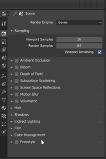
Honestly, I believe that sampling settings of environment light like MIS belong into render settings as well, so does the “Simplify” rollout in the scene tab. When working with and tweaking Cycles, you have to constantly shuffle between 3-4 tabs.
Because of compositor or video sequencer post-processing.
It is unaware of which camera is used. If you make a render using a compositing effect dependent of a certain size, it may be ruined if you switch to a camera using another resolution.
If you make resolution per camera, post-processing enabling should be per camera, too.
At that moment, you would have to be careful while rendering animations and check all cameras of used scenes. And you would probably want performance settings per camera, too.
But you are right, if additional camera are present to control different angles and produce only stills : format is rarely the same. We try to adapt it and image composition to showed angle.
And it is a little bit weird to create a copied scene or only save one of used resolutions in .blend file or use a script or an addon.
That is true but that does not mean that is a mess. MIS settings of world are in World properties like MIS Settings of lamps are in Lamp properties and MIS settings of materials are in Material properties.
That’s a per element scattering to make per element adjustment.
There is no reason to consider MIS settings of World a more global setting than world background shader strength.
The split with output settings is helping a little bit. But Lighting will continue to be a complex work involving every element in your scene. You will continue to shuffle between properties editor tab, outliner and node editor, anyways.
It is still in scene tab. But it would make sense to have it in render settings. Performance panel have also settings for viewport. And basically, when we are working with eevee, tweaking of viewport settings and render settings becomes almost same exercise.
1 Like
Thumbs up for the reorganising. I really enjoy the direction this is taking.
It would be nice if ordering in properties for each render engine would be independent of each other, and maintain configuration in each one?
I’m not sure if it would be possible and how it would affect other tabs.
I think it is better to avoid to try to maintain ordering.
If you prefer an engine for a specific type of effect and never use the other engine for this effect, importance of panel is probably not the same in each tab config. As a consequence, there is probably one engine that would have corresponding panel closed at the end of the list and at the other hand, for the other engine it would be at the middle.
When you are making test renders to compare EEVEE and Cycles that makes sense to expect same effect setting at same place. But this is something that you will do when learning the engines. Not after decision to use one engine for one production have been taken.
Currently, user can set each tab config as he wants and save that as his start-up file.
Or he can give same position to color management, Film, Freestyle panels, etc… and save this as his startup file.
Currently, user is free. I don’t think it would be a good idea to impose an automatic reordering to users who don’t want that.
Only for one render engine, in the other the order will be ordered at the discretion of Blender, as shown in the gif.
I’m not sure if I was clear, just in case:
The problem I’m referring to is that when you modify the order of items while in a render engine, then when you switch to another render engine, the order of the items you had later are automatically disordered according to some criteria that Blender chooses. So you could perhaps configure the order for a single render engine and save the startup file, but for the other render engine the items would be ordered according to the criteria that blender chose.
To my way of seeing it, Blender is imposing an automatic reordering for the render engine in which you are not configuring the order of the items.
So if that’s what you were referring to, sorry then, I was the one who is misinterpreting you.
You are right. Some panels are reordered but not all panels and not always.
I succeeded to make a similar ordering for both engines and save it as startup file.
But a reordering after that for one engine destroyed it for the other one.
It looks like a bug more than an intended behavior.
Oh, you are right. I just tried between Cycles and Blender render in 2.79 and the ordering seems to work in a more logical way.


I can’t understand your mockup
To avoid scrolling sub tabs
I really don’t get the resistance to scrolling.
Why is it preferable to click a tiny icon, wait, not that one, the other one, wait, I missed, there it is. over just scrolling?
I could understand if mousewheels were an expensive luxury, but scrolling is a top level interaction scheme, and it’s a waste to ignore the flexibility and ease of use that it provides.
1 Like
If new tabs are being added, I still think we should consolidate the particles and physics tabs: https://blender.community/c/rightclickselect/Qkbbbc/physics-properties-organization
1 Like
I perfectly understand the resistance to scrolling when it is about a dozen of panels.
Because scrolling corresponds to continuously modifying locations of buttons/properties… when it is not the whole panel itself that has been missed.
So, the fact to miss the good button and property is a lot more important when editor’s scrolling is needed.
But why horizontal tabs in vertical tabs when there is obviously space in default workspace to add again an half-dozen of other tabs.
@JLampel you are not coherent. The thread is about splitting one long tab into 2 new tabs that are shorter. But you add in your post, a link to a proposal of merging 2 tabs that are already long into 1 that would be unbearable to work with.
Anyways, modifiers and particles are supposed to become nodes managed into a node editor. What will stay in properties editor about that will probably be reduced to a sum-up list. These tabs if they are kept will probably not continue to be seen as a mess.
The mess will be the nodetree in node editor but that will be the reflect of complexity of user’s work.
Maybe it would be better to make a huge enhancement to the baking process, like allowing to queue several map types and objects packs, and put all those in a separate dedicated baking tab ?
2 Likes
I like the look of the tabs to the left, but there is some pretty big unused space underneath it…!?
However, the amount of unused space would be heavily dependent on the height of the properties window on the user’s screen (sometimes, you have it a bit shorter to make way for the outliner or another window).
Unless you kick alignment to the curb and make the width of the panels variable, there’s just not much that can be done without making things look worse or without doubling the number of tabs.
I won’t derail this if the thread is specifically about the render properties tab, but the physics tab is pretty rough to use when combining multiple types on one object (collision, forcefield, and dynamic paint are common combos). The beauty of the particles and materials list style organization is that you can add as many systems as you want without any extra mess. I’m not sure how it would be unbearable to work with, as the overall effect would actually be making the scrolling distance shorter, not longer.