Good point. 
There may not be a perfect solution, but at least you are on the right track…
Good point.
There may not be a perfect solution, but at least you are on the right track…
Oop… right. Missed that; was spending too much time looking at the pictures and not enough time reading (stupid literacy!)
That said, if you intend on these images being part of a more official proposal, I’d recommend showing the header as a shift from the panel color. Of course, if you’re the one that’s ultimately going to be coding this, then that’s probably not necessary. 
No problem.
My issue with using a different color for the header is that it then makes it more distinct from the contents. But that is probably something a theme designer can deal with if given that extra tool.
I personally don’t like adding another horizontal line (below the header) as it is adding another element to a busy-looking area. But it could be added as long as it was just within the client area (so margin on either side) since the panel separation lines are going completely side-to-side here. Will give that a think.
I like the Shading/Hover on post #13, and the checkboxes on the right, it will avoid accidental clicks on arrow/checkbox.
ba_fjg asked about indentation. If the spacing on the header is tightened up a bit then we could add some indentation without wasting too much space:
It’s definitely better with indentation. Much easy to parse.
Something else worth trying. If we remove the division lines for the sections that are closed then they contribute a lot less visually to the page. It makes it easier to concentrate on the sections that are open. Of course we’d still have to show the panel bounds on hover.
Ignore… double post.
Very nice looking, I think it would be a great addition to the GUI. My only addition would be a slight occlusion effect between panels to make them look “stacked”. I think it really helps to make the division pop and show that each stack is a separate entity. It reinforces that the properties are “inside” of a panel.
You are right. But right now that causes an inconsistency at the intersection between two open panels. This is fixed by making other changes that are now possible when combined with some of the other proposed changes. I think. I’ll mock up what I mean when I get a chance…
This is a great improvement! I acctualy like all the improvements (especially the dark shade for the open panels and the intendationt) but one; the icons. I think the old arrows will look great with all the new improvements.
I quite like your ideas to get rid of visual noise, since there’s a lot of it in Blender’s UI.
I don’t mind if the arrows are removed, I also like the idea to extend panel dividers across the properties editor and have panel titles alligned. One other feature I see from your concepts is how the drag panel widget is hidden until you hover your mouse over it. Of course I have to repeat myself and say I like it and find it a very elegant solution.
For sure. This thread has basically identified 8 (or so) very different and independent possible changes. I have a feeling that as we go further we will find that it is only a small subset that will make the biggest difference. The indentation alone makes a huge difference that I wouldn’t have guessed at earlier. I’ll be prioritizing the impact of these changes have (to me) and will put them back in order. My hunch is that you are right and the +/- might not be doing as much as the rest.
As usual it is the mockups that really get the juices flowing.
I like it without the triangles.
I turned them off and straight away i started pressing the the panel header text, which i never do, even though i knew it was possible.
I like the look of the shaded opened panels and aligned text.
Just for comparison, this is how the competitors look like.
Modo
3ds Max
Maya

Cinema 4d
Thanks!
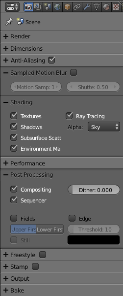
So here it is (on the right) with checkmarks moved to the right of the titles, panel divisions extending to the edges, ba_fjg’s indentation, m9105826’s occusion, and Wolter’s orginal arrows back in.
The biggest change from all the previous is that it is now highlighting the panel contents, not the header with it as earlier proposed. I think this better follows how most people imagine this control working.
Is it obvious which section is open? It certainly seems easier to concentrate on the open panels and ignore the closed ones. Are the arrows better than the +/- ?
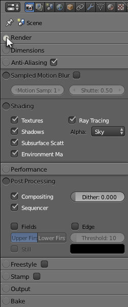
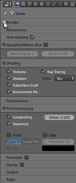
To be fair, we can get most of the above with the current theme preferences. So today you can easily get what you see on the left below. The difference on the right will be the movement of the checkbox, the indentation, and the shading. Not much difference really.
I’ll throw this in the ring for a replacement for the arrows/± symbols. I think it’s understated enough to flow with the existing UI while also standing out enough (especially with mouseover highlighting if deemed necessary) that they begged to be clicked. It also goes well with the overall proposed “inset” UI changes. Perhaps a bit smaller than what I’ve mocked up, but I’d like to know what people think of the general idea.
I love them. But I am someone who could see them disappear completely. For those that see the arrows as providing a useful service they might see it differently.
Your mockup above, compared with my last one, illustrates the two ways of looking at the properties panels. The title is on the top of an area that gets larger when you click on the arrow, OR it is something that reveals a content section hidden below. Your mockup shows the former (title is part of the content that gets larger) while mine shows the latter (title reveals a hidden content section).
Either way is valid but I think the latter is more prevalent?
I made it before I saw your more recent mockup. I definitely think a combination of those buttons with the revealed content section would look better.
EDIT:
Like this. Changed the size of the buttons, too.
The more I think about it the more I like it, especially considering that the top row of the properties panel already operates on a “push button” aesthetic.