Is there a way to have Icons and text on the tabs? Yes, I know that It would take up more space, but it might be helpful for learning the tabs.
Right now, I’m having to hover over the icon and hope the name pops up. I say hope because I use a Wacom tablet, and holding the pencil perfectly still so that the description window will pop up is a real test of my steady hand. This takes way too much time for my liking.
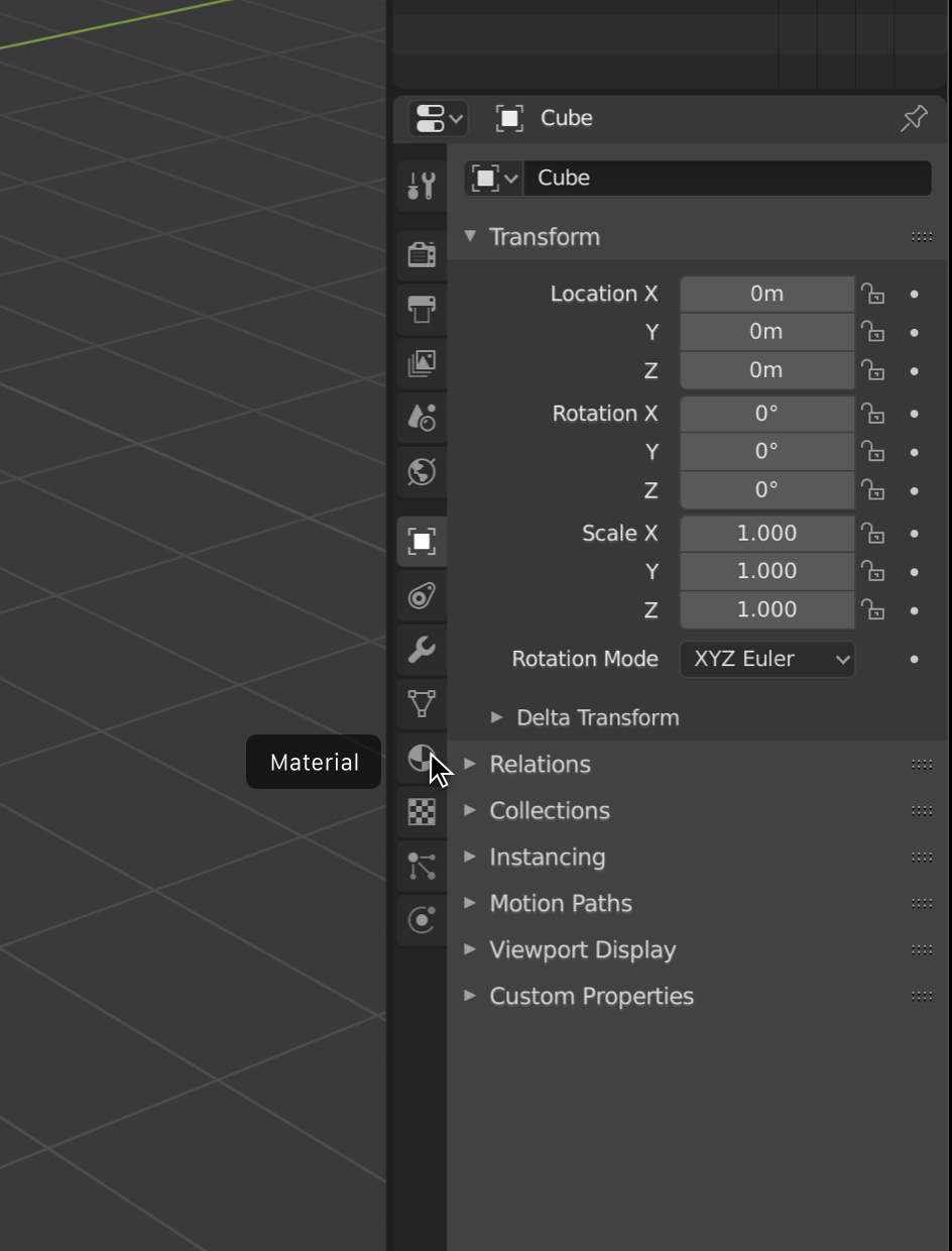
If I could just click the icon and have the name of the tab display on the screen somewhere, that would also be useful.
I’ve noticed that if I hover just to the right of the tabs icons, I get a double arrow and can hide the icons. A couple thoughts on that: I should be able to press T to toggle the visibility of the icons to be consistent with the way T works in other places. Also, I can imagine being able to pull right and expand the text so that I can quickly browse for what I am looking for.
Right now the Properties editor always has one tab selected. But it might be possible to add a state where none are selected, for example when the file is first opened.
In that state all the tabs would just be wider, taking the entire width, and would include the name beside the icon. The header could say “Properties”. Click a menu row and the menu just shrinks to the width we see now, revealing the panels and hiding the menu text.
I think that would have very limited impact, given that you always want a tab to be active, to display information and controls.
Instead, what we could do, is what we already do for the toolbar - here we show the tooltip faster, next to the tool so it doesn’t overlap. They are called ‘insta-tips’.
As I describe it, yes it would have limited impact. But there might still be something of the idea…
If you examine the Properties area now, you will see that you can drag between the tabs and the content. Right now all you can do is drag left to make it smaller to hide the tabs - for some reason I can’t think of. LOL
But what if you drag right and make the tabs wider, so they show text beside them? A completely optional way to show more details, especially for new users. Again, it could start that way when Blender first opens and nothing is selected, and slide over the moment you do select something. And a “Blender 101” could be open like that until manually dragged over.
Yes, exactly, as an optional behavior for people like the OP who are unfamiliar, at first, with each icon. And as starting behavior when the UI is set to “beginner” or however we might signal Ton’s idea of “Blender 101”.
As for the width, that isn’t really a consideration for such an optional behavior. Besides, I could argue that the Property panel works just fine for some people at 250 pixels wide. And for others they might prefer to use it when 600 pixels wide. So it’s not too odd that there might be beginners who prefer to see it with text on the tabs at 400 pixels wide for the utility it brings them at that time.
Part of the confusion of what each tab does, is compounded by the fact that we don’t show that descriptor in the header, like most programs would do. Maybe we should drop the dumb breadcrumb, and instead show something like “Render Settings - MyScene”, “Object Properties - Car”, etc. And maybe show “Object Properties - Car+” or some other way to signify when multiple objects are selected.
Hey that’s not a bad idea. With all the reshuffling I find myself lost very often in properties, so that would help. However OP is touching on another issue - a real papercut : to display a info popup, one must keep the cursor perfectly still, and that is super difficult using a tablet. Maybe there could be some margin of error in there. It would be real nice.
As for a reason to hide the tabs: in some layouts you may want to have multiple tabs always visible (like the material tab and the render settings), and you can then hide the tabs to save space (and prevent accidental changes to the layout).
I can see the use of this for Blender 101, but in other situations the lack of discoverability makes this a lot less valuable. There’s a value assesment to be made there, but it must be made by BF programmer who knows how long it’d take, and how much it complicates the code.
Tooltips -and possibly having tooltips show up more easily on a tablet?- seems like a more immediately helpful solution, together with optional icon colouring to show broadly what the tab relates to (modeling, rendering…).
It is really just a thought experiment. It’s not something that was possible when the tabs were horizontal so I enjoy thinking through how it could look and work, who it could help, and how hard it would be to implement.
I like those toolbar insta-tips very much, especially because you can quickly move the mouse over the other icons and see the other tooltips immediately. It’s a bit like scrolling through the tooltips to quickly find the one you need. I’d love to have this for the properties tabs as well.
Many DCC tool have text or icon-with-text UI such as Modeling toolkit and UV toolkit in Maya, Fusion360 and Zbrush.
I think it is good if blender will allow user to select current icon-only UI or with text UI option.
That mockup is exactly what I was looking for. Adding my 2 cents as a new user to blender.
The use case is this: Every time I google something and inevitably land on a forum post that says “in the X tab of the properties panel change something…” and I end up spending the next 60 seconds hovering my mouse over each of the icons waiting for a tooltip to pop so I can try to figure out where the correct panel is.
It’s even worse if the thing only shows in one mode (pose/edit/etc) because then I spend the next 3 minutes switching to different modes and then hovering over the icons again waiting for tooltips to show.
As a new user, it is a giant PITA to not have at least the option to show text beside the icons because many of them are rather arbitrary and nonsensical. For example, my automatic assumption based on the icons is that the view layer properties should be a listing of all images in the file, the scene view icon is some type of color swatch picker, and the physics properties icon is something you use to rotate the model, the object properties icon is something you would use to scale the model, etc…