I have a little suggestion and I’m wondering how others feel about it.
First of all, I do like the single column layout. But, sometimes the text of the properties gets cut off:
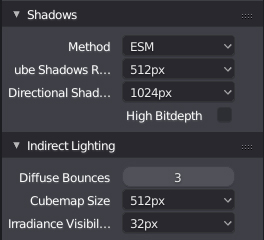
The only way to see the name is to resize the panel and through off your layout:
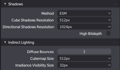
I feel that the issue here is that we are holding to the center alignment far to rigidly. I would really love to see a more sensible alignment. Something like this:
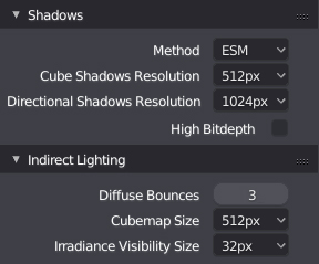
Maybe this is a little extreme but you get the idea. Most of the controls really don’t need to be half the size of the panel. How about 1/3?