What if I have it follow cursor and hold alt and use dynamic menu? Once you let go of alt, go back to following cursor.
Then simply use pie menu ?
This would be the best solution in my opinion fully functional properties menu under your cursor when ever you need it, top bar icons would swap the bottom context
I can probably have an Icon right next to the cursor that transitions the menu when clocked. And the only way to access would be by holding down alt. I can probably make a small gesture system, shake cursor to open?
I’ll just go ahead and make it optional to the user. Maybe be able to edit them later on.
This is starting to look functionally a bit better. Any idea if the menu entries would be customizable?
I hope UI customisation using dragging & dropping of panels (combined with the possibility to have free floating panels) will be something that the developers gets around to look at - after Blender 2.80 are released. Julian Eisel seems to think this could be a good idea too.
Concerning panels that hides. AutoCad have implemented a auto-hide setting in their panel solution (triggered by mouse-over):
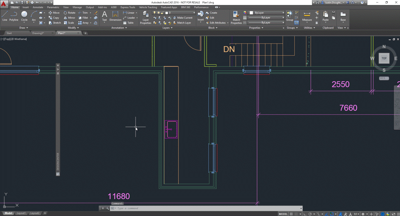
Panels can in AutoCad be docked or free floating - and be customised with multiple tabs:
The ‘look’ of the implementation is of course very dry & technical - since AutoCad is a very dry & technical program ![]()
Cursor Template now hides behind panels so its not in the way of parameters.
2 Likes
Sorry if this has come up already but any plans to consolidate or standardize the menus?
I think it would be nice if the menu area of the appBar were painted with the OS titlebar colors. This would help make it feel a bit more global.
You already can change the colors in the theme options 
For sure about changing the colors in the Blender theme. I was just meaning that particular area could use colors taken from the operating system instead of the theme. Its fairly easy to ask the OS for those colors.
Hmm. That’s a good idea. At least for Windows and Linux (not a thing on Macs unless Blender is going to do that frosty glass thing macOS does with most chrome in the OS.
This may make Blender feel less foreign to the platform.
While we are at it can someone please redesign that ugly ass view cube thingy? It’s fugs. Something a little classier and less garish would be nice.
Maybe like this.

1 Like
This might just be rumor, but people here have said there is a patent on the autodesk view cube. Supposedly the foundation has to be really careful to not make something that looks too similar.
How about a view Suzanne? Grab an ear and twist…
2 Likes
That would be kind of cool actually.
hey!
https://blender.community/c/rightclickselect/nBbbbc/funny-navigation-widget-and-split-area-widget
Maybe for the kids blender 101, but that’s just unprofessional looking to put monkey head as a view cube…
2 Likes