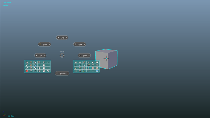
it’s a half wrong solution, if you ask me.
That’s good when you can memorize icons of not many applications. But I do not think it is very useful in Blender by having only icons without text when you have thousands of options that you should be able to distinguish quickly. Text in Pie Menu is good.
What the hell are you saying?! I imagined you with a annoying pitch voice. The man is doing what he wants you just can´t ask him to do things.
So, the UI is good enough just because you say so? Arguments, proofs, evidence.
No.
It is possible to change the roundness of the buttons in blender ?
yeah there should be a secondary option to tell the menus which direction to go to.
Cool ideas going around here, keep up the work guys.
With Blender 2.78 btw they want to update the Pie menus which can be looked up over here:
https://wiki.blender.org/index.php/Extensions:2.6/Py/Scripts/3D_interaction/viewport_pies
I feel like that’s already going into the right direction with getting rid of Clumpsy drop down bars when hitting W or CTRL+E in Edit mode. I know like no one is going to use the Pie menus, but honestly guys, since I gave them a try, you never want to go back. Like really. It’s like the same situation with sculpting from mouse to tablet. Feels awesome!
And honestly that way Blender can make it more into industry standard UI layout, because Max and Maya are already using them. Only problem I feel like is, that Max and maya have like a really bloated and slapped with hundreds of functions - pie menue iteration. Doesnt feel that right to me. I hope Blender dev’s will keep a good balance between the changes and additional UI overhauls, like the pie menus and so on. Because this will make or break the deal for new Artists, because UI still feels daunty sometimes.
This has been talked about for a while, and generally, I think pies are pretty positive. They’re a decent intermediate step between toolbar-based and key-driven workflows. Also, I think they’re less intimidating to brand new users than the current menu system.
Questions/Concerns, since I don’t have extensive experience with them:
- How cluttered can/should a pie menu get? The current menus are much more compact and can contain two dozen options or more. If implementing pie menus moves more operator access to toolbars, nested, or mouse-driven menus, it’d probably be a deal breaker.
- Piggybacking a bit on the first, how are nested pies handled?
- Is it practical to give users a specific ‘custom menu’ for placing often used and hard to reach operators/tools. Maya, for instance, allows you to add often used items to your toolshelf, which is still clunky in the usual Autodesk kind of way, but is notably artist friendly, i.e. requires no scripting knowledge. So, drag/drop custom pie menu (Shift W, maybe) in Blender?
I actually used pie menus for very long time, but then I started again using the traditional way.
I can’t believe I hadn’t tried the Pie Menu yet, being familiar with Realsoft3d (yeah, a rare breed indeed) where I used something like it all the time!
The transition from Realsoft to Blender was very difficult to me, with plenty of hair-pulling and cursing 
But after a few years I wouldn’t dream of going back. When learning Blender, you just have to forget about figuring things out for yourself, it requires some serious studying of tutorials and manuals. Especially the ‘boring’ stuff like data blocks, links, relations etc!
The UI now feels OK to me, not perfect but OK. And very fast. I’ve been working as a visualizer at several architects using Blender and they are amazed by my speed and the quality of the renders 
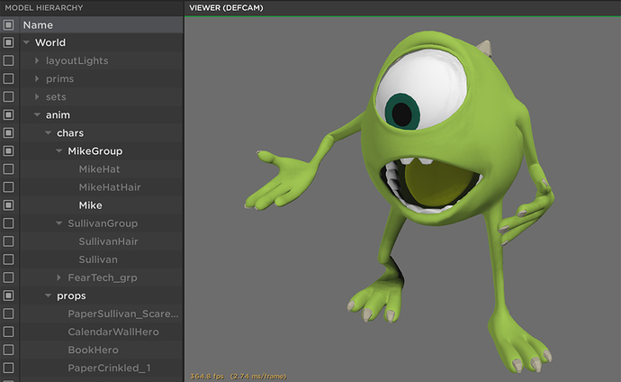
One little thing that could be better: the Outliner and Properties windows, or rather: the cooperation between them.
In Properties, we now have a Scene, RenderLayers and World tab, and special Camera, Light, Particles etc tabs. These are also objects in the Outliner, but they aren’t always selectable.
Why not make everything selectable as active object in the Outliner and replace all these separate specific tabs with one Specific Properties tab?
In other words: more power to the Outliner. Any active object - including World Scene, Materials etc -has specific properties which can be put into one tab in the Properties window.
Admittedly, this is a remnant of my Realsoft history…  Just my 2 cents.
Believe me, if you use Pie Menu Editor addon and make PMs like these you will LOVE it. Pies with subPies, menus, commands, scripts…
Really, the only, and I repeat: THE ONLY essential GUI option currently missing, in my opinion, is a simple method to hide and show individual panels in the main properties panels, the tool shelf side panel, and the viewport properties side panel and allowing the user to do this on a per-screen layout (workspace), and dragging/dropping these in any other panel.
This would instantly solve all the clutter in many cases. In my daily workflow I have no need at all for many of those panels, and a simple option to just hide those from view would relieve the visual clutter tremendously.
The tabs in the tools panel are a “nice try, but no cigar” GUI decision, and are merely a stop-gap measure as long as the user is not allowed to create their own custom tabs, customize and hide the panels, hide tabs, and so on. I now have 12(!) tabs filled with sub-panels, and it is just TOO much - not to mention that the vertical text on the tabs is difficult to read, and slows down the workflow.
When I switch to my UV screen layout, I always wonder why I still have to deal with all the panels that are not related to that task at all.
As long as the users are disallowed to create their own custom panel layouts and do this on a per screen layout basis, things are just going to become more cluttered as we progress forward.
thanks herbert123, this is what i’ve been saying since someone even mentioned the possibility of creating panels.
A dev was working on this feature, don’t know the status.
I second this. I used Cinema 4d for Years and i am still baffled how much superior C4d’s Outliner/Object manager is.
Every other 3d application sucks in comparison. EVERY SINGLE ONE! :ba: Cinema’s outliner owns them all, and the advantage it has is unreal. I don’t get why no other Company tried to copy its functionality. It blows my mind, the 3D scene is always adapting really fast to superior workflows, why not in this case?
As a non-C4D user, I’d like to know more about that. Can you explain or link to an explanation of its best attributes?
I can give you a couple of examples of the top of my head.
All modificators, deformers, selections, vertex-maps, texture-sets etc. are visible as small icon (called tag) behind the name of an object. You see everything with one glance.
If you click on them, the attribute manager switches to the actual tag data.
You can change the order of things, name them, search for them and built very complex hierarchies. Everything is stack-able.
Whatever you do to an object, it is mostly visible as an tag or separate parent object. If its procedural or non-destructive its there.
You can copy tags from one object to another. Or copying a tag to all its children.
Copying or duplicating is a simple CTRL + drag. You can make an Duplicate of an object and put it into an hierarchy/group with one click and drag.
You can multiselect, change attributes for all at the same time, or apply modificators/deformers to multiple objects at once.
Some procedures or processes have their own object, like Subdivision or Booleans for example. They behave like a group object.
If you have 100 objects to subdivide, you just throw them all under one Subdivision Surface object and be done with it.
You want to bool object A from object B?
You create an Bool object and throw both objects in there. A at the top B at the bottom. Not much fiddling with menus and options, can be done with 4 clicks.
You can have complex hierarchies(made up of several objects) bool complex hierarchies.
What you do in a modifier stack in Blender, in C4d you do it inside the Object manager. You could combine Mirror, Subdivision and Bool with multiple meshes inside of an hierarchy for example.
There is either a top-bottom or bottom-top approach.
The non-destructive Bevel modificator for example needs to be grouped under the object you want to bevel.
That’s just the tip of the iceberg.
Its not so much about the single features but the amount and totality of it.
In every other 3d application you barely need the outliner, its there, but it doesn’t do much.
In C4d the Outliner/Object Manager is the central core of the GUI and your scene. You use it everytime and always and whatever you do in 75% of all cases its faster and easier than Max, Maya, Modo and Blender.
How ca I participate in this project?
I can’t believe I’m linking my proposal again, 6 years after I did it:
I still think some ideas might be used, yes, blender’s UI is stepping on the same spot for 6 years after there were plans on ‘finishing it’. It really never happend.
Whaterver concept wins, several things are still important - compression (many tasks accessed with as few clicks as possible), readability, avoid scrolling, avoid too much freedom in reorganization (allow the user to remember panel positions e.t.c., so he can access them fast)
all is described in detail in my proposal, and really, my proposed solutions aren’t important, but keeping the above concepts is.


