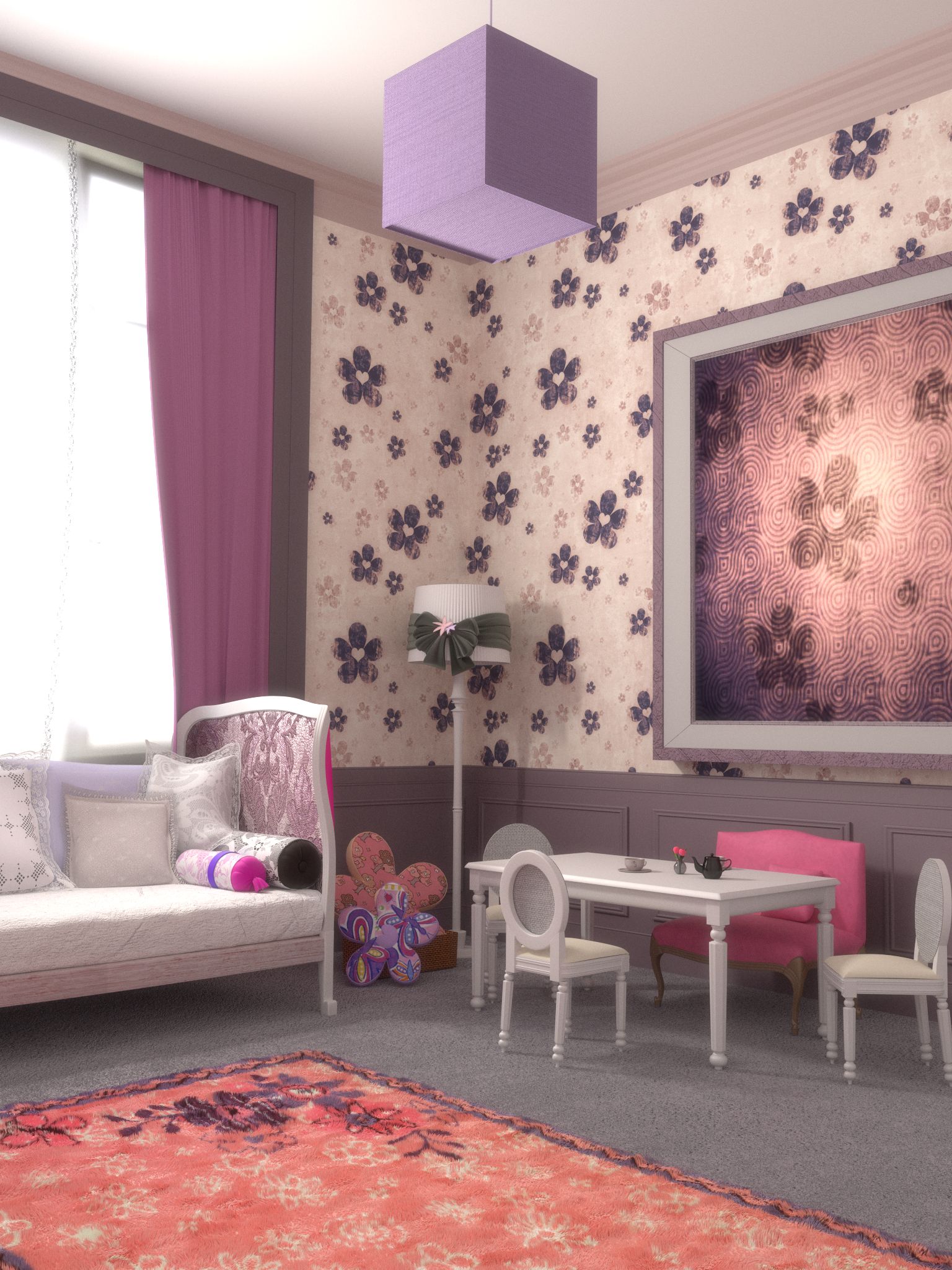
I like Your render, think the material of the courtain frame can be better, maybe with image textures and I agree the cube of the lamp is weir, it is too perfect, You can add an small bevel, maybe do it bigger on the bottom and adding a subdivision with fractal. If You see your reference image You can see that the cube is like curved. The material on the bigger sofa is great, You can add a material like that on the small and pinked sofa to make it better but it is ok now.
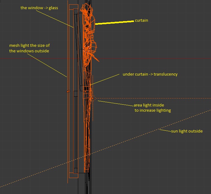
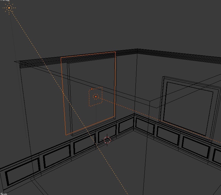
Well, if you want more light you can add another area lamp between undercurtain and curtain (adjusting the strenght)
i’m already doing that and it is working.
What i don’t understand is why chairs and table are casting nearly no shadows on the floor…
they do have shadow, but it is not showing because of the floor texture, i think i should change it.
I like Your render
thank you, check down the update please.
think the material of the courtain frame can be better, maybe with image textures
definitely it need enhancing, but i experimented too much on it to get it right but it is not coming
the cube of the lamp is weir, it is too perfect, You can add an small bevel
it already has as all corner objects in the scene, but i guess it is small, i’ll increase that and update.
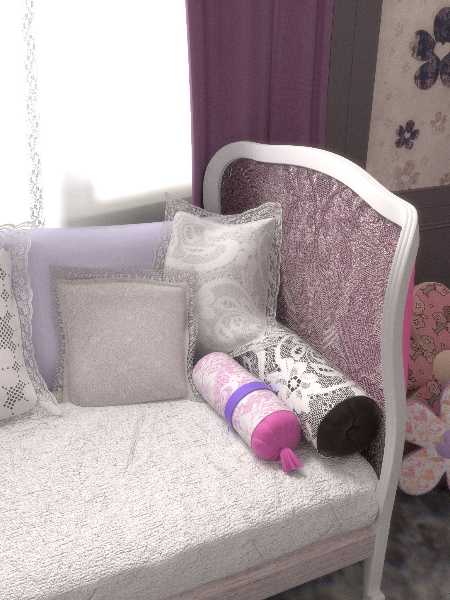
You can add a material like that on the small and pinked sofa to make it better but it is ok now.
yea that one needs enhancing too, i’ll see to it -iAw-.
update: add simple post processing.

You can sepparate a little te top board from the roof and from the walls to get some shadows there, You can add noise textures to your materialas in the displacement and, in the midle of the output material and the noise texture a math node (shift + a, vector, math and change the math to multiply) to adjust the value, You can see the tutorial about introduction to realisticmaterials in cycles by BlenderGuru, I just saw it and it is great.
Other thing, You can check the materials of “El Brujo de la Tribu” in blendswap.com, he uploaded “blackbody” materials, great materials, You can apply those materials in your scene and see if it get better with them (emision materials for the lamps).
You might want to change your focal length. The kids chairs look warped. I am sure they are modeled correctly, but when rendered they bend.
The kids chairs look warped.
if you mean the seat it is the cushion!
a close up :
a new render is on the way with new floor, saturation, i’ll update ASAP -iAw-.
Your mat’s texture is a lot denser and darker than the original, and doesn’t seem to fit in a kids room. Also the mat is very flat. I think the biggest (and hardest) fix for this image is the lighting. yours is softer and more flat. Also adding more details to the models might help (it might even get you some more pronounced shadows)
Your mat’s texture is a lot denser and darker than the original
true, i searched for liter kiddish one but i couldn’t findif you can direct me to one i’ll be happy to use it.
. I think the biggest (and hardest) fix for this image is the lighting. yours is softer and more flat. Also adding more details to the models might help (it might even get you some more pronounced shadows)
the thing is the original picture is over exposed in an interesting way, i can’t replicate it, each time i try to over expose my render it gets very bad artifacts! and i’ve been with this project for a long time now -near 4 months of scattered bits of work-, i think i may test vray renderer i used it in max before.
Is your lighting an emission rectangle where the window is? or is it a bigger plane in the distance streaming through the window?
think about what a window is. it’s a small block of space, through which a gigantic field of emission is simultaneously streaming through and blocked by.
It looks as though your lighting is too soft to be accurately [/SIZE]representing[SIZE=2] window light. even taking the curtains into consideration . . .
I think the carpet is too formal for a room of kids. I am just saying
I think the carpet is too formal for a room of kids. I am just saying
true, i coudn’t a kiddish one.
trying vray, this is the same light setup, but much better shadows, i’ll do the texturing next and see what happens:

That’s odd… You should be able to get the same result in cycles as there are no fundamental differences on how shadows look. If you rendered this way in cycles (without textures) it really should more or less the same, if not you can easily tweak the light a bit to make it look like this.
yes it could get the same, but the speed man ah…, this is a medium preset and it took like 3 min to render, i’ll see after texturing what happens.
cycles is awesome but still not mature enough as much as vray, although it is much better integrated into blender and much cleaner, also vray standalone is cheap.
now vray exporter is good but still beta, i mean the nodes are no easy to deal with like cycles which are very clean and forward, also lack of documentation, anyway here is the finished image by cycles, it took 9 hours to render on i5 2500 CPU:
thanks for all the comments and critic.
also making of on my WIP site.
Looks really great!
I keep on thinking that the lamp need a bevel but it look great, the render, I am not sure but maybe the curtains look weird when them join together.
The overall result come well but the room to me seems like “cold” : maybe is becouse of lack of the light flooding compared to reference or you can try changing the floor and wall panelings material to a wood one, just don’t choose low res textures.