New image :
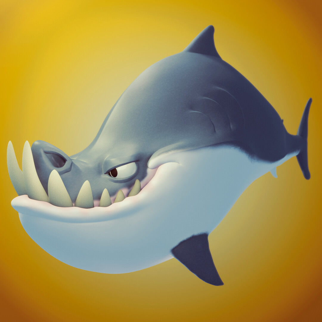
Hey, there is my latest sculpt, rendered with Eevee
I think I did improve myself in render and lighting, but there’s still something a bit off… do you have any suggestions ?
New image :
Hey, there is my latest sculpt, rendered with Eevee
I think I did improve myself in render and lighting, but there’s still something a bit off… do you have any suggestions ?
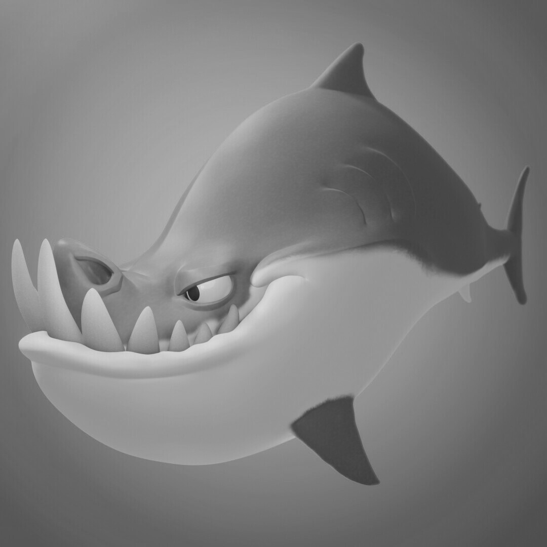
It’s a very appealing image, I like the circular gradient in the background that draws attention towards your subject.
It does feel too flat however, and I think perhaps tweaking the roughness could help. He looks like he should be more shiny in places, especially the eye. A darker ambient occlusion would help increase the contrast too.
Additionally, although it’s stylized some subtle surface detail could go a long way as well, maybe small noise or something to break up the flat look. Hope this is helpful!
thks for your answer, I’ll start going through all of your ideas 
have a great day
Here, I think that you have the luxury of: “what do you want?” Do you want to tilt toward “cartoon,” or “a cartoon character that is actually physical?” It’s up to you. (But: “remember the Law of Diminishing Returns!”)
Right now, I find this image to be perfectly satisfactory and pleasing.
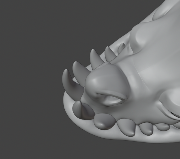
This is a very nice shark sculpture! ![]() … oh wait!
… oh wait! ![]() better not touch!
better not touch! ![]()
I agree with ZachDude that the shark looks “flat”. It’s mainly because of the lack of shadows. The fins do not cast a shadow. The teeth cast a very pale shadow.
Especially the belly has no shadow. Also, the back would look more three-dimensional if you add a stronger rim light to get a contrast to the back and the tail fin.
Maybe shift the light area of the background to the left to focus on the face (and the teeth ![]() ), and create a darker area for the tail. The shark would come more “out of the dark depth”. The Depth of Field setting of the camera will add even more depth to the image.
), and create a darker area for the tail. The shark would come more “out of the dark depth”. The Depth of Field setting of the camera will add even more depth to the image.
How about making the shark look into the camera? Or use a widescreen image format and place something (tasty) in front of it?
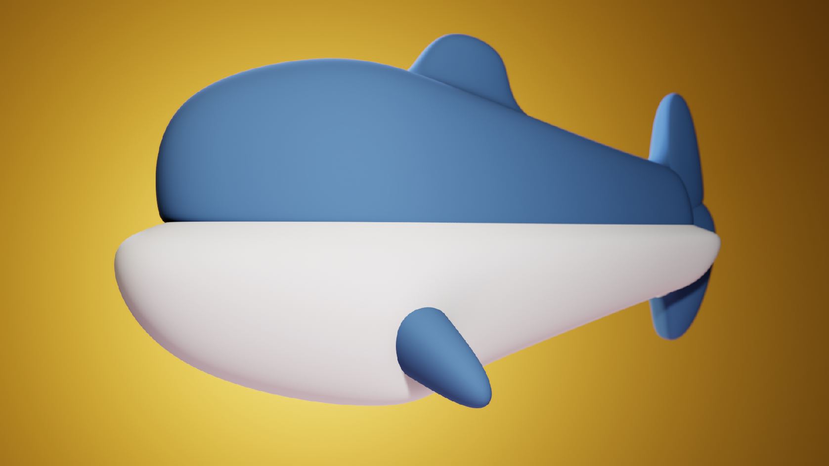
Here’s a try with a mockup of the default cube. There are 5 lights for the model:
I agree with ZachDude on this one. The image is too flat, and yes, post-processing effects like ambient occlusion, tweaking roughness, grain, etc. can help.
But the main problem to focus on is the lack of shadows. It feels like there are no lights in the scene and only the textures are lit. If there is a light source in your scene, make sure to place it beside the shark, for example, just to cast some shadows.
Also, you could add a touch of texturing to each element. Other than that, It looks great!
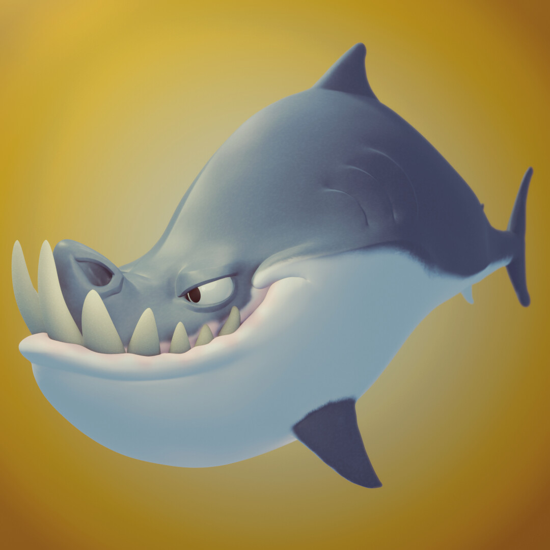
Ok, first, thanks everyone for your replies ![]()
So I’ve been remaking this image, while going through all of your ideas
only, @JoeBlunder, I didn’t add any other stuff, or changing the pose of the shark or the camera, as it was the style I wanted ![]()
Here’s the image :
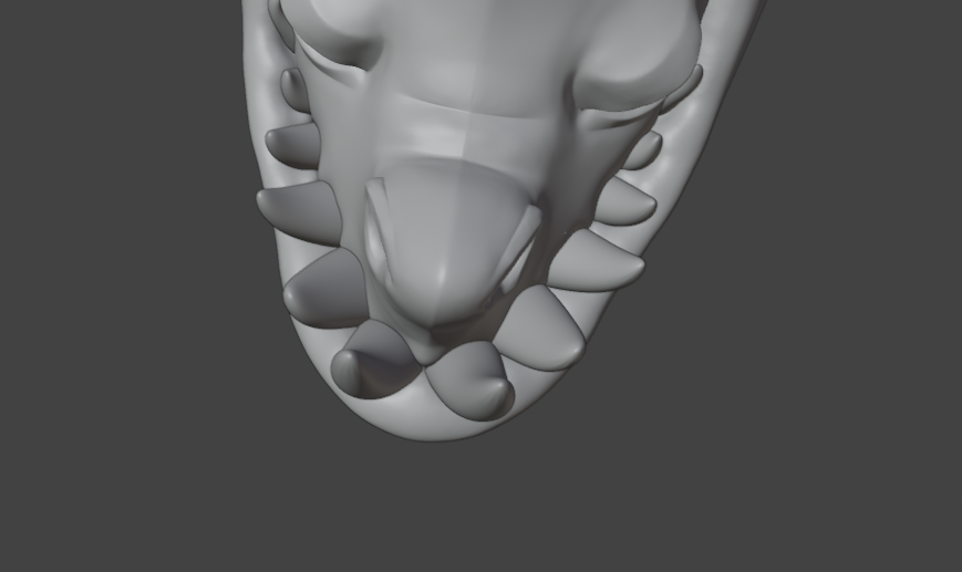
Where does the leftmost tooth come from?
Regards,
Gregor
Well, my shark is symetrical, so at the same place than the right one 
To me it looks like this tooth is outside the mouth. As if it sticks on the right cheek. See http://test.szaktilla.de/shark_stylised_good_g.jpg
I think this has reached a pretty good level.
You can of course tweak it further by having the story be stronger but that would be making a new concept and image altogether.
I would consider moving onto the next one, depending on your goals / focus.
I sometimes go and visit Sketchfab for a bit to get some fresh perspectives on things.
Lastly, do you have an idea what you want to achieve with this image?
Something like: “Have it look good enough for work as a shading artist” gives a very different next step as a: “Improve my eye for contrast and lighting” etc
just making these up
That all being said: Nice work!
Hm. So I think it must be some strange matter of perspective.
The good stuff- I don’t see any problem with the model. I think it’s very appealing. The teeth are modeled just fine, in my opinion.
What feels off to me are the colors. The shark looks flat to me because the color is too de-saturated and there is not enough contrast on the shadows. Since it’s a shark, I think it would benefit with having some highlighted areas on the skin and eye as well.
I’m not experienced enough in blender to give a complete solution to this issue, I’m more speaking from my painting/illustration background here.
Hey this islooking great! Although, as others have said, the thing that strikes me is how flat it is. If we turn it black and white you can see that the darkest areas arent very dark at all.
Look how adding a bit of contrast with a levels adjustment layer immediately gives it a bit more pop
While Photoshop is great for tweaking images to look better, ideally you want to create this effect at render time, using lights. Photoshop can be reserved for the icing on the cake.
Are you using an environment light? If so, have you plugged in a hdri? and have you tried turning it down? Let me know how you get on!
Ok I see, so I have no hdri, I’ve just work with tri-lamp and some more point lamp, now I’ve redo my scene, pick your counsels and here my result :
It is certainly better, but it doesn’t seem the lighting has changed, only the contrast of the current lighting. Would you mind if I had a play with your scene file? Would be a bit easier to show you what I mean that way. Totally understand if not!
Well, here’s the blend file : Usually I would care but for a tiny project like that there’s no problems at all.
Background and Hdri.zip (349.4 KB)
https://drive.google.com/file/d/1g_hK_pwMfRMj_Bm6KIIZnLGQWfZhyJMA/view?usp=sharing
The file being too big I had to come with a Google drive link, hope there’s no problems.
can’t download because access is denied.
try with this one, maybe it’ll be better : https://drive.google.com/file/d/1g_hK_pwMfRMj_Bm6KIIZnLGQWfZhyJMA/view?usp=sharing


